January 10, 2015
Tableau Tip: One Parameter; Unlimited Number Formats
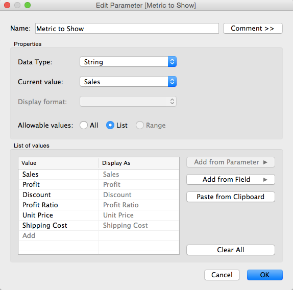
Step 1: Create a parameter that is a list of metrics.
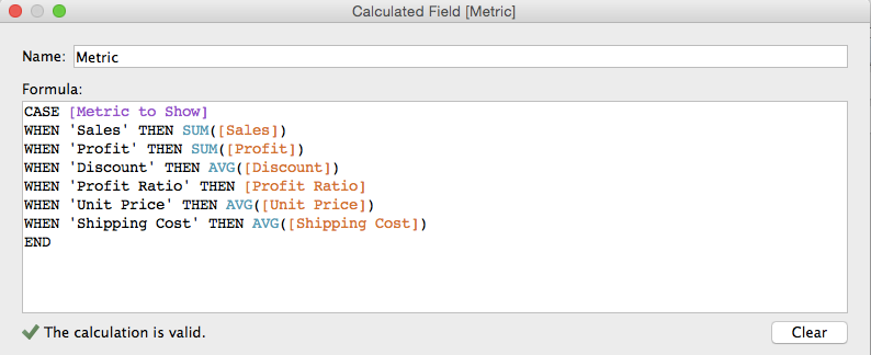
Step 2: Create a calculated field that returns the value of the metric selected.
October 10, 2014
Flowing with Tableau - The Tableau Wannabe Podcast Hangout with Joe Mako
January 24, 2014
Tableau Tip: Showing all dates on a date filter after a Server refresh
I saw on this thread that it’s still an unsolved problem. In a nutshell, here’s a summary of the problem:
- You created a dashboard that has a date slider quick filter and you’ve told Tableau to use all dates.
- The next day when the data source refreshes, the quick filter doesn’t automatically include the new date(s). The slider has to be manually moved to the right to accommodate for the new data.
Let me first explain the problem in a bit more detail. Assume that you have a set of sales data for the first few days of the year.

And you built a cool dashboard with a date slider like this:

You publish the dashboard to Tableau Server and set the data source to refresh each night. But when you look at it a couple of days later, you notice that the chart hasn’t changed.

You can clearly see that four more days should be included, but the slider is still stopped at January 10th. Tableau does not automatically adjust the date slider; it stays at whatever dates were picked when you published the workbook.
That leaves you with two options, both of which are not satisfactory:
- Republish the workbook every day.
- Tell your users that they have to adjust it themselves every day.
Step 1: Create a parameter that allows two options and show the parameter control.

Note from Joe: This allows us to default the view to including all dates, while enabling the interactor to decided to apply a date filter.
Step 2: Duplicate the data source (or alternatively create a data source that has only the dates since that’s all you need to make this work, or you could use custom SQL like “SELECT DISTINCT Date FROM Table”)
Note from Joe: This will give us a data source with a valid date range, a kind of dynamically populated parameter.
Step 3: Unlink the Date field in the secondary data source. Ignore any warnings.

Note from Joe: This way there is no Group By clause sent in the query to the secondary date list data source.
Step 4: Create a calculated field that checks for matching dates.

Step 5: Replace the Date filter on the worksheet from the primary data source with the Date field from the secondary data source and show the quick filter. Again, ignore any warnings.

Note from Joe: The combination of this calculated field in the primary data source, and a filter on the Date field directly from the secondary data source, is where the magic happens. The filter on Date that we just placed will happen in the query to the secondary data source, then the aggregations to get the MIN and MAX Date in the secondary, and then the comparisons that happening the formula will happen after the results are returned from each data source. This is effectively enabling us to get the selection of the filter available to use in the calculated field.
Step 6: Add the date match calculated field that you created in Step 4 to the Filters shelf and set it to At Least 1.

Note from Joe: The INT() in the formula turns the Boolean value into an integer because a Boolean cannot be Continuous and Tableau cannot filter on a Discrete Measure if it is not a table calculation. So by changing the data type, we can make the pill a Continuous Measure and filter on it.
Step 7: Clean up the dashboard – Remove the quick filter that is showing, add the quick filter for the Date slider and show the parameter control.
When you publish the dashboard, be sure to pick All Dates from the parameter created in Step 1 above. The Date slider will still not move, but at least we are now defaulting the dashboard to always show all dates and then the user can filter if they wish.

January 14, 2013
And the winner of the VizWiz Electric City redesign contest is…
John Matyskiel of Ontario, Canada!
The participants were asked to redesign this viz. The instructions were intentionally vague and I also intentionally chose a data set that had a few problems. There were several outstanding entries, for which I’ll highlight a few of my favorites below.
We must start with John’s winning entry, which he built with Adobe Illustrator.

Download a PDF version here to view at full size.
What set John apart from the others was his use of story telling. I felt like I really learned something after reading John’s work. Even though I‘m not typically a big fan of stacked bar charts, John’s work for me because visually the bars are asking me to compare travel methods across an individual city, not down the chart. John makes good use of colors too, keeping travel methods within the same categories in the same color palette. If I had to pick one thing to improve, it would be to make the gridlines lighter.
For his efforts, John will receive a super warm Facebook hoodie. I suppose he might need it up in Canada.

Robin Kennedy of The Information Lab in the UK submitted this interactive version built with Tableau. Click on a City to see the Travel Methods update. Then click on a Travel Method and see the Country comparisons update. What’s really neat is how Robin uses different shapes depending on the Travel Method you select. Try it.

Kalpana Behara submitted this great hand-drawn viz all the way from India (click it to see a larger view). She’s a cartoonist and a Manchester United fan, but I didn’t count her loyalties against her. I love the cross-tab view, the good use of colors to categorize the data, and the choice to use a lollipop chart, which emphasize precision (dots) over length (bars). Her design also makes it easy to see where there are holes in the data.
I’m not sure if Kalpana is trying to tell me something, but there’s a hidden devil on the page. Subtle indeed…

Tableau Zen Master Joe Mako submitted this simple and clean design built in Tableau. Needless to say, for anyone that knows Joe, he did a great job of using colors, particularly the shading within categories and is an overall good technical re-design. What sets John apart from Joe is his story telling.

Jon Schwabish’s entry was also built with Adobe Illustrator and it’s very similar to Joe Mako’s, except it takes up much more space. I like how the color of the headers correspond to the colors of the bars. That’s a nice visual cue. Jon also added some very helpful text.

Thank you to all of those that entered! It was a lot of fun reviewing each submission. I was amazed at how different people can look at the same data.
And again, congratulations to John Matyskiel! You’re sweatshirt is on the way.
July 26, 2012
Tableau Tip: Adding totals of a 2nd measure on top of stacked bar charts
Before I get started, credit for the technique/trick in this blog post to Jonathan Drummey. Follow Jonathan on Twitter or follow his new blog.
Also, if you don’t use the Tableau Forums for getting answers to those things that have you stumped, then you’re missing out. It’s very rare that I can’t either (1) find the answer or (2) get the answer by starting a discussion.
Now, consider that you have a stacked bar chart of sales by Product Container color-coded by Region.

Great! But it would be more useful to label the top of each bar with the totals sales like this.

Awesome! I was banging my head trying to figure out how to make this work. Adding totals to a stacked bar is straight forward, but the trick here is that the bars represent % of total, not the raw sales.
It seems so simple, but I was stumped. Fortunately Jonathan was there to save the day, and I can’t believe how simple it was.
Here’s how it’s done, starting with the stacked bar.
Step 1 – Create a calculated field with the value of one

Step 2 – Drag your new “One” measure onto the right side of the chart until you see the dotted lines (which indicate a dual axis), then drop it.
You now probably have an ugly chart like this:

Step 3 – Change the aggregation for the One measure from Sum to Average (right-click on the One pill, go down to Measure, then pick Average)
Step 4 – Right-click on the right axis and choose Synchronize Axis
Step 5 – Click on the carrot on the top-right of the Marks card and choose Multiple Mark Types
Step 6 – Scroll to the right on the Marks card until you get to SUM(Sales). Change the mark type to Bar.

Step 7 – Scroll to the right again to get to AVG(One).
- Remove Region from the Color shelf
- Set the color transparency to 0%
- Change the mark type to Gantt Bar (Joe Mako suggested using Gantt Bar instead of Bar because it creates a line at the top and it will eliminate the chance that the user could select a hidden bar.)
- Drag the Sales measure onto the Label shelf
- Set the Label alignment to Top

You should now have a chart that looks like this:

Step 8 – Right-click on the right axis and uncheck Show Header
That’s it! Pretty simple! (Now that I know how to do it.)

Download the workbook here.
May 24, 2012
Creating an interactive monthly calendar in Tableau is easier than you might think
Dustin’s post does an excellent job of taking you through creating a calendar viz step-by-step. But I felt it fell a bit short in the end since you didn’t actually see a calendar. Dustin’s end product looks like this:


Ok, let’s get to it.
Step 1 – Create a list of dates in Excel and open the data in Tableau.


Step 4 - Right-click drag the Date field onto the Row shelf and choose the WEEK(Date) discrete format

Your view should look like this:

Step 5 – Clean up the view a bit by right-clicking on the Date label and choosing Hide Field Labels for Columns

Step 6 – Right-click on the WEEK(Date) pill on the Rows shelf and uncheck Show Header

Your view should look like this:

We’re getting close!
Step 7 – Right-click drag the Date field onto the Text shelf and choose DAY(Date)

Step 8 – Align the Text to the top right, center the header for the WEEKDAY(Date (copy) field, re-size the view a bit and we now have a beautiful calendar.

Ok, sweet, we have something that looks exactly like a calendar, but so what? This doesn’t tell us anything.
Consider that you want to see the profit ratio for your sales (or any other metric) displayed on each day as a color. This is where data blending comes in handy.
Step 9 – Connect to the Superstore Sales data source (or any other data you want to use, as long as it has a date field)
Step 10 – Create the data blending relationships. Go to the Data menu and choose Edit Relationships. You will need to create these Custom relationships:

Step 11 – Create a calculation for Profit Ratio by right-clicking on any field and choosing Create Calculated Field

Step 12 – Drag the Profit Ratio measure onto the Color shelf

That’s it! You must admit this is pretty cool.
Note that Tableau defaults positive and negative colors to the Red-Green palette; you might want to change it for those color blind folks out there (and to keep Steve Wexler off your back).
If you want to take it a couple steps farther, you could show the quick filter for the MY(Date) field, create a parameter to allow for any of several metrics to be chosen, and on an on to make it a truly interactive analysis.
In the version embedded below, I changed the color palette to Red-White-Green so that those days without any sales would be white instead of gray.
Try this with your own data. I bet your users will find this incredibly useful, especially as a performance monitoring tool.

November 28, 2011
Tableau Tip: Adding dynamic Top X labels in 9 easy steps (add Bottom X for even more goodness)
There a good chance you’ve run into this scenario before, maybe in a past life in Excel or with Tableau: You have a chart with a bunch of bars or columns or maybe a line chart, and you want the top 5 values labeled. Ideally, the chart would look something like this:

With Tableau, you can manually assign labels to these points, but wouldn’t it be better for the points that are labeled to change dynamically based on the data you have selected? There’s no easy way to do this in Tableau, but as always, there’s a workaround that’s quite simple once you implement it once or twice.
Be patient as you read your way through this; it might seem a bit complicated, but I’ll detail every step. Let’s get started.
1. Drag the Order Date dimension onto the Columns shelf, right-click on the pill and choose All Values (This changes the Order Date field from a Discrete dimension to Continuous; not a critical step, simply personal preference)

2. Drag the Sales measure onto the Rows shelf (I’ve filtered the Order Date to 2010 only, but that’s not necessary either)

3. Create a parameter, I named mine Top X, with the following properties:

NOTE: I could have chosen to always label the top 5 or top 10 values, but I want the consumers of the dashboard to be able to select the number of values they want to see labeled, thus the need for a parameter.
4. Right-click on the “Top X” parameter and choose “Create Calculated Field…” Name the field “Top X Label” and enter this formula:
IF INDEX()<=[Top X] THEN SUM([Sales]) END
I’ll explain the need to use the INDEX function in a bit.
5. Right-click on the “Top X” parameter and choose “Show Parameter Control”
6. Drag the Top X Label calculated field (from step 4) onto the Label shelf on the Marks card.

7. Here comes the trick: Right-click on the Top X Label measure and choose “Edit Table Calculation”

8. In the Table Calculation dialog box, change the Compute Using option to Advanced

9. In the Advanced window, change the Order Along settings to the Sum of Sales Descending. This will force the Top X Label field to index the values based on Sales from highest to lowest (thus the reason the calculated field compares to the INDEX() function).

That’s it! The top 5 points are now labeled. You’re chart should look like this:

You can use the Top X parameter to pick the number of values you want to label. Even if you filter the data, maybe to only show the East Region, the labels will still work properly.
But this is Tableau, so let’s take it a step farther. Maybe you need to label the top 5 and the bottom 5. There’s a neat little way to do this too.
1. Duplicate the Top X parameter and rename it Bottom Y and the show the Bottom Y parameter control
2. Duplicate the Top X Label calculated field, update it to reference the Bottom Y parameter and rename it to Bottom Y label:
IF INDEX()<=[Bottom Y] THEN SUM([Sales]) END
So now what? There’s no way to add a second label! True, but there IS a way to add a secondary axis.
3. Drag Sales onto the Rows shelf, right-click on it and choose Dual Axis

4. Remove “Measure Names” from the color shelf (we don’t need different colors since we’re using the same measure twice)

5. On the Marks card, click on the carrot on the upper-right of the card and choose Multiple Mark Types

6. Click the right arrow twice until you see “SUM(Sales) (2)”, then drag the Bottom Y Labels calculated field onto the Label shelf

7. Right-click on the Bottom Y Labels field, choose Edit Table Calculation, then repeat steps 8 & 9 above. The only difference is that the advanced table calculation should be in ascending order for the Bottom Y Labels:

You’re done! You now have an interactive chart that allows the user to pick the number of top and bottom values they want to see. Interact with it, download it and see how it works for yourself.
Finally, I would like to thank Joe Mako for his help in walking through this situation. He helped me with the formula and advanced table calculation for the Top X Label field.



