August 10, 2015
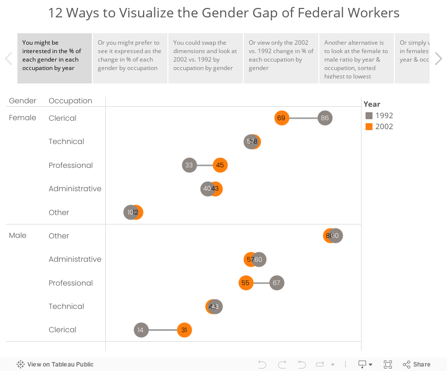
Makeover Monday: 12 Ways to Visualize the Gender Gap of Federal Workers

What would you call these charts? Not pie charts...maybe "spilt pie charts"? | From http://t.co/jZZKbLnAl0 pic.twitter.com/cyqwtp8UYz
— Jon Schwabish (@jschwabish) August 5, 2015
As I was thinking about this makeover, I couldn't settle on a single best way to visualize this data. I did know, though, that these moons/pies/donuts/dots needed to communicate more effectively. I've come up with 12 alternatives, each of which works way better than the original. The reason there are 12 is because there are multiple ways to display the dimensions based on the story you want to emphasize. And yes, I could have come up with another 12.
Special thanks for Carl Allchin for his feedback and help with the text on the tabs in the story points.
January 14, 2013
And the winner of the VizWiz Electric City redesign contest is…
John Matyskiel of Ontario, Canada!
The participants were asked to redesign this viz. The instructions were intentionally vague and I also intentionally chose a data set that had a few problems. There were several outstanding entries, for which I’ll highlight a few of my favorites below.
We must start with John’s winning entry, which he built with Adobe Illustrator.

Download a PDF version here to view at full size.
What set John apart from the others was his use of story telling. I felt like I really learned something after reading John’s work. Even though I‘m not typically a big fan of stacked bar charts, John’s work for me because visually the bars are asking me to compare travel methods across an individual city, not down the chart. John makes good use of colors too, keeping travel methods within the same categories in the same color palette. If I had to pick one thing to improve, it would be to make the gridlines lighter.
For his efforts, John will receive a super warm Facebook hoodie. I suppose he might need it up in Canada.

Robin Kennedy of The Information Lab in the UK submitted this interactive version built with Tableau. Click on a City to see the Travel Methods update. Then click on a Travel Method and see the Country comparisons update. What’s really neat is how Robin uses different shapes depending on the Travel Method you select. Try it.

Kalpana Behara submitted this great hand-drawn viz all the way from India (click it to see a larger view). She’s a cartoonist and a Manchester United fan, but I didn’t count her loyalties against her. I love the cross-tab view, the good use of colors to categorize the data, and the choice to use a lollipop chart, which emphasize precision (dots) over length (bars). Her design also makes it easy to see where there are holes in the data.
I’m not sure if Kalpana is trying to tell me something, but there’s a hidden devil on the page. Subtle indeed…

Tableau Zen Master Joe Mako submitted this simple and clean design built in Tableau. Needless to say, for anyone that knows Joe, he did a great job of using colors, particularly the shading within categories and is an overall good technical re-design. What sets John apart from Joe is his story telling.

Jon Schwabish’s entry was also built with Adobe Illustrator and it’s very similar to Joe Mako’s, except it takes up much more space. I like how the color of the headers correspond to the colors of the bars. That’s a nice visual cue. Jon also added some very helpful text.

Thank you to all of those that entered! It was a lot of fun reviewing each submission. I was amazed at how different people can look at the same data.
And again, congratulations to John Matyskiel! You’re sweatshirt is on the way.


