September 4, 2023
28 Charts in 60 Minutes - Forbes Cloud 100: Companies Scaling Up and Scaling Down

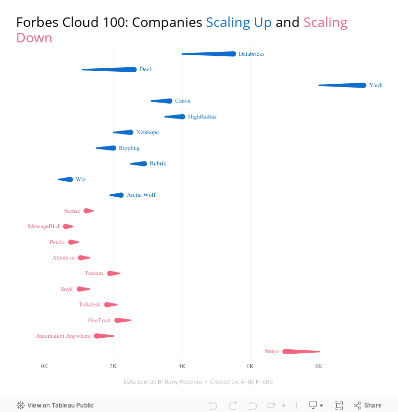
How many people power the Forbes Cloud 100? Is there a correlation between company rank and employee size? Have they expanded or contracted.
Learn how to build 28 charts in 60 minutes that compare two years.
May 10, 2016
Tableau Tip Tuesday: How to Create Directional Lollipops

In this week’s tip, I show you how to create directional lollipops, an alternative view to time series jittering. In the video, I look at the incredible season by Stephen Curry and his shot results minute-by-minute, game-by-game.
Enjoy!
December 29, 2015
Dear Data Two | Week 36: Indecision

- Who I was with?
- What stress level did it introduce?
- What was the major topic?
- How long will it take to resolve?
- Was it resolved by the end of the week?
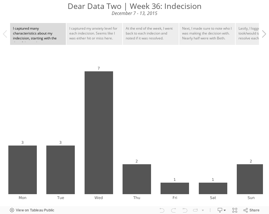
- There was an even split (42%) between low and high anxiety levels. To me, that means that my decisions were either simple or hard, which doesn't surprise me as I'm a pretty much black or white kind of person.
- I was able to resolve 68% of my indecisions. I take that as a good sign that I follow up on things and try to not let things pester me for too long.
- As for who I was with, nearly half of the indecisions I logged were with my wife. That didn't strike me as unusual because it's really just a sign of a married couple making decisions together.
- 79% of my indecisions took days or less to ultimately resolve.

December 17, 2015
Dear Data Two | Week 32: Sounds

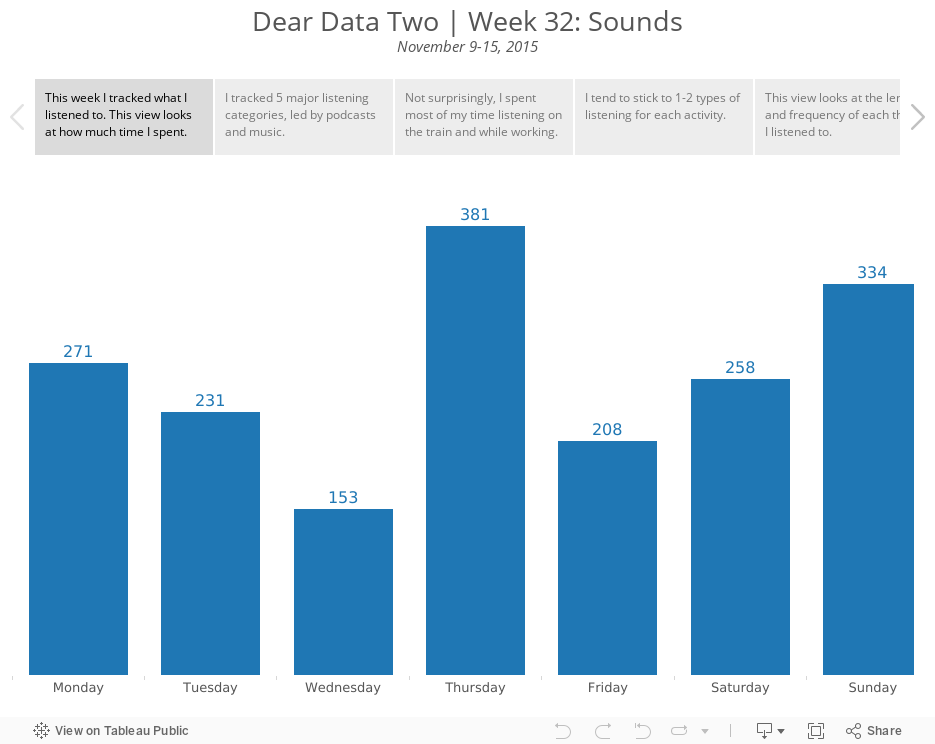
I tend to have a fairly set routine, so I didn't learn much about myself this week. Overall, I listen to podcasts on the train and when running and I listen to music at work and when running. I was hoping that adding the length of time listened would provide some insight, but it really didn't. The longest things I listened to were sporting events and movies, duh, of course!
Anyway, here's my Tableau story that walks you through how I looked at the data. For the postcard, I drew inspiration from Giorgia's postcard, which looks like a sheet of music. I have my lines going down as well, but my didn't turn out quite as nice. It looks like I'm hanging myself when running.
December 8, 2015
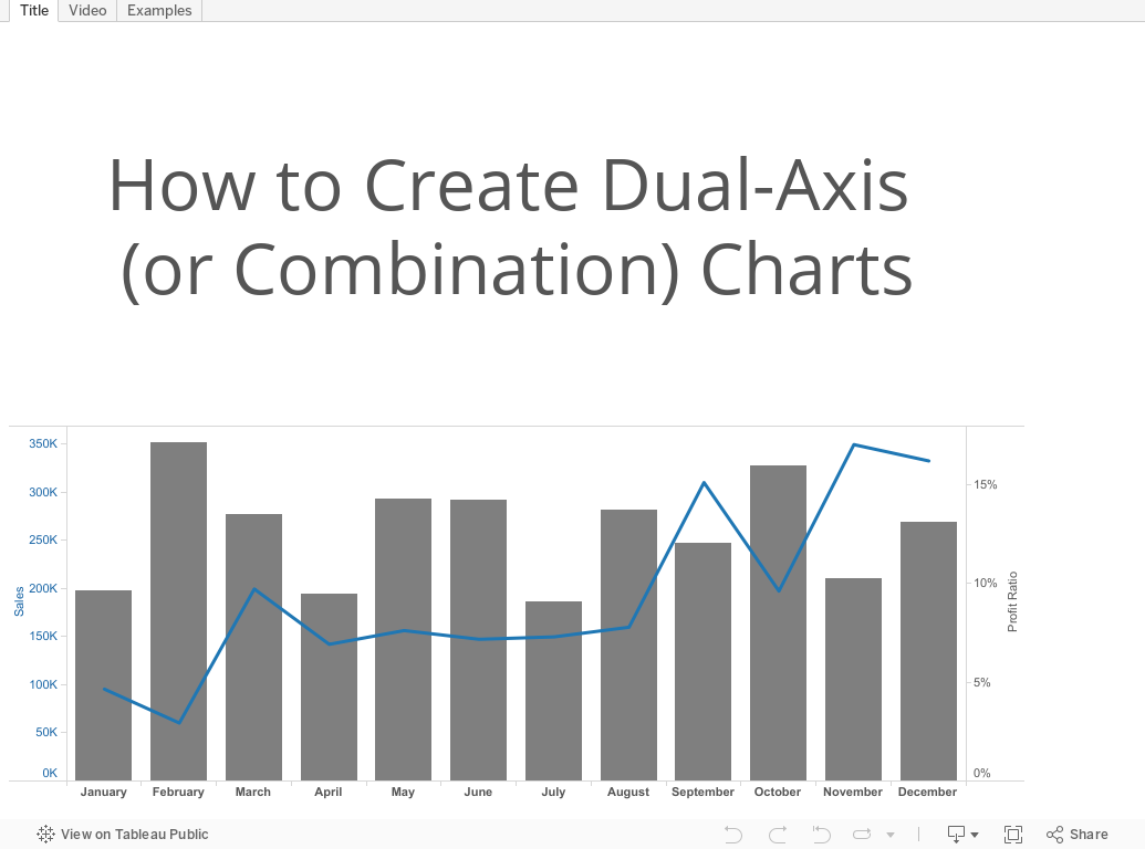
Tableau Tip Tuesday: How to Create Dual-Axis Charts

September 22, 2015
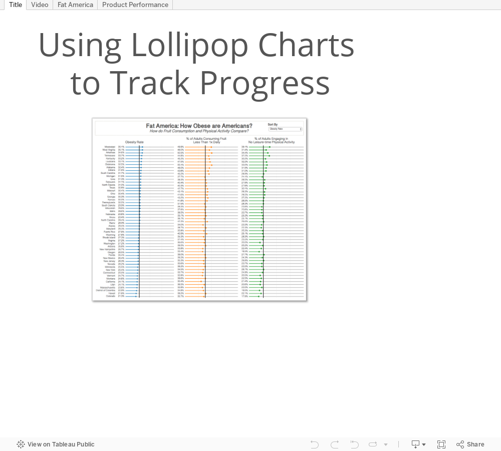
Tableau Tip Tuesday: Using Lollipop Charts to Track Progress

- How to use import.io to get the data
- How to use the Tableau Web Data Connector to bring data into Tableau from import.io
- How to build the lollipop progress charts
- Options for customising the view
- A practical example that will likely apply to your work
It’s a bit of a long video since there’s so much to cover. If there’s anything else you’d like me to create videos for, please let me know in the comments below.
September 8, 2015
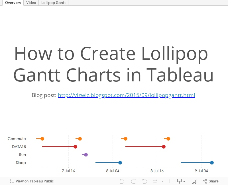
Tableau Tip Tuesday: How to Create Lollipop Gantt Charts

September 6, 2015
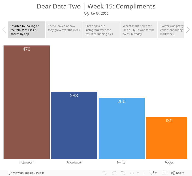
Dear Data Two | Week 15: Compliments

July 14, 2015
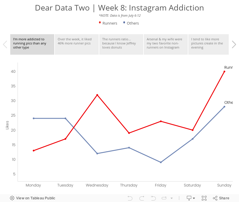
Dear Data Two | Week 8: Instagram Addiction

Week 8 was supposed to cover the period from May 25-31, but my data collection had a major fail. What I’ve done instead was use IFTTT to capture all pictures that I like on Instagram and log them to a Google Sheet. Note that IFTTT records the date that the picture was taken, not the date that I liked the photo, so the dataset reflects photo dates. Good enough for me!
I then exported the data from Google Sheets into Excel and did some date manipulation before importing the data into Tableau. Once I had the data in Tableau, I began to explore the data to see if any patterns emerged, focusing primarily on whether I liked running or non-running pictures the most. The story points below reflect my thought process. Enjoy!
June 4, 2015
Dear Data Two | Week 7: Complaints

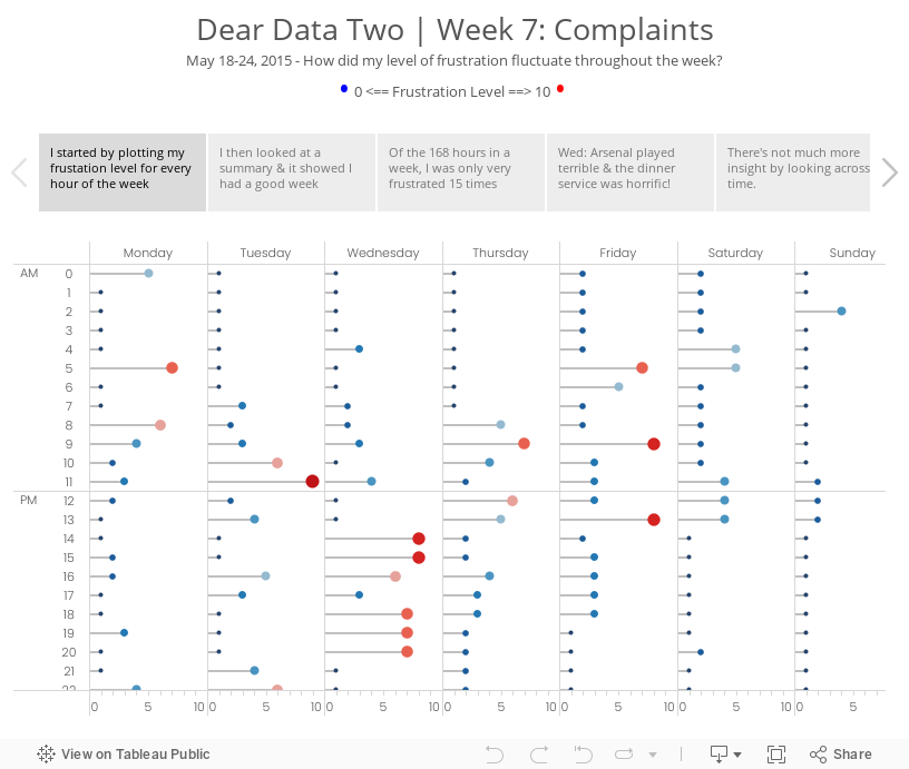
For week 3 Jeffrey sent me a donut chart by accident (so he says…) and while I was thinking about my ideas for this week, I started connecting some data points with lines and ended up with a radar chart. (See the draft version in the story points.) It’s funny how he and I both have gone against what we would consider best practices. What does that mean??
I decided to go with a clock them this week and split the data up between morning and afternoon. From there, I plotted each day going outward from the centre for that hour. For example, at 12am, Monday is closest to the middle and Sunday is farthest from the middle. This helped me see which hours were cumulatively the most frustrating for me for the week. Each dot is separated by the frustration level. If the frustration level was three, then the dot would be 6mm from the previous dot. I then sized the dots by the frustration level so as to double encode the values.
It’s no surprise that my sleeping hours were generally the least frustrating, except for 5am when jetlag kicked in. Overall, 9am was my worst hour in the morning and 1pm was the worst in the afternoon. The story points viz below goes into more of the explanations.
February 17, 2015
Tableau Tip Tuesday: Creating Lollipop Charts
Click the image below to explore the viz and view the video.

February 9, 2015
Makeover Monday: Beyond the Box Score - Which Teams Outperformed Their Predicted Win %?
@VizWizBI Just read your article on the Cali vax rates and VotD. Would you mind taking this down/offer advice? http://t.co/oCMoCnIiV3
— Kevin Ruprecht (@KevinRuprecht) February 4, 2015
Kevin has been following my Makeover Monday series and wanted some advice/feedback. He and I are going to do a screen share session later today to talk about his viz, my makeover, and my thought process. Thanks for asking Kevin!!Kevin is new to Tableau, so it takes quite a bit of courage to post on a site as large as SBNation.com. We should all be cognizant that there are tons of people learning Tableau every day. We need to be thoughtful with our comments and the words we choose when we respond. Think about how you would feel if you were new to Tableau and someone commented negatively about your first viz. What would you want to hear? How would you feel?
In the end, we should all be kind to everyone we meet. We want to be an encouraging community.
Here's Kevin's original viz. Click on the image to go to the original article.

- Where's the title? What is this about?
- Why don't the stats in the slope graph match the stats in the lollipop chart?
- What is BaseRuns?
- Which font did Kevin choose and why?
- There are some formatting changes that need to be made.
- What does "BR Filter" mean?
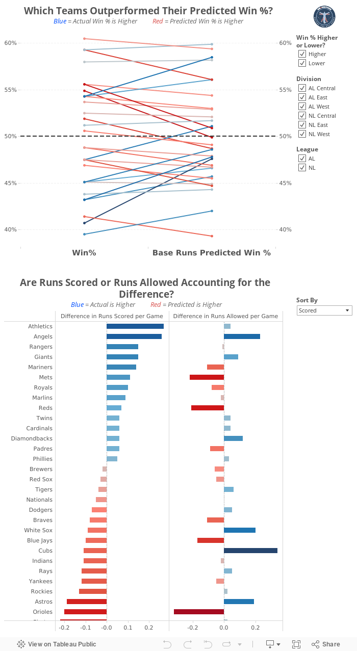
Some of the changes I made:
- Change the overall font to Helvetica Neue
- Added titles that describe what each chart is about
- Updated the "BR Filter" to something more understandable to the average reader
- Reformatted the slope graph, including: adding gridlines, changing the reference line, adding a secondary axis to aid in reading, reversed the colors
- Replaced the lollipop chart with a bar chart that shows details about the stats in the slope graph, making it a two-part story
- There are some other things as well, but those are the biggest changes.
July 21, 2014
Makeover Monday: Slicing Up the La Liga & Premier League Revenue Pies

- There are 20 slices in each pie.
- Each slices contains way too much content: team logo, team name and revenue, yet it lacks the percentage each team takes in, which is more meaningful than the revenue in this case.
- The image is blurry.
- The fonts are tiny.

I chose a lollipop chart because I wanted to show the data in a bar chart view, but accentuate the end points. I then color-coded the dot on the end of the lollipop by the revenue and kept the range consisted across the leagues. In addition:
- I kept the scales for the bars the same on both charts so that you could see how the leagues compare to each other.
- I converted the Pounds to Euros (1 british pound sterling = 1.26 Euro) to make the data more comparable.
- I included the share of revenue as a label on the lollipop.
- There are only two teams that matter to TV networks in Spain.
- The Premier League is very, very rich. The team will the lowest revenue allocation is higher than the third highest team in La Liga.
January 14, 2013
And the winner of the VizWiz Electric City redesign contest is…
John Matyskiel of Ontario, Canada!
The participants were asked to redesign this viz. The instructions were intentionally vague and I also intentionally chose a data set that had a few problems. There were several outstanding entries, for which I’ll highlight a few of my favorites below.
We must start with John’s winning entry, which he built with Adobe Illustrator.

Download a PDF version here to view at full size.
What set John apart from the others was his use of story telling. I felt like I really learned something after reading John’s work. Even though I‘m not typically a big fan of stacked bar charts, John’s work for me because visually the bars are asking me to compare travel methods across an individual city, not down the chart. John makes good use of colors too, keeping travel methods within the same categories in the same color palette. If I had to pick one thing to improve, it would be to make the gridlines lighter.
For his efforts, John will receive a super warm Facebook hoodie. I suppose he might need it up in Canada.

Robin Kennedy of The Information Lab in the UK submitted this interactive version built with Tableau. Click on a City to see the Travel Methods update. Then click on a Travel Method and see the Country comparisons update. What’s really neat is how Robin uses different shapes depending on the Travel Method you select. Try it.

Kalpana Behara submitted this great hand-drawn viz all the way from India (click it to see a larger view). She’s a cartoonist and a Manchester United fan, but I didn’t count her loyalties against her. I love the cross-tab view, the good use of colors to categorize the data, and the choice to use a lollipop chart, which emphasize precision (dots) over length (bars). Her design also makes it easy to see where there are holes in the data.
I’m not sure if Kalpana is trying to tell me something, but there’s a hidden devil on the page. Subtle indeed…

Tableau Zen Master Joe Mako submitted this simple and clean design built in Tableau. Needless to say, for anyone that knows Joe, he did a great job of using colors, particularly the shading within categories and is an overall good technical re-design. What sets John apart from Joe is his story telling.

Jon Schwabish’s entry was also built with Adobe Illustrator and it’s very similar to Joe Mako’s, except it takes up much more space. I like how the color of the headers correspond to the colors of the bars. That’s a nice visual cue. Jon also added some very helpful text.

Thank you to all of those that entered! It was a lot of fun reviewing each submission. I was amazed at how different people can look at the same data.
And again, congratulations to John Matyskiel! You’re sweatshirt is on the way.
July 16, 2012
Tableau Tip: I’ll take you to the candy shop. I’ll show you how to make a lollipop.
I’ve been gone for a few weeks enjoying some much needed time off before changing jobs and moving to the west coast. I’m hopping back into the blog saddle with a series of posts about different charts type, their strengths and weaknesses, when to/not to use them, etc.
The posts will include step-by-step instructions for creating the charts in Tableau. The instructions for many of these charts have been written before and I will reference the authors whenever I know about their work.
I will typically use a chart I’ve found on the internet in order to provide variety of examples and also to provide a forum for discussing the strengths and weaknesses of their chosen designs.
Let’s get right to it with this lollipop chart from The Washington Post (via Chart Porn):

I like the clean design, the use of simple colors, and the excellent use of data-ink ratio of this chart, but there are few issues that immediately stand out to me. First though, what is a lollipop chart?
I couldn’t find an exact definition, but I think of a lollipop chart as a combination of a bar chart and a dot plot. Lollipop charts are great for giving you a sense of both length (bars) and precision (dots).
However, it only makes sense to use the stick of the lollipop when you’re range starts at zero.
In the example above, the bars start at 60, therefore including the bars could mislead the reader into thinking the retirement age in Malta is five times lower than Austria. In this example, the bars should be removed, which turns the chart into a dot plot.
Another problem with this chart is that there is no particular rationale to the sort. At first I thought it was ranked buy retirement age from youngest to oldest, but then Spain was listed before the United States.
For the purpose of the rest of this blog post, we’re going to focus on the retirement age only.
Taking the issues above into account, the data could be represented as a simple dot plot:

Or alternatively as a lollipop chart:

Hopefully at this point you understand when and why you would use a lollipop chart. In the end, it’s basically a bar chart with a bit more emphasis on the exact value of the bar. CAUTION: Don’t avoid a bar chart simply because a lollipop chart looks cute. I would nearly always prefer a bar chart over a lollipop chart.
So now onto the instructions for how to build this chart. (Credit to Andy Cotgreave, who back in his days at The Data Studio wrote similar instructions)
Step 1 – Drag the Country dimension onto the Rows shelf and the Retirement Age measure onto the Columns shelf. The result is a bar chart. Click the sort ascending button.

Step 2 – Drag the Retirement Age measure to the Columns shelf again. The results is the same bar chart side-by-side.

Step 3 – Right-click on the 2nd Retirement Age measure on the Columns shelf and choose Dual Axis

Step 4 - Right-click on the 2nd Retirement Age measure on the Columns shelf and choose Synchronize Axis
Step 5 - Right-click on the 2nd Retirement Age measure on the Columns shelf and uncheck Show Header
Step 6 – Drag the right side of the chart to the left to shrink the view

Step 7 – On the Marks card, click on the triangle (a.k.a. carrot) on the upper-right and choose Multiple Mark Types

The Marks card should now show “All” at the top and there are now arrows for moving left and right through the measures on the Column shelf, e.g., the two Retirement Ages measures.

Step 8 – Click the right arrow on the Marks card once, then:
- Change the format of the chart from Automatic to Bar
- Move the Size slider all the way to the left to make the bars as small as possible
- Remove the Measure Names field from the Color shelf
- Change the color of the bar by clicking on the colored square.

Step 9 – Click the right arrow on the Marks card again to move to the 2nd Retirement Age field, then:
- Change the format of the chart from Automatic to Circle
- Remove the Measure Names field from the Color shelf
- Drag the Retirement Age measure onto the Label shelf
- Format the Label to the font color of your choice and set the horizontal alignment to Center to place the label in the middle of the circle
- Change the color of the circle by clicking on the colored square
- Resize the circle

Voila! You’re lollipop chart is complete. After you practice these steps a few times, you’ll be able to build it in under one minute…guaranteed!

Download the Tableau Workbook here.






