Showing posts with label web data connector. Show all posts
June 11, 2017
Viva Las Vegans! An Iron Viz Entry
data.world
,
iron viz
,
Las Vegas
,
map
,
Tableau Conference
,
vegan
,
vegetarian
,
web data connector
No comments
This also gave me a chance to test the new web data connector from data.world. One of the data sets is a list of over 18,000 restaurants that serve vegetarian or vegan food in the US. I took this list, narrowed it down to Las Vegas, eliminated and closed restaurants and joined it to a Excel files that has the websites for each restaurant.
It's not anything too complicated nor flashy, but here's to hoping that practicality and usefulness is important to the judges as well. I've also designed it for mobile!
Enjoy!

May 3, 2017
What did it take to get to the Madrid Marathon?
Alteryx
,
Information Lab
,
Madrid Marathon
,
map
,
routes
,
RunKeeper
,
running
,
statistics
,
strava
,
tableau
,
TomTom
,
web data connector
No comments
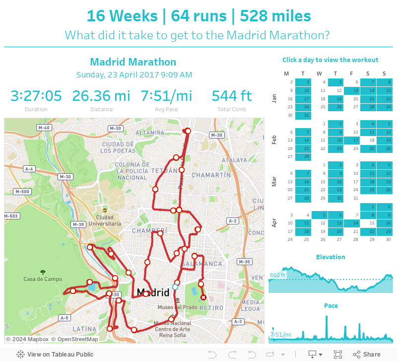
My TomTom watch syncs to both Runkeeper and Strava, both of which I used to visualize my 16 week training program.
The routes for each run are in the form of GPX files, with a data point for every second of the run. I created this Alteryx workflow to parse those files and create the routes I needed to visualize in Tableau.
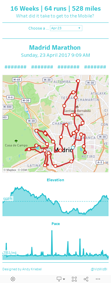
When designing the dashboard, I wanted the focus to be on the map, so I allocated the most space for that. I used the Mapbox Outdoor theme map because it's very similar to what Runkeeper uses. I made the lines red so that they stand out against the map and then added indicators for the start, end, and each mile.
Above the map, I wanted to display the stats for each run (from Strava). I added a calendar on the right to show the frequency of my runs (I must admit I'm pretty consistent). The user can click on a date to see the details and map for that run.
Lastly, I added elevation and pace charts. I'm not all that pleased with how these turned out, but it'll have to do.
So that's about it. 16 Weeks | 64 runs | 528 miles - that's what it took to get to the Madrid Marathon.
September 22, 2015
Tableau Tip Tuesday: Using Lollipop Charts to Track Progress
Alberto Cairo
,
import.io
,
lollipop
,
progress
,
tableau
,
tips
,
Tuesday
,
wdc
,
web data connector
5 comments

I was first exposed to using lollipop charts to track progress by Alberto Cairo back in January 2013. In the viz, I used lollipop charts to show the percentage of educated and obese people by State in the U.S. I realized I never wrote about how to create them, so in this tip, I’m going to show you several things:
It’s a bit of a long video since there’s so much to cover. If there’s anything else you’d like me to create videos for, please let me know in the comments below.
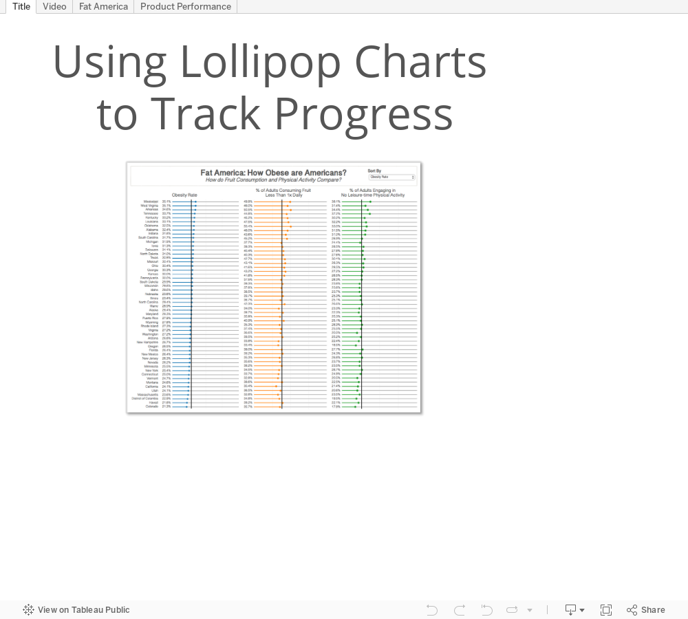 NOTE: After creating the video, I did quite a bit of formatting on the visualisations to get the sorting to keep the sheets in sync and to create the second dashboard. I’d highly recommend you download the workbook to see how I did it. Particularly, see the LOD calc I had to create to get the sorting to work on the sparklines.
- How to use import.io to get the data
- How to use the Tableau Web Data Connector to bring data into Tableau from import.io
- How to build the lollipop progress charts
- Options for customising the view
- A practical example that will likely apply to your work
It’s a bit of a long video since there’s so much to cover. If there’s anything else you’d like me to create videos for, please let me know in the comments below.
Subscribe to:
Posts
(
Atom
)






