June 24, 2022
My Sabbatical with Maggie

October 14, 2019
#MakeoverMonday: Ironman World Championship Medalists

The viz to makeover is a simple table from Wikipedia:

What works well?
- The years are listed in order from most recent to oldest.
- Table can be sorted
- Including separate columns for each medal
- Including links to each athlete
- I'm not convinced that both the flag and country abbreviations are necessary; one is probably enough.
- Some of the athletes have red text and some have blue. I couldn't find anything on the page that explained this.
- Comparing athletes across years is difficult because of the precision of the times/
January 12, 2018
Visualizing 854 Strava Runs
— Marcus Volz (@mgvolz) December 23, 2017
Uh...HELL YES I want to create this. Chris suggested recreating it in Tableau, which I plan to do next week The Information Lab France. In the meantime, I decided to follow the simple instructions that Marcus posted on github.
The vizzes are built using using rstats and ggplot.
I ran into a few errors at first; upgrading my version of R was all it took to make them go away. The processing is super fast and the outputs are really, really cool. You also have the option to customize the size of the viz. I'm thinking of getting these printed as posters.
Here are the routes of my 854 runs from 2013-2017 as small multiples.
And here are all of the runs I've done around London.
Another really fun couple days learning. Now that I understand how all of this works, it should make prepping the data in Alteryx and creating the viz in Tableau significantly easier.
September 29, 2017
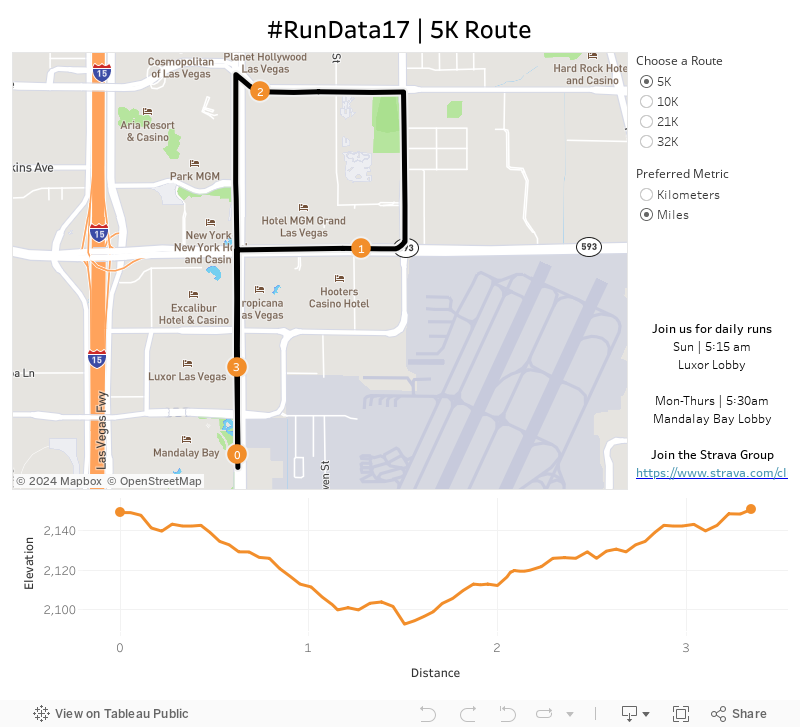
Announcing the #RunData17 routes

Given the conference is significantly larger this year, I bet we can double it! There are 5K, 10K and 21K options and all different paces. Want to go set a land speed record? Go for it! Want to walk? That's fine too! The point is to get out and start your day the right way...with a run!
The run start and end at the Mandalay Bay lobby. We'll start at 5:30am, so get there a few minutes early to sign a waiver and for a group photo.
To help you, I've created this dashboard so you know the routes. It's mobile friendly too!
I hope to see you in Vegas!
September 18, 2017
Makeover Monday: A Day at the Races
Given there's also the #FitData17 challenge we thought we'd give everyone some data to play with.
I'm going to be making over my results from Strava.

What works well?
- Of course no run is good without a map.
- Including a breakdown of my pace for each mile
- Showing a timeline along the bottom and allowing me to customize the metrics
What could be improved?
- There are no markers on the map to show me where I started, ended nor any mile markers along the way.
- The table shows me my pace, but it doesn't add any value because I can't see all of the miles at the same time making spotting trends impossible.
- The line chart has three separate metrics showing, yet only one axis. It doesn't make sense to overlap three metrics.
What I wanted to learn?
- Is my 3:25 goal for Frankfurt achievable?
- Is there anything interesting in the heart rate data?
- I want to be able to compare the key metrics across the two races.
- Is hitting "the wall" avoidable?
Click on the image for the interactive version.
| Click on the image for the interactive version |
May 3, 2017
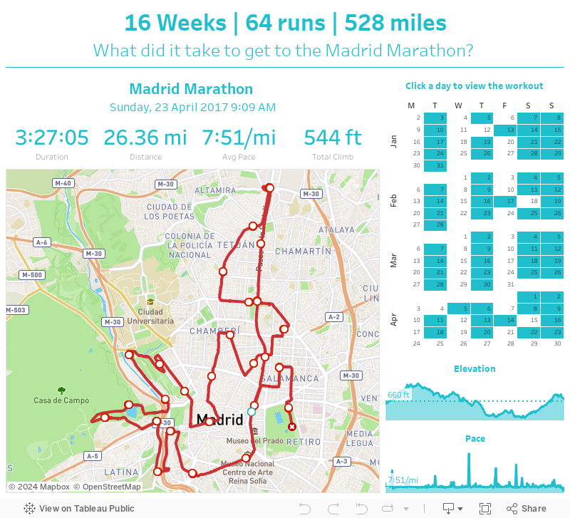
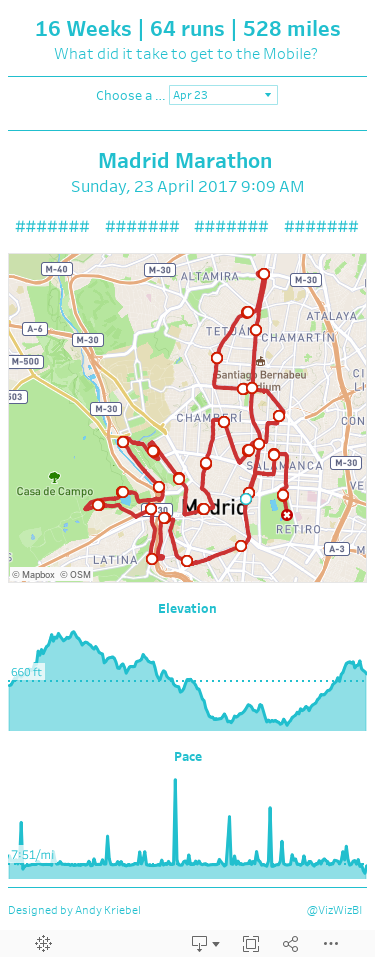
What did it take to get to the Madrid Marathon?
My TomTom watch syncs to both Runkeeper and Strava, both of which I used to visualize my 16 week training program.
The routes for each run are in the form of GPX files, with a data point for every second of the run. I created this Alteryx workflow to parse those files and create the routes I needed to visualize in Tableau.
When designing the dashboard, I wanted the focus to be on the map, so I allocated the most space for that. I used the Mapbox Outdoor theme map because it's very similar to what Runkeeper uses. I made the lines red so that they stand out against the map and then added indicators for the start, end, and each mile.
Above the map, I wanted to display the stats for each run (from Strava). I added a calendar on the right to show the frequency of my runs (I must admit I'm pretty consistent). The user can click on a date to see the details and map for that run.
Lastly, I added elevation and pace charts. I'm not all that pleased with how these turned out, but it'll have to do.
So that's about it. 16 Weeks | 64 runs | 528 miles - that's what it took to get to the Madrid Marathon.
November 24, 2016
From London to New York in 500 miles | My New York City Marathon Training Visualized
Like most runners, I love my running data! My watch syncs to Tom Tom, Runkeeper, Strava and Nike+. Why all of them? Well, why not? Naturally, I wanted to see how my training went. Was it effective? How'd I do in my long runs? How often did I run? What was my average pace? The questions are endless.
I'm also in the middle of testing a new Web Data Connector for Strava that brings back A TON of information about each run. Mix all of this together and you get a dashboard of my marathon training.
Click on the image for the interactive version (it's too wide for my blog). Once you're there, you can click on any activity and see the map update with the route of each run. The activity will also be highlighted across all of the charts.
And yes, I got the data from Strava yet I'm using Runkeeper colors. I simply like their colors better. Enjoy!

October 14, 2016
Join us at #RunData16!


For the past few Tableau Conferences, members of the Tableau Community have come together for some early morning running. Last year, as you can see above, we had an incredible turnout and we expect this year to be much more of the same.
Details:
- When: 5:30am Mon, Tue, Wed
- Where: Four Seasons
- Distances: 5K and 10K (easy enough to make longer or shorter if you'd like)


- Run leaders: Eva Murray, Paul Chapman, Me
- More info on Strava
Yes, a 5:30am start time is early, but in our experience, you HAVE TO start this early if you want time to make the keynotes. Running people are a weird bunch anyway, so 5:30 is never too early for us!
The run leaders will have high visibility bibs and torches for everyone's safety. If you have lights, bring them along. I've run these routes many times and it's a beautiful trail along the river. There are always tons of runners out and about.
NOTE: You may see a meetup list on the conference website, but it doesn't start until 6:30. If you go to that one, you have very, very little chance of making the keynotes. Plus, most of the runners will be at our run. And we'll be done before they even start!
Tableau has informed us that they will not be supporting us this year. However, keep up with the #RunData16 hashtag on Twitter for all of the latest information. See you in Austin!
August 7, 2015
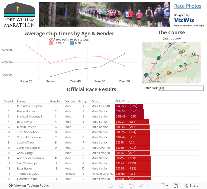
Fort William Marathon: Race Recap & Visualised Results
 |
| I met Hairy Coo on my shakeout run Saturday. Quite the nice guy! |
 |
| Really happy with my result, especially with how much I stopped |
 |
| Finishers medal that I'll cherish forever |
 |
| Nothing beats your kids cheering you on and waiting for you at the finish |
For a first marathon, many people told me I was crazy for choosing this course, but I wouldn't trade it for anything. It was incredibly well organized, small, and the setting was second to none. Seriously, how often do you get to run in the Scottish Highlands?
July 25, 2015
Dear Data Two | Week 10: To-Do Lists

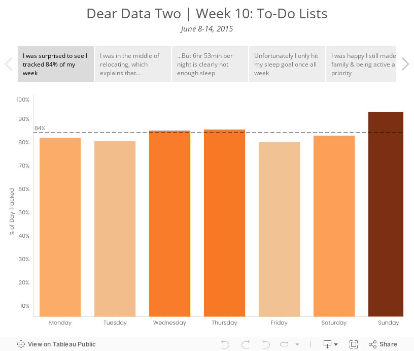
I decided to take a look at the specific activities I was performing. I ended up grouping them in more general categories to improve the visualisation; I prefer a bit more simplicity in my life as well as my vizzes. I used several methods for data collection this week: Swarm, Moves, Fitbit, Runkeeper, IFTTT, Sunrise Calendar. From there, I looked at a few specific categories:
- Overall rate of tracking - I was curious to see how much of my time I was actually able to account for.
- Relocation - I knew I was blowing off packing and the like, mostly because I hate it. The data proved this out.
- Sleep - Was the way I was feeling overall possibly due to a lack of sleep? I probably should have looked at sleep quality as well, but I didn’t include that data.
- Family time - Was I spending enough time with my family? This is always a huge priorty for me.
- Running - I was smack in the middle of marathon training. Was I completing my training? Was that impacting anything else?
- Work - Tom knew I wouldn’t be working much this week, but would I get ANY work done?
Given this set of goals, I explored the data in Tableau and created a few key stories. The last two tab in the story are images of the postcard.
July 14, 2015
Dear Data Two | Week 8: Instagram Addiction

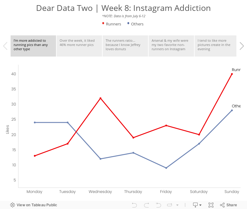
Week 8 was supposed to cover the period from May 25-31, but my data collection had a major fail. What I’ve done instead was use IFTTT to capture all pictures that I like on Instagram and log them to a Google Sheet. Note that IFTTT records the date that the picture was taken, not the date that I liked the photo, so the dataset reflects photo dates. Good enough for me!
I then exported the data from Google Sheets into Excel and did some date manipulation before importing the data into Tableau. Once I had the data in Tableau, I began to explore the data to see if any patterns emerged, focusing primarily on whether I liked running or non-running pictures the most. The story points below reflect my thought process. Enjoy!
June 30, 2015
Alteryx + Tableau: Visualising a Simpler RunKeeper Training Plan

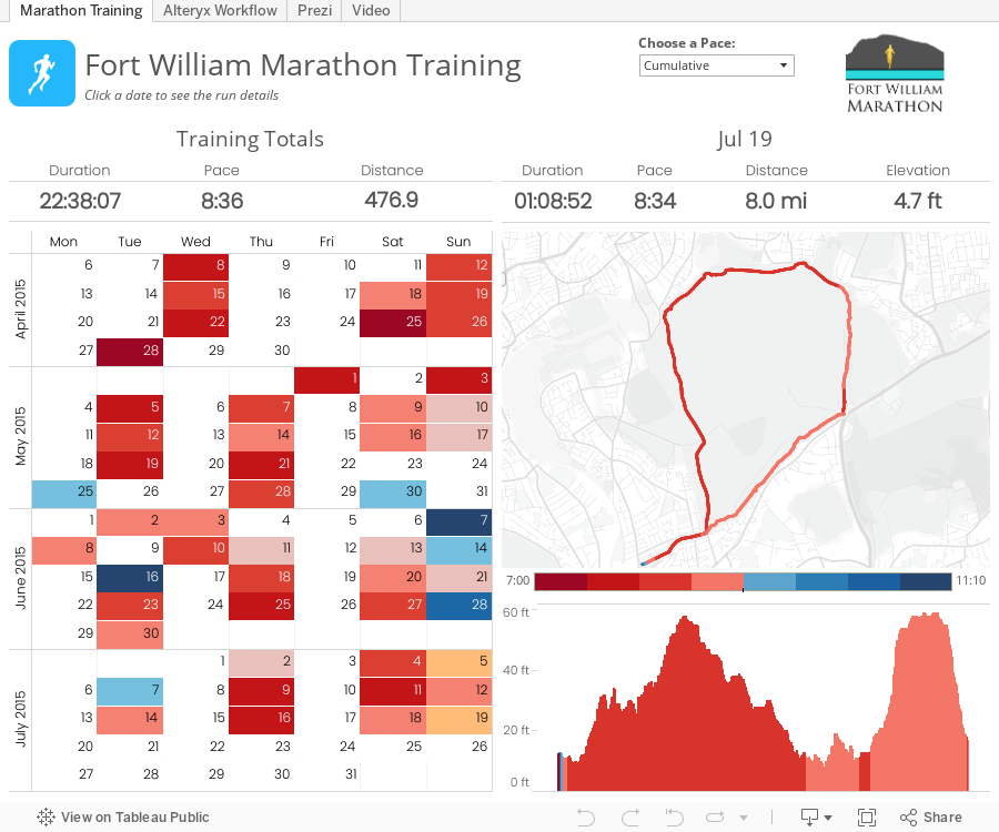
The basic reasons behind this project were twofold:
- I was learning Alteryx and wanted a use case to apply what I was learning.
- I'm training for my first marathon and wanted a better way to see all of my runs in one place.
April 12, 2015
English Football Stadium Tracker

Today, I set out to see some football stadiums. I mapped a route that took me from Wimbledon, past three iconic football stadiums.
 |
| Craven Cottage - home of Fulham FC |
 |
| Loftus Road - home of QPR FC |
 |
| Stamford Bridge - home of Chelsea FC |
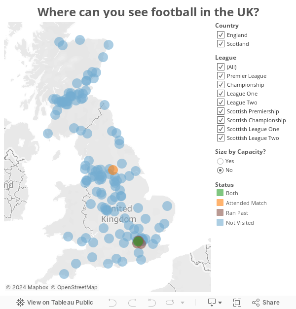
And yes, I know I titled this post "English" and Scotland is not part of England, but UK football stadium tracker doesn't resonate as well with me.
August 7, 2013
Where did they come from? How did they do? Visualizing results from the Summer Breeze Half/10K/5K
This past Saturday, 1,589 runners/walkers participated in the Summer Breeze Half/10K/5K, put on by Brazen Racing. At the end of the race and on their website, when you want to find your time, you look it up on a table like this:

This is great when you simply want to find yourself and see where you placed, but it doesn’t give you any insight into the entire race. Being the data nerd/runner that I am, I wanted to know more. Who are the runners? What do we know about them? Where are they from? How do different demographics perform? Did certain areas in California produce faster average times?
To answer these questions, I downloaded the data and created this race results visualization. Go ahead…click around, look for patterns, get a feel for the race.






