September 18, 2017
Makeover Monday: A Day at the Races
Given there's also the #FitData17 challenge we thought we'd give everyone some data to play with.
I'm going to be making over my results from Strava.

What works well?
- Of course no run is good without a map.
- Including a breakdown of my pace for each mile
- Showing a timeline along the bottom and allowing me to customize the metrics
What could be improved?
- There are no markers on the map to show me where I started, ended nor any mile markers along the way.
- The table shows me my pace, but it doesn't add any value because I can't see all of the miles at the same time making spotting trends impossible.
- The line chart has three separate metrics showing, yet only one axis. It doesn't make sense to overlap three metrics.
What I wanted to learn?
- Is my 3:25 goal for Frankfurt achievable?
- Is there anything interesting in the heart rate data?
- I want to be able to compare the key metrics across the two races.
- Is hitting "the wall" avoidable?
Click on the image for the interactive version.
| Click on the image for the interactive version |
May 29, 2015
Dear Data Two | Week 6: Physical Contact

I'm a huge quantified self data collector, which you'll likely see throughout my Dear Data Two work. I wanted to see how I could use Alteryx to help me get the data into Tableau for analysis before creating my analogue version because I feel like the best way to learn a new tool is to find a practical application. This is the first workflow I built on my own in Alteryx. It might not be the most elegant or most efficient, but I sure did learn a lot along the way. You can download this workflow here.

One of the things I have started to like the most about Alteryx is that I can push all of the complicated row level calculations that I used to do in Tableau to Alteryx, which in the end makes Tableau much faster. For example, I used to multi-row tool to calculate the distance between two geographic points recorded by my watch.
From there, I created the dashboard below to explore the data. In particular I wanted to view the maps and see the summary stats. One thing I learned is that I need to figure out a way to account for times that I paused my watch; that data doesn't appear in the GPX files.
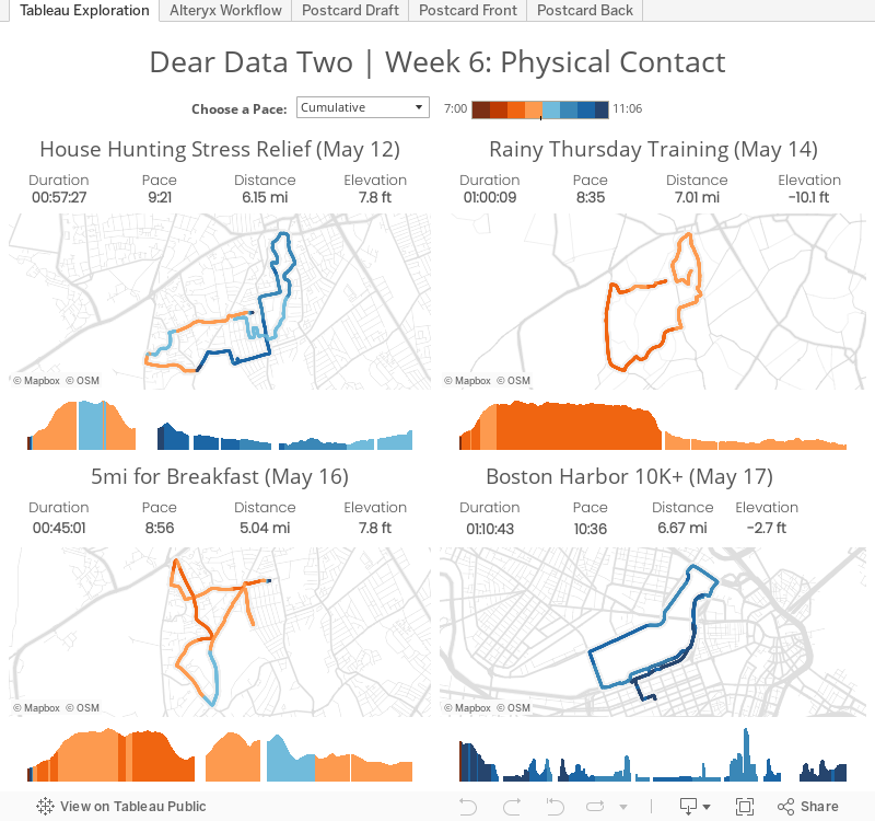
Exploring the data Tableau helped me quantify my runs for the week, but that didn't account for all of my physical activity for the week. To capture ALL of my activity:
- I noted my total daily steps from Fitbit.
- I calculated the number of steps for my runs by taking my stride rate of 184 strides per minute from TomTom and multiplying by the minutes I ran in Strava.
- I subtracted my running steps from the total steps to get my walking steps.
- I used the time of day that I ran and roughly calculated the proportion of walking steps before and after each run each day.
That resulted in this draft, which is sort of like a dot matrix:


March 31, 2015
Makeover Monday: What is Montreal’s Best Gym?

- It’s a pie chart.
- It’s 3D.
- The “Other” category is sorted first, when it should be last.
- Sorting “Other” first takes away from the focus of the story.
- There are way too many colors/slices.
- The amounts are repeated in both the pie and the legend.
Here’s my makeover, a boring bar chart, done with infogram:
January 23, 2014
The Victors & the Quitters: Who completed the 30-day pushup challenge?
During the first week of December, I posted a question on Facebook asking who might want to do a 30-day pushup challenge. I didn’t expect very many takers, however 33 people took on the challenge. The challenge seemed simple: 100 pushups per day for 30 days. But it wasn’t as easy as it seemed. Only 3 of 33 completed the challenge.
How did everyone do? Check out the viz below to find out.

October 31, 2012
Has you wife accused you of putting on a few pounds? Find the exercises that are right for you.
Earlier this week, my wife was having a conversation on Facebook about our move to California when she suddenly said “he has gained weight from the cafeteria.”
She’s was being funny. If you ever meet her, you’ll know what an angel she is quite quickly, especially for putting up with me.
Unfortunately she’s not exactly wrong. I pretended to be offended of course.
Many of us are familiar with the “freshman 15” from college. At Facebook, there’s the “Facebook 15”. Same idea. I can use the unbelievably tasty, free food and unlimited snacks as an excuse (moderation is a challenge), but I really haven’t gained much weight, maybe five pounds.
I exercise, not often enough however. I decided that I needed some help, so I build this viz to help me find the right activities for me.






