Showing posts with label routes. Show all posts
May 4, 2023
Tableau Techniques for Top Notch Spatial Analytics
airlines
,
analytics
,
distance
,
emoji
,
how to
,
lines
,
London
,
mapping
,
path
,
rats
,
routes
,
shape
,
shapefile
,
spatial
,
tableau
,
tug
,
video
No comments

Looking to level up your data visualization skills? Enjoy this live stream from the April 2023 Analytics Tableau User Group (TUG) where I dive deep into spatial data analysis in Tableau!
In this session, I will walk you through the process of importing and visualizing spatial data in Tableau. You'll learn how to use advanced mapping techniques to create powerful and visually stunning visualizations that tell compelling stories with your data.
I cover everything from basic mapping to advanced geospatial analysis, so whether you're a seasoned pro or just getting started with Tableau, you'll walk away with a wealth of knowledge and practical tips you can apply to your own data analysis projects.
Don't miss this opportunity to learn from me and take your data visualization skills to the next level. Watch now and start unlocking the power of spatial data analysis in Tableau!
Download the workbook and data sources to follow along.
MEMBERSHIP PROGRAM
Join my exclusive membership program for data analytics and visualization professionals. The membership program provides unparalleled access to tutorials and templates, curated content, an online community, webinars, expert guest speakers and live training with me.
My program is the best platform to learn, grow, unlock your potential, and succeed in your career.
Sign up or express your interest @ andykriebel.com
June 18, 2019
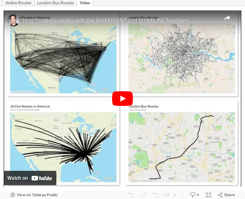
#TableauTipTuesday: How to create routes with the MAKEPOINT and MAKELINE functions
airlines
,
airport
,
bus
,
flights
,
London
,
makeline
,
makepoint
,
route
,
routes
,
Tableau Tip Tuesday
,
vector map
No comments

Leave a comment if you have any questions.
April 9, 2019
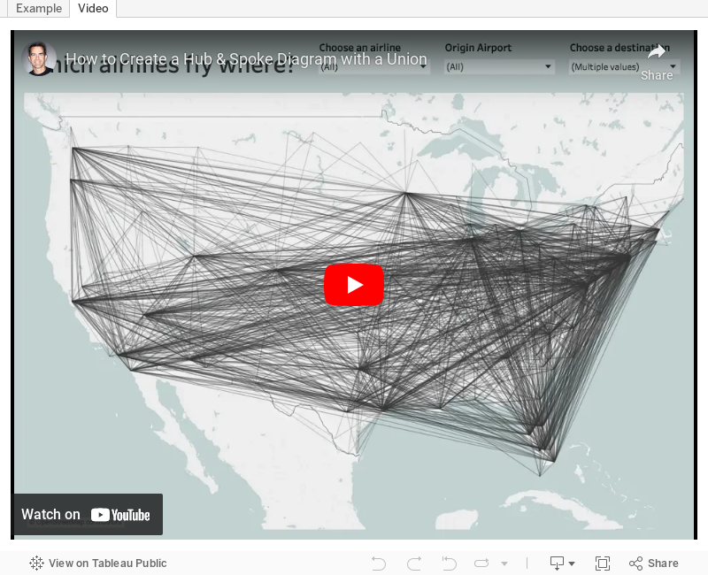
#TableauTipTuesday: How to Create a Hub & Spoke Diagram with a Union
airlines
,
airport
,
hub
,
path
,
routes
,
spoke
,
Tableau Tip Tuesday
,
union
No comments

January 12, 2018
Visualizing 854 Strava Runs
ggplot
,
Marcus Volz
,
routes
,
rstats
,
running
,
strava
No comments
Before Christmas, Chris Love sent me this tweet to check out:
Uh...HELL YES I want to create this. Chris suggested recreating it in Tableau, which I plan to do next week The Information Lab France. In the meantime, I decided to follow the simple instructions that Marcus posted on github.
The vizzes are built using using rstats and ggplot.
I ran into a few errors at first; upgrading my version of R was all it took to make them go away. The processing is super fast and the outputs are really, really cool. You also have the option to customize the size of the viz. I'm thinking of getting these printed as posters.
Here are the routes of my 854 runs from 2013-2017 as small multiples.

And here are all of the runs I've done around London.

Another really fun couple days learning. Now that I understand how all of this works, it should make prepping the data in Alteryx and creating the viz in Tableau significantly easier.
— Marcus Volz (@mgvolz) December 23, 2017
Uh...HELL YES I want to create this. Chris suggested recreating it in Tableau, which I plan to do next week The Information Lab France. In the meantime, I decided to follow the simple instructions that Marcus posted on github.
The vizzes are built using using rstats and ggplot.
I ran into a few errors at first; upgrading my version of R was all it took to make them go away. The processing is super fast and the outputs are really, really cool. You also have the option to customize the size of the viz. I'm thinking of getting these printed as posters.
Here are the routes of my 854 runs from 2013-2017 as small multiples.
And here are all of the runs I've done around London.
Another really fun couple days learning. Now that I understand how all of this works, it should make prepping the data in Alteryx and creating the viz in Tableau significantly easier.
September 29, 2017
Announcing the #RunData17 routes
Data17
,
Las Vegas
,
routes
,
RunData17
,
running
,
Tableau Conference
,
TC17
No comments

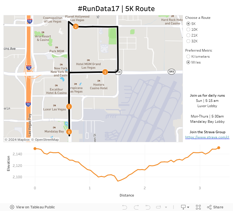
Given the conference is significantly larger this year, I bet we can double it! There are 5K, 10K and 21K options and all different paces. Want to go set a land speed record? Go for it! Want to walk? That's fine too! The point is to get out and start your day the right way...with a run!
The run start and end at the Mandalay Bay lobby. We'll start at 5:30am, so get there a few minutes early to sign a waiver and for a group photo.
To help you, I've created this dashboard so you know the routes. It's mobile friendly too!
I hope to see you in Vegas!
London Bus Routes - The Benefits of Linear Geometries in Tableau 10.4
bus
,
linear geometry
,
linestring
,
London
,
map
,
Mapbox
,
public transportation
,
routes
,
Tableau 10.4
,
TfL
No comments
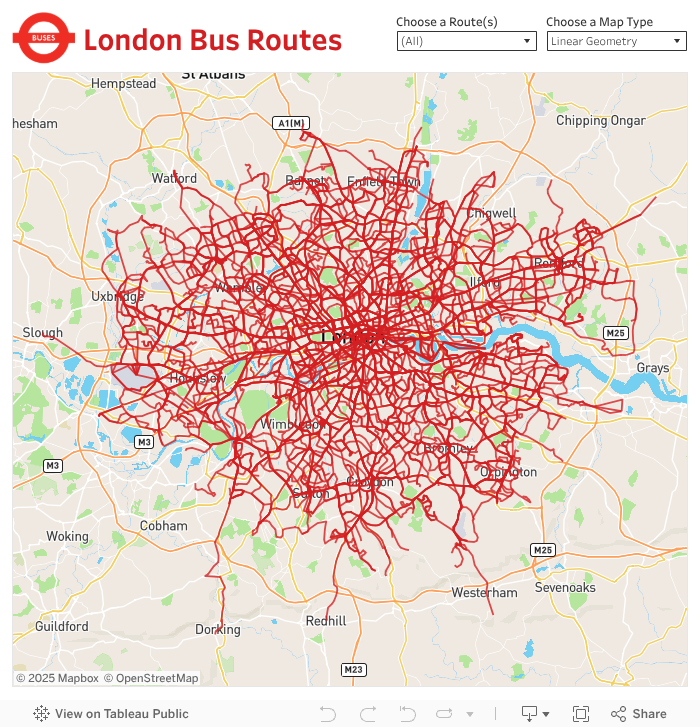
- Plot each bus stop and connect the dots, or
- Create a single line for the entire path
What are the benefits of each?
Plotting Each Bus Stop
This method, which uses the Path shelf to connect the bus stops, allows you to indicate the name of each bus stop along the route. However, the drawback is that Tableau has to draw each bus stop. For London bus routes, this means drawing 28,270 marks then connecting each of those dots for the respective route.
Using Linear Geometry
This method, which creates a mark represented as a line for each bus route, results in only 736 marks (one for each route). That means you'll be significant performance gains. The drawback is that you lose the detail of each bus stop.
Which should you use?
It depends on the granularity you need. If plotting each point is important, the go with method A. If aggregating to the route is ok, then go with method B.
For this use case, I wanted to test both options. First, I went to the TFL website to download the data of every stop for every bus route (requires an account). The data comes as a CSV with eastings and northings, so I turned to my friend Alteryx for converting these into shapefiles.

I used this tip by Rob Suddaby from when he was in The Data School to convert the Eastings and Northings into a spatial object. From there it's simple to create either the linestrings for the entire route or points for each stop.
A quick Mapbox map added for context and we're done! One additional twist I added was to size the bus routes on the map based on the number of routes selected. This only works on the map with each individual stop. I'll be sharing this tip during my TC session in Vegas.
Have a play...enjoy!
May 3, 2017
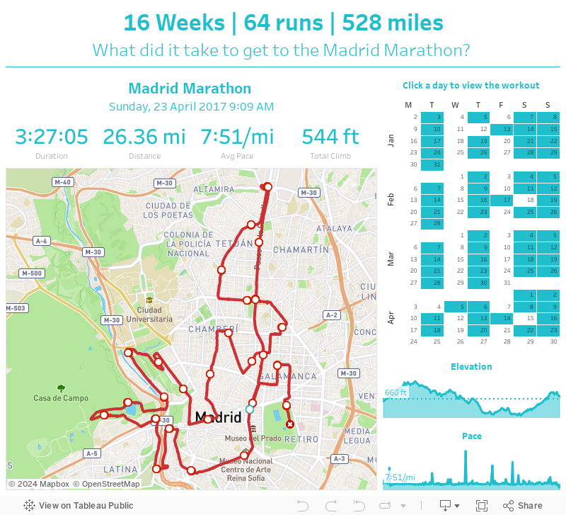
What did it take to get to the Madrid Marathon?
Alteryx
,
Information Lab
,
Madrid Marathon
,
map
,
routes
,
RunKeeper
,
running
,
statistics
,
strava
,
tableau
,
TomTom
,
web data connector
No comments
My TomTom watch syncs to both Runkeeper and Strava, both of which I used to visualize my 16 week training program.
The routes for each run are in the form of GPX files, with a data point for every second of the run. I created this Alteryx workflow to parse those files and create the routes I needed to visualize in Tableau.
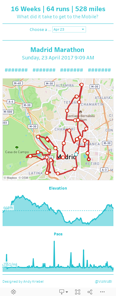
When designing the dashboard, I wanted the focus to be on the map, so I allocated the most space for that. I used the Mapbox Outdoor theme map because it's very similar to what Runkeeper uses. I made the lines red so that they stand out against the map and then added indicators for the start, end, and each mile.
Above the map, I wanted to display the stats for each run (from Strava). I added a calendar on the right to show the frequency of my runs (I must admit I'm pretty consistent). The user can click on a date to see the details and map for that run.
Lastly, I added elevation and pace charts. I'm not all that pleased with how these turned out, but it'll have to do.
So that's about it. 16 Weeks | 64 runs | 528 miles - that's what it took to get to the Madrid Marathon.
November 24, 2016
From London to New York in 500 miles | My New York City Marathon Training Visualized
map
,
marathon
,
new york city
,
race
,
routes
,
RunKeeper
,
running
,
strava
,
training
3 comments
Just about three weeks ago I ran my second ever marathon, and it sure was a big one! In fact, the New York City Marathon set a world record for the most marathon finishers: 51,388 finishers, 51,995 people started, a 98.8% completion rate.
Like most runners, I love my running data! My watch syncs to Tom Tom, Runkeeper, Strava and Nike+. Why all of them? Well, why not? Naturally, I wanted to see how my training went. Was it effective? How'd I do in my long runs? How often did I run? What was my average pace? The questions are endless.
I'm also in the middle of testing a new Web Data Connector for Strava that brings back A TON of information about each run. Mix all of this together and you get a dashboard of my marathon training.
Click on the image for the interactive version (it's too wide for my blog). Once you're there, you can click on any activity and see the map update with the route of each run. The activity will also be highlighted across all of the charts.
And yes, I got the data from Strava yet I'm using Runkeeper colors. I simply like their colors better. Enjoy!

Like most runners, I love my running data! My watch syncs to Tom Tom, Runkeeper, Strava and Nike+. Why all of them? Well, why not? Naturally, I wanted to see how my training went. Was it effective? How'd I do in my long runs? How often did I run? What was my average pace? The questions are endless.
I'm also in the middle of testing a new Web Data Connector for Strava that brings back A TON of information about each run. Mix all of this together and you get a dashboard of my marathon training.
Click on the image for the interactive version (it's too wide for my blog). Once you're there, you can click on any activity and see the map update with the route of each run. The activity will also be highlighted across all of the charts.
And yes, I got the data from Strava yet I'm using Runkeeper colors. I simply like their colors better. Enjoy!
March 30, 2016
Converting Eastings and Northings into a Tableau Transport for London Bus Route Finder Using Alteryx

Today my son Oscar came to work with me to spend time with the Data School and give them an assignment. He asked them to download the Transport for London data and find something interesting. I paired Oscar with Ben Moss and they wanted to look at the busiest times for busses. Oscar will publish his work on his Tableau Public profile when he’s done.
Oscar then wanted to take the bus route information and plot the routes on a map. The data include eastings and northings and we need to somehow turn these into points on a map. Tableau doesn’t understand these as geographic dimensions, but fortunately Rob Suddaby had just written a blog post on how to do this with Alteryx.
Super duper simple!!
June 30, 2015
Alteryx + Tableau: Visualising a Simpler RunKeeper Training Plan
Alteryx
,
calendar
,
dashboard
,
elevation
,
fitness
,
map
,
marathon
,
routes
,
RunKeeper
,
running
,
tableau
,
workflow
7 comments

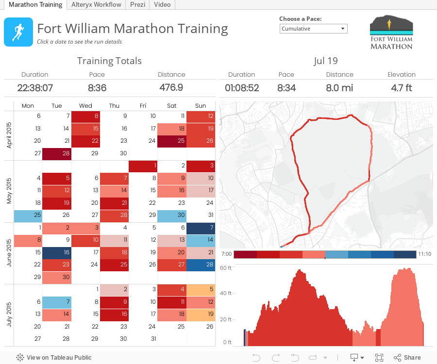
Last night I had the honor of presenting at the London Quantified Self Meetup about a project I've been working on to improve the training plan interface for RunKeeper. The session wasn't recorded, so I've recorded it again this morning, which also allows me to go into more detail.
The basic reasons behind this project were twofold:
Everything is embedded within the Tableau workbook:
The basic reasons behind this project were twofold:
- I was learning Alteryx and wanted a use case to apply what I was learning.
- I'm training for my first marathon and wanted a better way to see all of my runs in one place.
May 29, 2015
Dear Data Two | Week 6: Physical Contact
Alteryx
,
Dear Data Two
,
elevation
,
exercise
,
map
,
physical contact
,
routes
,
steps
,
strava
,
workflow
No comments

What an amazing week for me for Dear Data Two! The topic for week 6 physical contact and I've been learning Alteryx. The first thing I thought of was physical activity, not physical contact, so I emailed Jeffrey and asked him if he was ok with me taking such liberty on the topic. Fortunately Jeffrey was ok with my idea, but then I decided I could stick to the original contact by extending my thinking a bit.
I'm a huge quantified self data collector, which you'll likely see throughout my Dear Data Two work. I wanted to see how I could use Alteryx to help me get the data into Tableau for analysis before creating my analogue version because I feel like the best way to learn a new tool is to find a practical application. This is the first workflow I built on my own in Alteryx. It might not be the most elegant or most efficient, but I sure did learn a lot along the way. You can download this workflow here.

One of the things I have started to like the most about Alteryx is that I can push all of the complicated row level calculations that I used to do in Tableau to Alteryx, which in the end makes Tableau much faster. For example, I used to multi-row tool to calculate the distance between two geographic points recorded by my watch.
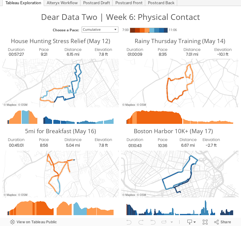
From there, I created the dashboard below to explore the data. In particular I wanted to view the maps and see the summary stats. One thing I learned is that I need to figure out a way to account for times that I paused my watch; that data doesn't appear in the GPX files.
Exploring the data Tableau helped me quantify my runs for the week, but that didn't account for all of my physical activity for the week. To capture ALL of my activity:
That resulted in this draft, which is sort of like a dot matrix:


I'm a huge quantified self data collector, which you'll likely see throughout my Dear Data Two work. I wanted to see how I could use Alteryx to help me get the data into Tableau for analysis before creating my analogue version because I feel like the best way to learn a new tool is to find a practical application. This is the first workflow I built on my own in Alteryx. It might not be the most elegant or most efficient, but I sure did learn a lot along the way. You can download this workflow here.
One of the things I have started to like the most about Alteryx is that I can push all of the complicated row level calculations that I used to do in Tableau to Alteryx, which in the end makes Tableau much faster. For example, I used to multi-row tool to calculate the distance between two geographic points recorded by my watch.
From there, I created the dashboard below to explore the data. In particular I wanted to view the maps and see the summary stats. One thing I learned is that I need to figure out a way to account for times that I paused my watch; that data doesn't appear in the GPX files.
Exploring the data Tableau helped me quantify my runs for the week, but that didn't account for all of my physical activity for the week. To capture ALL of my activity:
- I noted my total daily steps from Fitbit.
- I calculated the number of steps for my runs by taking my stride rate of 184 strides per minute from TomTom and multiplying by the minutes I ran in Strava.
- I subtracted my running steps from the total steps to get my walking steps.
- I used the time of day that I ran and roughly calculated the proportion of walking steps before and after each run each day.
That resulted in this draft, which is sort of like a dot matrix:

For the final version, I colored the dots: Blue dots represents 200 steps walking and red dots indicate 200 steps running. I rounded the numbers for drawing purposes.

You can view the images in the Tableau dashboard above as well, but note that as you're exploring the dashboard, when you click on the tabs that contain images, they will take several seconds to load. I've reported this bug to Tableau.
I really learned a ton this week thanks to Dear Data Two because I found a great use case for Alteryx. Not only did I learned a bunch of Alteryx tools I hadn't learned in the training I took at Inspire15, but I also learned how to do row-level calculations in Alteryx and how those can help Tableau performance.
Subscribe to:
Posts
(
Atom
)






