April 9, 2019
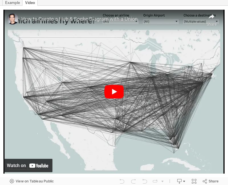
#TableauTipTuesday: How to Create a Hub & Spoke Diagram with a Union

April 8, 2016
Brexit: How will it affect your favourite Premier League team?
 |
| Click the image for the interactive version |
Brexit is a hot topic in the news these days over here in the UK. The ramifications are far and wide. Leaving the EU would mean a LOT of lost jobs, impacting even the Data School and the Premier League.
Back in September, The Guardian wrote an article and created this visualisation to show which teams in the Premier League would be impacted the most.
 |
| Click the image to view the interactive version |
I like the layout of this, but what it lacks is a simple way to see where the players that are impacted come from. I also wanted an excuse to practice the new Union feature in Tableau 9.3. It took me a couple of hours to recreate the data set and then another hour or so to create the interactive viz below.
Find your team and see how many players they could lose if Brexit happens!
December 12, 2015
Dear Data Two | Week 31: Positive Feelings

I recently had a conversation with Paul Banoub and he was telling me about the impact that the Dear Data Two presentation in Vegas had on him, particularly when I talked about being nicer to people (specifically my family). This really struck me and it made me realise that I have a great opportunity through this project to really learn about myself.
So when I looked back at tracking positive feelings, I assumed that all would be rosy and great. I mean, I have a great life, a great job, a great family, live in an amazing place. Yet little did I know that I was in for a shock!
For week 31, I tracked the time, place, who I was with, and what I was doing each time I felt a positive emotion. I started by exploring the data in Tableau, which I walk you through in the story points below. The shock came when I started looking at the people I was having positive feelings with, or I should say, the people I WASN’T having positive feelings with, notably my three youngest kids. I had no idea that I felt this way until I actually looked at the data, and this is the power that this little project has brought into my life. It has helped me recognize areas where I can improve. For that, I’ll be forever grateful.
If I listen to the data, I can make a real, significant difference on my life, how I perceive people, how I treat people, and how and who I spend my time with.
August 19, 2012
Tableau Tip: Create hub & spoke diagrams using the Path shelf
I’m in constant learning mode with Tableau. I don’t think a day has gone by when I haven’t learned something. I love the Tableau community because everyone freely shares ideas from which they hope others borrow. This technique of from-to patterns is no exception; it’s definitely not a new topic I’m covering here. But I do like documenting the processes I follow, which is more or less why I started this blog in the first place.
Paths are not a feature I use often, so in my inevitable quest for all things Tableau, I decided to find some data that would provide a good learning experience. The data for this post comes from the Bureau of Transportation Statistics.
Here’s a sample of the data.

Each origin airport/destination airport combination is represented as one row in the spreadsheet. This is great, but in order to use Tableau’s Path functionality, you need to have two records for each origin/destination combination. The first for the starting point, and the second for the ending point.
You can accomplish this quite easily through Custom SQL. The example below contains all the columns I need from the spreadsheet.
- Those before the red box are inherent in the spreadsheet.
- The SQL inside the red box is for the fields I have to add to make the paths work.
- You must specify the path. In this case, 1 is the starting point, 2 the ending point.
- I added additional latitude and longitude fields to capture the starting and ending points. That is, I use the origin lat/long when my path = 1 and the destination lat/long when my path = 2.
- I included a concatenated string for the route, which I will use on the Level of Detail shelf.
- Union the SQL for path 1 to itself, but change the path to 2 and change the lat/long to the destination lat/long. Notice that the Route calculation stays to same.

In Tableau, all you have to do is:
- Double-click on both Latitude and Longitude to draw the map
- Add Route to the Level of Detail shelf
- Change the Mark Type to line
- Add the Path Order dimension to the Path shelf

You now have a giant mess of lines all over the place that represent every single route in the data. That’s all you need to do.
The trick is that you need to write the custom SQL in order to have your data in a usable format.
I wanted to take the viz a bit farther though, so I created this interactive version on Tableau Public.

I included:
- Filters options for Origin Airport, Destination Airport, and Airline (I chose ATL as my initial view since it’s the world’s busiest airport)
- Colors to indicate the length of the route
- Clicking on a color highlights the routes in the selected flight range and also highlights the destination airports on the bottom map
- A map of the number of passengers that flew to each destination, indicated by the size of the bubble
- Custom tooltips, which include the great-circle distance calculation
This is a pretty fun viz to interact with. Choose all origin airports and you see all of the routes. Choose the airport you most frequently fly from. Choose your preferred airline. The three New York airports are particularly interesting (EWR, LGA, JFK).
There are lots of other data elements that could be included, but I haven’t gotten to. Think about adding options to color the bubbles and lines by things like frequency of delays, average ticket price, etc.
Wouldn’t this be really cool to do with your friend networks on Facebook? Oh wait, we did that in a recent hack-a-thon.






