Showing posts with label airport. Show all posts
January 25, 2022
How to Calculate the Distance Between Two Points
airport
,
analysis
,
calculated field
,
charts
,
dashboard
,
data analysis
,
data visualization
,
distance
,
formatting
,
geographic
,
graphs
,
how to
,
makeline
,
makepoint
,
mapping
,
path
,
tableau
,
tip
,
tutorial
,
worksheet
No comments
Download the data set to follow along here - https://data.world/vizwiz/airport-to-airport-routes
June 18, 2019
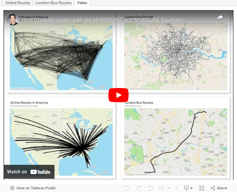
#TableauTipTuesday: How to create routes with the MAKEPOINT and MAKELINE functions
airlines
,
airport
,
bus
,
flights
,
London
,
makeline
,
makepoint
,
route
,
routes
,
Tableau Tip Tuesday
,
vector map
No comments

Leave a comment if you have any questions.
April 9, 2019
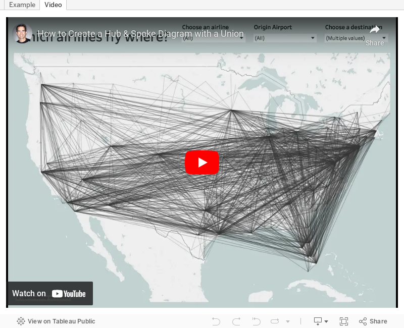
#TableauTipTuesday: How to Create a Hub & Spoke Diagram with a Union
airlines
,
airport
,
hub
,
path
,
routes
,
spoke
,
Tableau Tip Tuesday
,
union
No comments

September 7, 2017
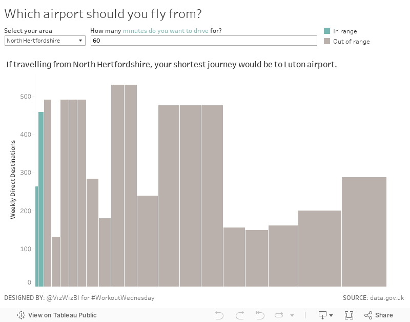
Workout Wednesday: Which airport should you fly from?
airport
,
skyline chart
,
table calc
,
UK
,
united kingdom
,
variable width bar chart
,
Workout Wednesday
No comments
What were the sneaky bits for me?
- Creating a measure for the variable width bars
- Using a table calc to return the airport with the shortest drive time (Emma did this as a separate sheet, whereas I did includes this in the title of my variable width bar chart
- Using a data source filter to filter the airports
Another fun challenge in the books! Thanks Emma!!
November 21, 2016
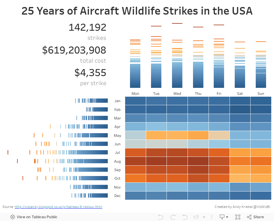
Makeover Monday: Wildlife Strikes in the USA
airlines
,
airport
,
gantt
,
heat map
,
Kelly Martin
,
Makeover Monday
,
travel
,
wildlife
No comments

Let's start with Kelly Martin's incredible airplane/wildlife collisions dashboard:

What works well?
- To put it simple, everything works well here. Kelly has a very intentional design style.
- Minimal use of color
- Great use of whitespace
- Excellent annotations
- Great use of icons
- Nice instructions
- Good interactivity
What doesn't work well?
- Remove the size legend and indicate that through text
As for the advanced logging, Tableau Research asked this week that we enable a setting on Tableau that creates an image every time you do something on a worksheet. I had no idea what this would result in, but in exactly 60 minutes, I created 396 images. That's a lot of squiggles! Here's a gif of my iterations:

For my makeover, I wanted to implement a visualisation technique I learned from Tableau's Michele Tessari at #Data16 in his session "Artful Data: The Balance of Art and Analysis". My goal was to show the number of strikes by weekday and month, but also to show the values for each state.
Another fun week of playing with data. Here's my take on this data set:
August 29, 2014
Two-way Sorting in Tableau - Sorting Some of the Viz by a Measure and the Rest Alphabetically
airport
,
calculated field
,
continuous
,
crosstab
,
date
,
delay
,
discrete
,
formatting
,
sparklines
,
table calculation
,
tableau
,
tips
,
travel
,
tricks
10 comments
I had an interesting requirement posed to me yesterday that I hadn't ever run into before. I'm using this Airline Delays data to demonstrate the technique. The requirements were along these lines:
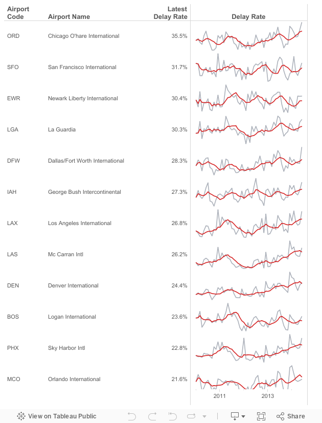
- Given a list of airports, there are a subset that are "targets". Let's assume they are the top 15 with the most flights in 2014: ATL, DFW, ORD, LAX, DEN, IAH, SFO, PHX, LAS, MCO, CLT, EWR, BOS, SLC, LGA
- The airports need to be sorted by the latest delay rate. However, only those in my top 15 list should be sorted by delay rate, the rest should be sorted alphabetically to make them easier to lookup.
- Include sparklines for each airport for 2010 to present.
This is the final product and here's how I went about solving this problem. There could very well be a more efficient method, but this worked for me.
Subscribe to:
Posts
(
Atom
)






