November 21, 2016
Makeover Monday: Wildlife Strikes in the USA
airlines
,
airport
,
gantt
,
heat map
,
Kelly Martin
,
Makeover Monday
,
travel
,
wildlife
No comments

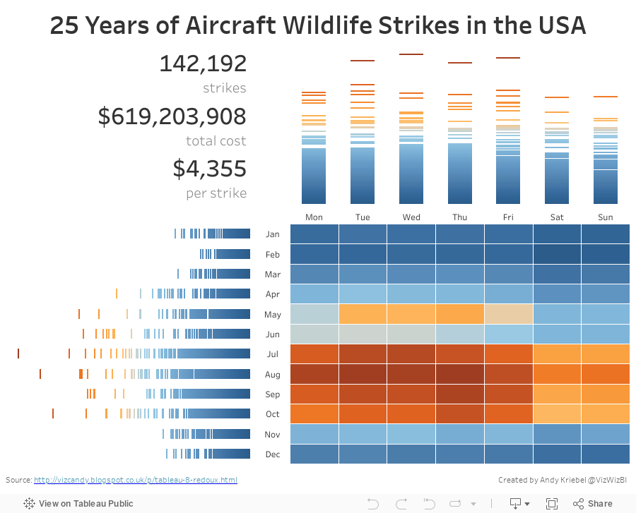
Let's start with Kelly Martin's incredible airplane/wildlife collisions dashboard:

What works well?
- To put it simple, everything works well here. Kelly has a very intentional design style.
- Minimal use of color
- Great use of whitespace
- Excellent annotations
- Great use of icons
- Nice instructions
- Good interactivity
What doesn't work well?
- Remove the size legend and indicate that through text
As for the advanced logging, Tableau Research asked this week that we enable a setting on Tableau that creates an image every time you do something on a worksheet. I had no idea what this would result in, but in exactly 60 minutes, I created 396 images. That's a lot of squiggles! Here's a gif of my iterations:

For my makeover, I wanted to implement a visualisation technique I learned from Tableau's Michele Tessari at #Data16 in his session "Artful Data: The Balance of Art and Analysis". My goal was to show the number of strikes by weekday and month, but also to show the values for each state.
Another fun week of playing with data. Here's my take on this data set:
Subscribe to:
Post Comments
(
Atom
)


No comments
Post a Comment