October 5, 2022
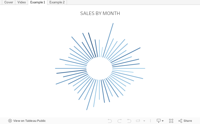
How to Create a Starburst Chart
Starburst charts, sometimes called sunburst charts or circular timelines, are one method of displaying data over time. They may look cool, but they aren't exactly easy to understand. If you are going to use them, I'd advise you to check with your audience first to ensure they understand how to read them.
In this video, I take you through how to build a single starburst as well as a series of starburst charts as small multiples or trellis chart.
All of the calculations are in the description for the video here. You can download the workbook below.
September 26, 2022
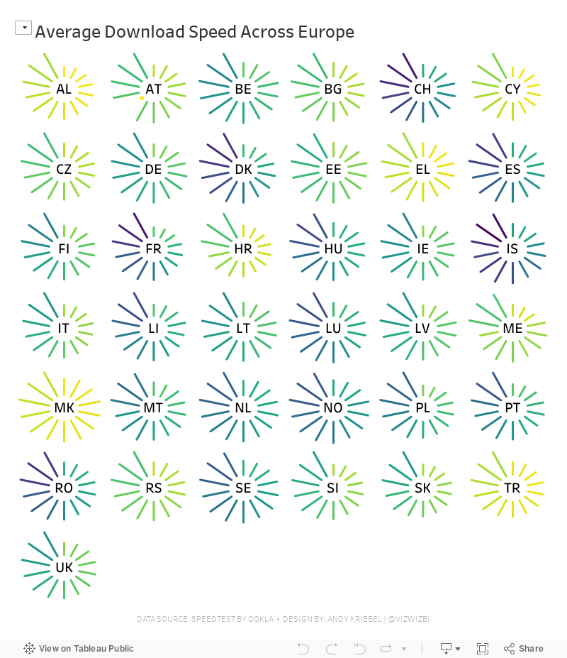
#MakeoverMonday Week 39 - Average Internet Speeds Across Europe

My goal this week was to correct my failures from last week, so I focused almost exclusively on building the starburst/sunburst chart. As promised to the viewers, I will also record a separate tip video for how to build them.
Here's the WatchMeViz and the viz is below that.
December 1, 2019
#MakeoverMonday: How have annual wages changed for union vs. non-union employees?

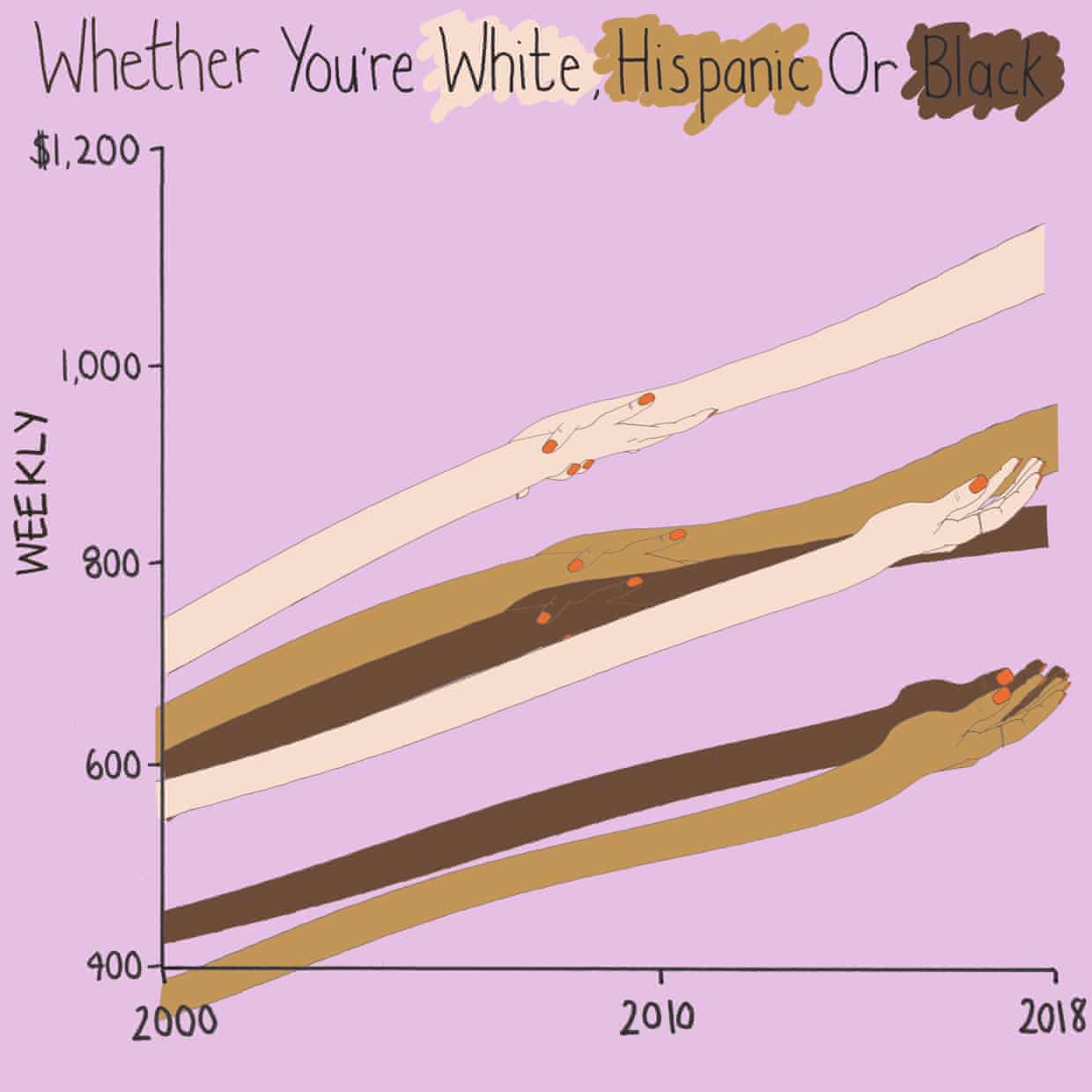
What works well?
- I like the handwriting font. It makes the viz look fun.
- The colors are distinct enough.
- Using shading on the title as a legend
What could be improved?
- Some hands are holding another, some are not. What does that mean? Does two hands mean union? If so, I don't understand why they join where they do.
- Using weekly wages is a tough concept to grasp. Why not convert it to annual wages?
- The viz is clearly not designed for any sort of precision or comparison.
What I did
- I really liked this Viz of the Day recently by Spencer Bauke and thought this was a good data set to try to emulate his work.
- I wanted to use parameter actions to allow the user to change the comparison year.
- I also wanted to use set actions like Spencer did, but this data wasn't structured in a way that made sense to try to do that.
- This turned out to be very good practice for LOD expressions.
- I loved using containers to lay all of this out!! It's a lot of work, but much easier to get everything to line up and all be the same size.
April 9, 2019
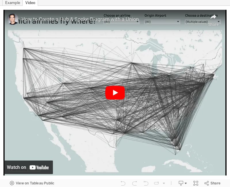
#TableauTipTuesday: How to Create a Hub & Spoke Diagram with a Union

June 5, 2018
Tableau Tip Tuesday: Split, Pivoting and Union with Tableau Prep

You can download the flow here.
April 8, 2016
Brexit: How will it affect your favourite Premier League team?
 |
| Click the image for the interactive version |
Brexit is a hot topic in the news these days over here in the UK. The ramifications are far and wide. Leaving the EU would mean a LOT of lost jobs, impacting even the Data School and the Premier League.
Back in September, The Guardian wrote an article and created this visualisation to show which teams in the Premier League would be impacted the most.
 |
| Click the image to view the interactive version |
I like the layout of this, but what it lacks is a simple way to see where the players that are impacted come from. I also wanted an excuse to practice the new Union feature in Tableau 9.3. It took me a couple of hours to recreate the data set and then another hour or so to create the interactive viz below.
Find your team and see how many players they could lose if Brexit happens!


