December 1, 2019
#MakeoverMonday: How have annual wages changed for union vs. non-union employees?

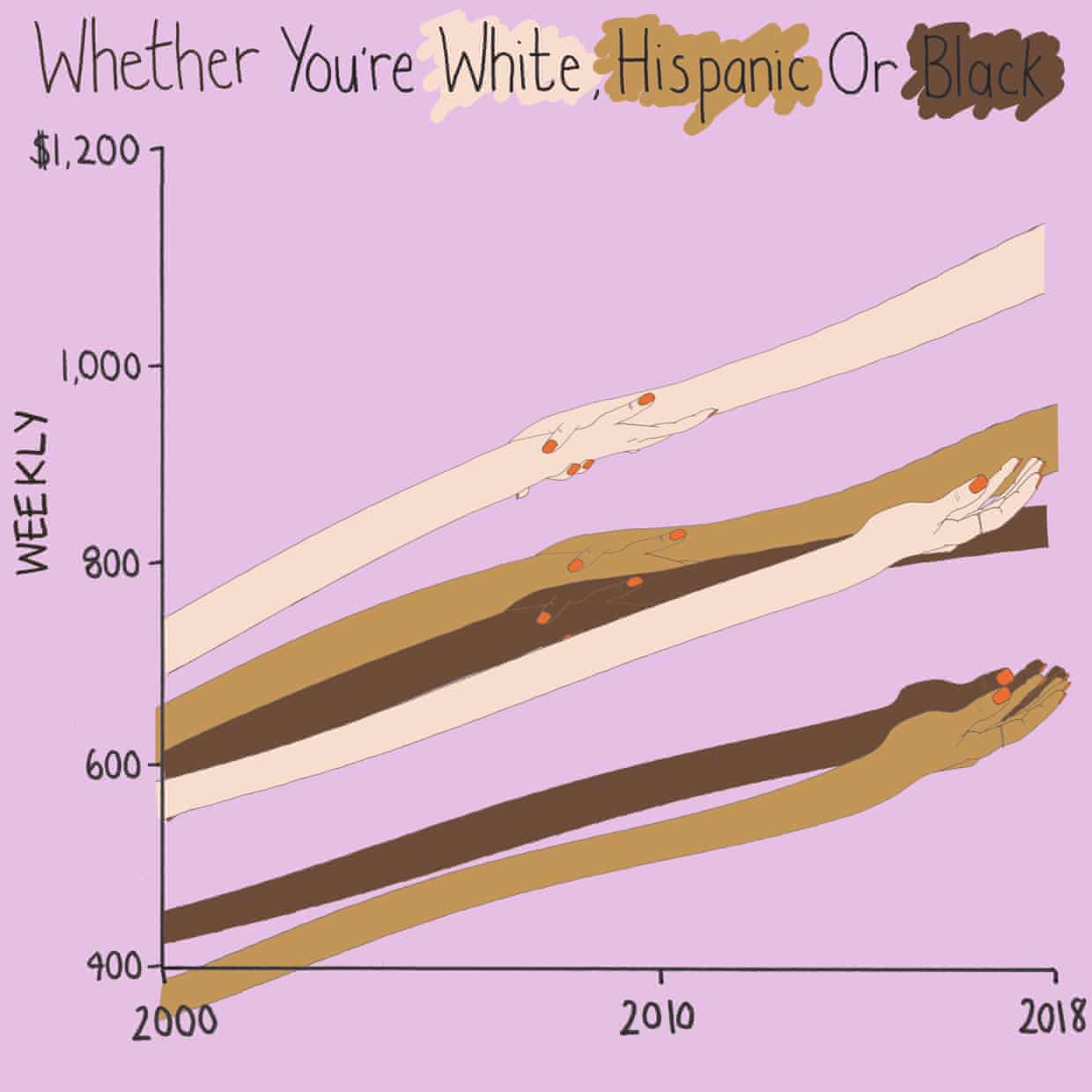
What works well?
- I like the handwriting font. It makes the viz look fun.
- The colors are distinct enough.
- Using shading on the title as a legend
What could be improved?
- Some hands are holding another, some are not. What does that mean? Does two hands mean union? If so, I don't understand why they join where they do.
- Using weekly wages is a tough concept to grasp. Why not convert it to annual wages?
- The viz is clearly not designed for any sort of precision or comparison.
What I did
- I really liked this Viz of the Day recently by Spencer Bauke and thought this was a good data set to try to emulate his work.
- I wanted to use parameter actions to allow the user to change the comparison year.
- I also wanted to use set actions like Spencer did, but this data wasn't structured in a way that made sense to try to do that.
- This turned out to be very good practice for LOD expressions.
- I loved using containers to lay all of this out!! It's a lot of work, but much easier to get everything to line up and all be the same size.
May 8, 2016
Makeover Monday: How Many Hours Do Women Work in OECD Countries?

Since Sunday is Mother’s Day in the States, this week’s Makeover Monday topic is about how many hours women work in various OECD countries. Let’s start by reviewing the original chart by Business Insider:

What works well?
- The stacked bar chart is relatively easy to understand since it only has four colors and there aren’t that many countries to compare.
- The chart is sorted by the smallest percentage of women working 40+ hours per week, which makes it easy to compare that category.
- The colors are easily distinguishable.
- Easy to read headers
What doesn’t work well?
- I have no idea what year this data is from. The data goes back to 1976. I assumed it was for 2016, since that’s when the article was written, but after finding the data myself, it looks like it’s from 2014.
- The title of the article "American women work way more than their European counterparts” isn’t entirely true. The chart doesn’t show all of the countries is Europe from OECD. The U.S. would rank 9th is you compare European countries and the U.S. from 2014.
- The chart title is useless.
- Japan isn’t in Europe, so why is that included?
- Why is the OECD average included if this is supposed to be the U.S. compared to Europe?
- There’s no rationale to the countries they chose to include. Is the author being deceitful on purpose? I hope it’s merely an oversight.
- While I don’t think this stacked bar chart is terrible, it does make it very hard to compare any of the other categories of hours worked.
The first thing I did was rebuild the chart including all of the OECD countries and reversing the sort to be by the highest rate of women working 40+ hours.
 |
| Click to interact |
I included several filtering and sorting options to allow the user to find their own story. The user can scroll through all of the years and see how the story unfolds. This view solves the problem of not being able to sort by any of the other categories of hours worked.
I didn’t love this though, so I created a slightly different version that shrinks the bars and adds dots. Think of it as a stacked dot chart.
 |
| Click to interact |
This is the beauty of Tableau. I can quickly iterate on ideas and see which one I like best. At first, I thought adding the dots would make it easier to understand. I think it looks pretty neat, but actually, I think I made it harder to understand.
The problem in both of these stacked charts is that I can’t see all of the years in one view. I was really curious as to the patterns. Has the % of women working 40+ hours per week in the U.S. grown? How does that compare to the OECD average? How do other countries compare?
With those thoughts in mind, I created this series of line charts across the different work hours ranges.
 |
| Click to interact |
I love these types of charts. I created one last week as well. What I like about them is they include lots of context. In this particular example, I can clearly see that the U.S. is higher than the OECD average in the 40+ hours worked per week section. Yet I can also see that there are quite a few OECD countries that are higher than the U.S. I can easily compare Europe to North America. Or only look at the top 10 countries according to U.S. News and World Report. I can zoom into a specific working hours category with a simple tap on the filter.
I almost stopped here, because I think this already is much better than the original. However, I wanted to see of there was a better way to compare the different work hours within a single country. To address that, I thought a small multiples view might work well.
 |
| Click to interact |
I chose to sort the countries by the highest % of women working 40+ hours per week in 2014. Then you read it in a z-pattern. So this view let’s you see where a country ranks amongst the others and you can also compare the hours worked within a single country.
Then it hit me. I quickly went to Andy Cotgreave’s blog and found this viz he created a few weeks ago:

Yes! This is it! It even matches the colors I was using. I duplicated the previous viz and changed it to an area chart. I then added some of the filtering options back.
NOTE: If you’re viewing this on a phone, you’ll see a long skinny version with less filtering and that also has the sorting option removed.
It took me five iterations, but I got there in the end. I’m not sure how I could have done this quicker with any tool other than Tableau. I love how I can fail fast! Which version do you like best?






