Showing posts with label wages. Show all posts
December 1, 2019
#MakeoverMonday: How have annual wages changed for union vs. non-union employees?
BLS
,
comparison
,
KPI
,
labor
,
level of detail
,
LOD
,
LOD calc
,
Makeover Monday
,
money
,
non-union
,
salary
,
statistics
,
union
,
United States
,
USA
,
wages
,
year over year
No comments

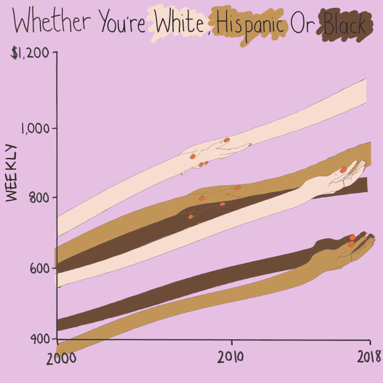
What works well?
- I like the handwriting font. It makes the viz look fun.
- The colors are distinct enough.
- Using shading on the title as a legend
What could be improved?
- Some hands are holding another, some are not. What does that mean? Does two hands mean union? If so, I don't understand why they join where they do.
- Using weekly wages is a tough concept to grasp. Why not convert it to annual wages?
- The viz is clearly not designed for any sort of precision or comparison.
What I did
- I really liked this Viz of the Day recently by Spencer Bauke and thought this was a good data set to try to emulate his work.
- I wanted to use parameter actions to allow the user to change the comparison year.
- I also wanted to use set actions like Spencer did, but this data wasn't structured in a way that made sense to try to do that.
- This turned out to be very good practice for LOD expressions.
- I loved using containers to lay all of this out!! It's a lot of work, but much easier to get everything to line up and all be the same size.
Here's my Makeover Monday week 49. Click on the image for the interactive version.
January 14, 2019
Makeover Monday: Workers Making Minimum Wage or Less in America
America
,
Business Insider
,
Chart of the Day
,
Makeover Monday
,
United States
,
USA
,
wages
No comments


What works well?
- Maps are easy to understand
- Positioning of Alaska and Hawaii in the available space
- Including notes about the data in the footer
- Simple, effective title
- Using a single color gradient; a diverging palette would not be appropriate
What could be improved?
- Ranges are not the same size
- Smaller States are nearly impossible to compare; this is a good use case for a hex or tile map
- No context for good vs. bad
What I did
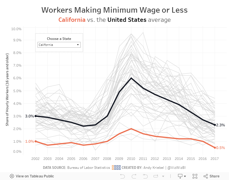
- Looked at the data over time
- Included a comparison to the US average for context
- Included all States for context
- Allowed the user to highlight the State they are interested in
- Included labels on the ends to the lines to show change over the entire period
August 10, 2015
Makeover Monday: 12 Ways to Visualize the Gender Gap of Federal Workers
DNA
,
donut chart
,
dot plot
,
employment
,
gender
,
Jon Schwabish
,
Makeover Monday
,
nelson davis
,
pie chart
,
slope graph
,
wages
No comments

Good friend Nelson Davis provided another great makeover example for this week. It started with this tweet from Jon Schwabish:
What would you call these charts? Not pie charts...maybe "spilt pie charts"? | From http://t.co/jZZKbLnAl0 pic.twitter.com/cyqwtp8UYz
— Jon Schwabish (@jschwabish) August 5, 2015
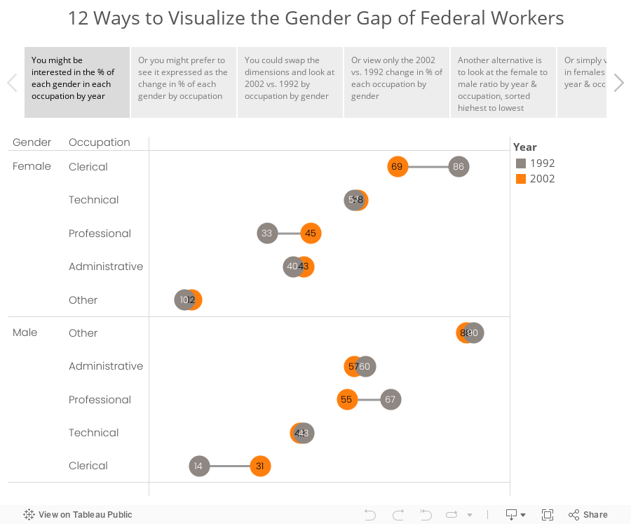
As I was thinking about this makeover, I couldn't settle on a single best way to visualize this data. I did know, though, that these moons/pies/donuts/dots needed to communicate more effectively. I've come up with 12 alternatives, each of which works way better than the original. The reason there are 12 is because there are multiple ways to display the dimensions based on the story you want to emphasize. And yes, I could have come up with another 12.
Special thanks for Carl Allchin for his feedback and help with the text on the tabs in the story points.
Subscribe to:
Posts
(
Atom
)






