March 8, 2024
Visualizing Time Series Data in Tableau
Last night I was invited to speak at the Chicago Tableau User Group about visualizing time series data. Other than spatial data, time series data is my favorite to visualize.
There seem to be endless methods for making time series data useful for analysis. Check out this video for 60ish ways to visualize time.
I had a 20 minute slot to present and, of course, I ran over time. I seem to do this with every session I run lately. Be it training for Next-Level Tableau, presenting at events, or running a livestream, I get into a groove and don't want to stop.
I was able to create 14 vizzes in 20+ minutes. I added an extra in this workbook to make the dashboard format nicely.
Click on the image below to download the workbook and dissect it. Get the data here to follow along.
Have fun!

September 26, 2022
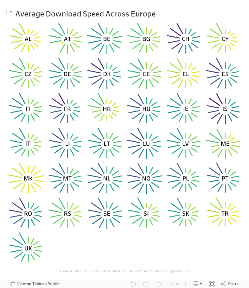
#MakeoverMonday Week 39 - Average Internet Speeds Across Europe

My goal this week was to correct my failures from last week, so I focused almost exclusively on building the starburst/sunburst chart. As promised to the viewers, I will also record a separate tip video for how to build them.
Here's the WatchMeViz and the viz is below that.
September 12, 2022
#MakeoverMonday 2022 Week 37 - Berkshire Hathaway Holdings

During Watch Me Viz, I covered set actions, parameter actions, highlighting, boolean calculations, table calculation, dashboard layout, and I failed at a starburst chart (I couldn't get the years to sort properly; I'll post it when I figure it out).
Enjoy! Check out the viz below the video.
March 1, 2021
#MakeoverMonday Week 9 - Seats Held by Women in National Parliaments in the EU


- Clear title
- Line chart is a good choice for a time series
- There are too many colors.
- What's the focus?
- The legend takes up a lot of space.
- The chart ratio is too flat.
- Overall, it's confusing and harder than necessary to find patterns.

December 18, 2017
Makeover Monday: State by State Temperature Change
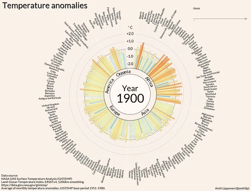
What works well?
- The animation makes the viz pulsate.
- Organizing the countries by region then alphabetically within each region.
- Including space between the regions
- Animating the global temperature over time as the years increment in the viz.
- Great choice of colors
What could be improved?
- The bars all go out from the center including the negatives. I would expect negative bars to go in the opposite direction of the positives.
- Align all of the countries to the same edge. The center alignment doesn't work for me.
My Goals
- Create something similar to the original (e.g., a starburst chart) but do it for each US State.
- Use similar color coding as the original; that is, show the variance to the 1951-1980 average temperature.
- Practice a trellis chart. I struggle with these, especially when using dates, as the table calcs get quite messy.
- Include a 10-year moving average on the sparkline that updates when you hover over a State.
- Start the starburst chart at 12 o'clock.






