August 30, 2024
How to Create a Win/Loss Sparkline

Check out the workbook here.
October 31, 2023
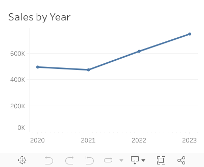
How to Create a Year→Quarter→Month→Day Drilldown in Tableau

Are you looking to take your Tableau skills to the next level? Do you want to create dashboards that offer a dynamic and interactive experience?
Look no further!
This comprehensive tutorial will walk you through the process of creating a Year→Quarter→Month→Day Drilldown in Tableau.
🔹 What You'll Learn:
1. How to set up 2 parameters for drilldown functionality
2. How to perform 9 simple calculations that power your dashboard
3. How to implement 8 simple dashboard actions for enhanced interactivity
4. Introduction to dynamic zone visibility
🔹 Who Should Watch:
1. Data analysts looking to expand their Tableau toolkit
2. Business intelligence professionals aiming for dynamic reporting
3. Anyone who wants to unlock the full potential of Tableau
🔹 Why This Tutorial is Unique:
1. Step-by-step guide for each component: Parameters, Calculations, and Dashboard Actions
2. Introduction to advanced Tableau functionalities like dynamic zone visibility
3. Reusable examples to cement your understanding
4. Tips and tricks for maximizing the utility of your drilldowns
Don't miss out on upgrading your Tableau skills.
Let's dive into the world of advanced Tableau functionalities and take your dashboards to the next level!
October 3, 2023
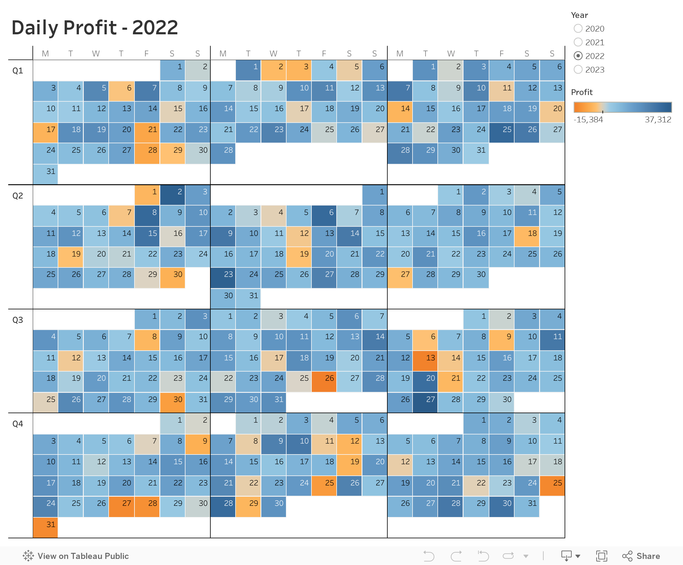
Master Dynamic Zone Visibility in Tableau: Yearly to Monthly Calendar Drill Down

Welcome to this comprehensive tutorial on creating a Yearly to Monthly Calendar Drill Down using Dynamic Zone Visibility in Tableau.
📌 What You Will Learn
In this video, you'll discover how to use Tableau's Dynamic Zone Visibility feature to effortlessly switch between yearly and monthly calendar views. If you've been looking to add more flexibility and dynamism to your Tableau dashboards, this tutorial is designed for you.🔑 Key Takeaways
- Understand the concept of Dynamic Zone Visibility- Set up a yearly calendar view in Tableau
- Implement drill-down functionalities to transition to a monthly calendar view
- Practical tips and tricks for optimizing your Tableau dashboards
🔗 Additional Resources
- Data- Workbook
August 8, 2023
How to Master the 3-Level Drill Down in Tableau (with Dynamic Zone Visibility)

Welcome to my guide on mastering the 3-Level Drill Down in Tableau!
In this tutorial, I show you step-by-step how to make the most of using dynamic zone visibility to create this functionality. We'll go through both scatter plot drill downs from Region → State → Postal code and then replicate that as a bar chart.
You can easily make this a map drill down by changing the chart type. That's it!
🔍 What you'll learn in this video:
1. The basics of drill down functionality in Tableau
2. Hands-on demonstrations, tips, and best practices
3. How to interact with the data
💡 Why is this important?
Drill down capabilities allow analysts to explore data from a broad overview down to granular details. By mastering the 3-level drill down, you can uncover hidden patterns, insights, and trends that might be overlooked in higher-level analyses.
📌 Prerequisites:
A basic understanding of Tableau's interface and primary functions will be helpful, but beginners will be able to follow along as well!
If you are following along, be sure to pause the video along the way as you repeat the steps.

January 31, 2023
How to Calculate Day over Day Change Excluding Weekends

In a previous tip, I showed you how to calculate day over day change and build 3 KPI cards.
However, this does not cover the case when you need to ignore weekends. In this #Tableau tip, I show you how to calculate daily change excluding the weekends.
You can copy/paste the calculations from below the video. Enjoy and good luck!

Calculations
- Latest Day
{MAX([Order Date])} - Weekday for Latest Day
DATEPART('weekday',[1. Latest Day]) - Sales for Latest Day
INT([Order Date]=[1. Latest Day])*[Sales] - Previous Day
IF [2. Weekday for Latest Day]=2
THEN [1. Latest Day]-3
ELSE [1. Latest Day]-1
END - Sales for Previous Day
INT([Order Date]=[4. Previous Day])*[Sales] - DoD Change
SUM([3. Sales for Latest Day])-SUM([5. Sales for Previous Day]) - DoD Change %
[6. DoD Change]/SUM([5. Sales for Previous Day]) - Positive Change
[7. DoD Change %]>0
September 12, 2022
#MakeoverMonday 2022 Week 37 - Berkshire Hathaway Holdings

During Watch Me Viz, I covered set actions, parameter actions, highlighting, boolean calculations, table calculation, dashboard layout, and I failed at a starburst chart (I couldn't get the years to sort properly; I'll post it when I figure it out).
Enjoy! Check out the viz below the video.
August 23, 2022
How to Create a Two-Level Drill Down in Tableau
There are tons of ways to create a single level drill down, but if you’re having issues creating a second drill down, this video is a guaranteed way to help you fix this problem.
Additional video - Single Level Drill Down
May 25, 2022
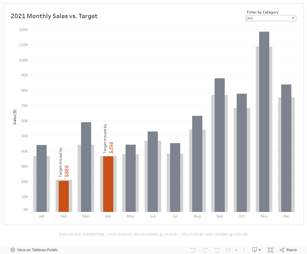
#WOW2022 Week 20 - Monthly Sales vs. Target
Resources
- Week 20 Challenge
- My Solution (image below)

April 21, 2022
#B2VB - 2022/W4 - Design Some KPIs
Resources:
KPI Samples from Tableau Public:

April 19, 2022
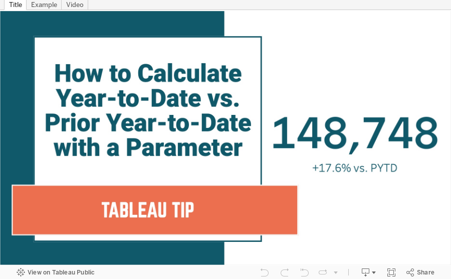
How to Calculate YTD vs. Prior YTD Based on a Selected Date
April 12, 2022
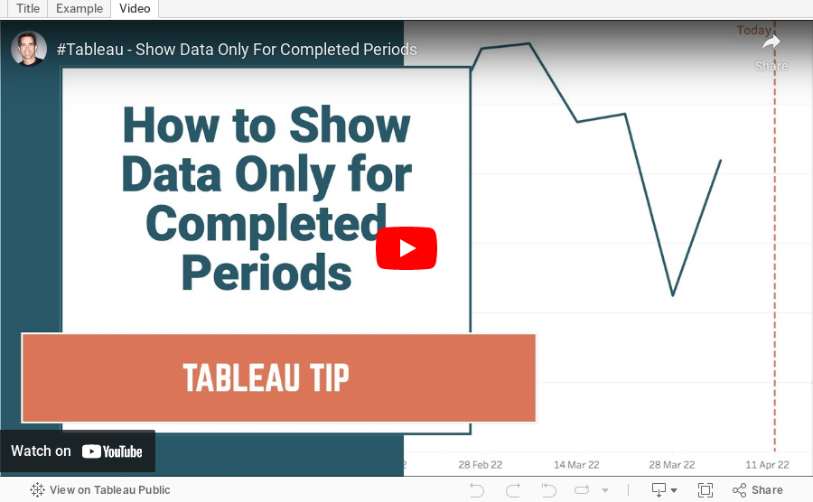
How to Show Data for Only Completed Periods
December 20, 2021
How to Filter by Rank Across Multiple Worksheets
In this tip, I show you how to use a parameter to filter the rank across multiple worksheets or an entire dashboard.
August 31, 2021
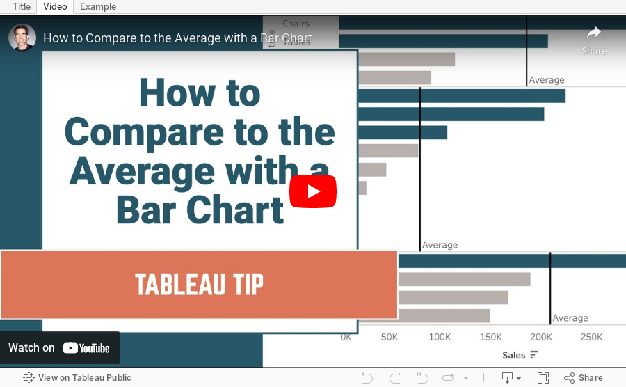
How to Compare to the Average with a Bar Chart

Context is important in data visualization. For every chart you create, consider asking yourself "compared to what?"
In this tip, I show you how to add context to a simple bar chart by showing whether a value is above or below the average.
November 17, 2020
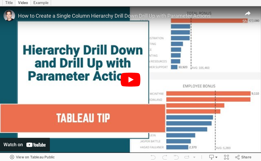
How to Create a Single Column Hierarchy Drill Down Drill Up with Parameter Actions

Twice recently I've used parameter actions to create a single column drill down and drill up to mimic a hierarchy.
June 19, 2018
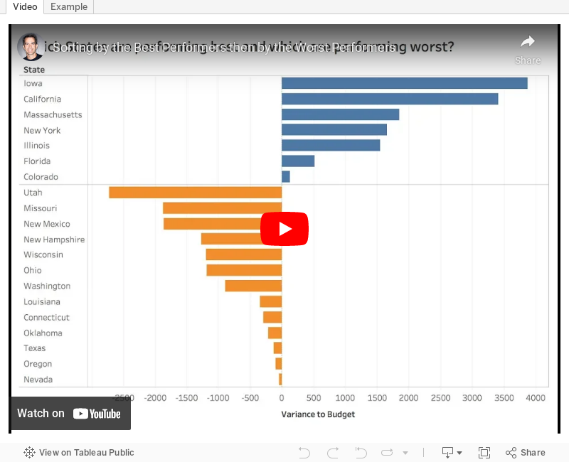
Tableau Tip Tuesday: How to sort first by the most positive values, then by the most negative values in a single chart

Enjoy!
November 15, 2017
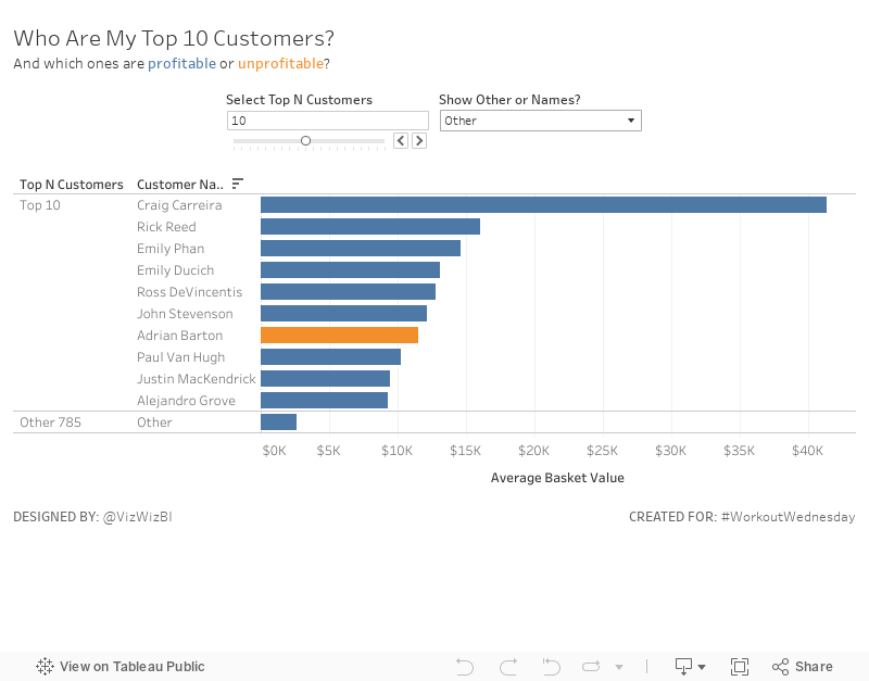
Workout Wednesday: Top N Customers with a Twist
I learned a bit about calculated sets and mixing them with parameters in calculations. Overall, not too bad. Good luck!
July 18, 2017
Tableau Tip Tuesday: Computed Sets vs. LODs
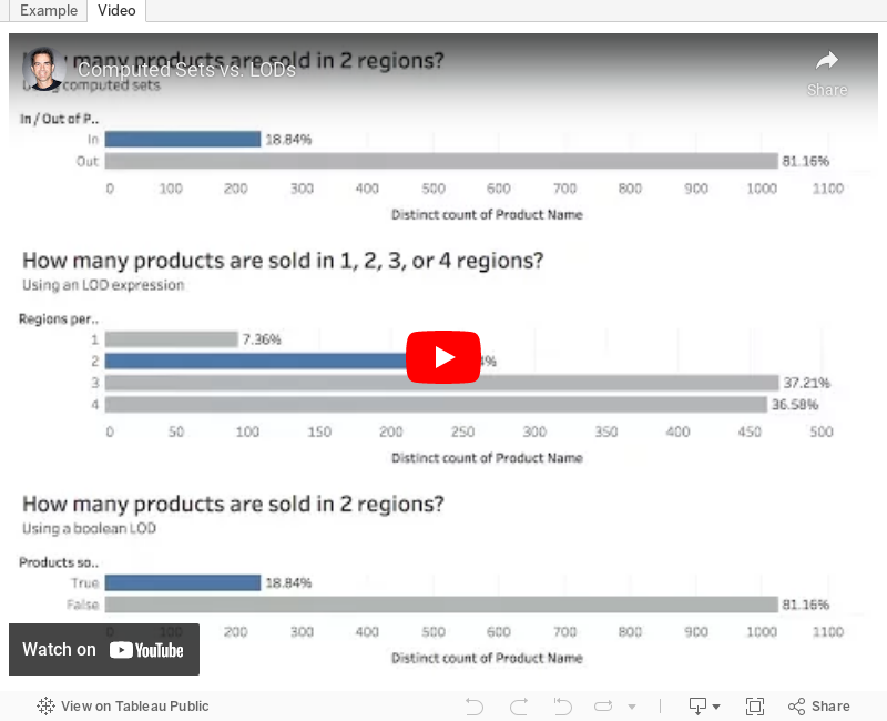
How can I identify the people that worked in both the Obama and Trump administrations using a calculation?
In this week's video, I show you how to answer questions like this with computed sets and level of detail expressions. I will also show you how to write an LOD to act like a set; I call it a boolean LOD.
Enjoy!
October 11, 2016
Tableau Tip Tuesday: How to Limit the Number of Marks in a View

In this week’s tip, I show you how to limit the number of marks that are displayed in a visualisation. The example I show will help prevent your users from creating line charts with too many different lines.
December 1, 2015
Tableau Tip Tuesday: How to Create a Single Filter with Multiple Levels of Aggregation

This week's tip covers two scenarios which are based on a great question from Pablo Sáenz de Tejada, who recently finished his training at The Data School and is on his first placement at easyJet with Paul Chapman.
- First, Pablo wanted to know how he could create a single select filter that includes multiple levels of aggregation (e.g., State and Region)
- Can he include a custom level of aggregation in the same filter (e.g., a custom defined Region)?
With that question in mind, here is this week's tip.