August 31, 2021
How to Compare to the Average with a Bar Chart
above
,
analysis
,
average
,
bar chart
,
below
,
boolean
,
chart
,
color
,
comparison
,
context
,
data visualization
,
graph
,
highlight
,
table calc
,
table calculation
,
tableau
,
tip
,
tutorial
,
window
,
window_avg
No comments

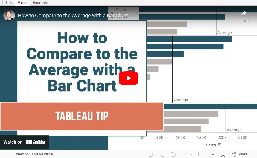
Context is important in data visualization. For every chart you create, consider asking yourself "compared to what?"
In this tip, I show you how to add context to a simple bar chart by showing whether a value is above or below the average.
Subscribe to:
Post Comments
(
Atom
)


No comments
Post a Comment