Showing posts with label average. Show all posts
June 4, 2024
Find Red Flags in Your Data in ONLY 5 MINUTES with Control Charts
analysis
,
average
,
control bands
,
control chart
,
distribution band
,
how to
,
lower control limit
,
outliers
,
reference band
,
reference line
,
standard deviation
,
tableau
,
tutorial
,
upper control limit
No comments

If you like this video, you'll love learning from me 4 hours per week in Next-Level Tableau. Join here.
Control charts are one of the best charts you can use for identifying outliers in a series of measurement. So what are they?
Control charts are used to monitor whether a process is performing consistently over time. It's basically a line graph that tracks data points collected at specific intervals, but with three key additions:
1. 𝗔𝘃𝗲𝗿𝗮𝗴𝗲 𝗹𝗶𝗻𝗲: This horizontal line represents the average performance of the process based on historical data.
2. 𝗖𝗼𝗻𝘁𝗿𝗼𝗹 𝗹𝗶𝗺𝗶𝘁𝘀: These are two additional horizontal lines, one above and one below the center line. They are typically 2-3 standard deviations from the average, but can be whatever number of standard deviations work for your situation. These limits reflect your "stable" range.
3. 𝗢𝘂𝘁𝗹𝗶𝗲𝗿 𝗶𝗱𝗲𝗻𝘁𝗶𝗳𝗶𝗰𝗮𝘁𝗶𝗼𝗻: Color-coding the outlier marks helps you more easily identify the problems.
The line chart you create will help you see if measurements fall within the control limits.
- If they do, it suggests the process is in control.
- If they fall outside the control limits, it indicates a potential problem that needs additional analysis.
Control charts are widely used for quality control purposes (especially in manufacturing), but they can be applied to any process where you want to track performance over time.
Download the workbook here.
September 21, 2021
#MakeoverMonday 2021 Week 38 - What is your personal information worth?
action
,
average
,
caption
,
dark web
,
dashboard
,
dashboard action
,
drill down
,
internet
,
Makeover Monday
,
median
,
parameter action
,
personal information
,
set action
,
title
,
worksheet action
No comments

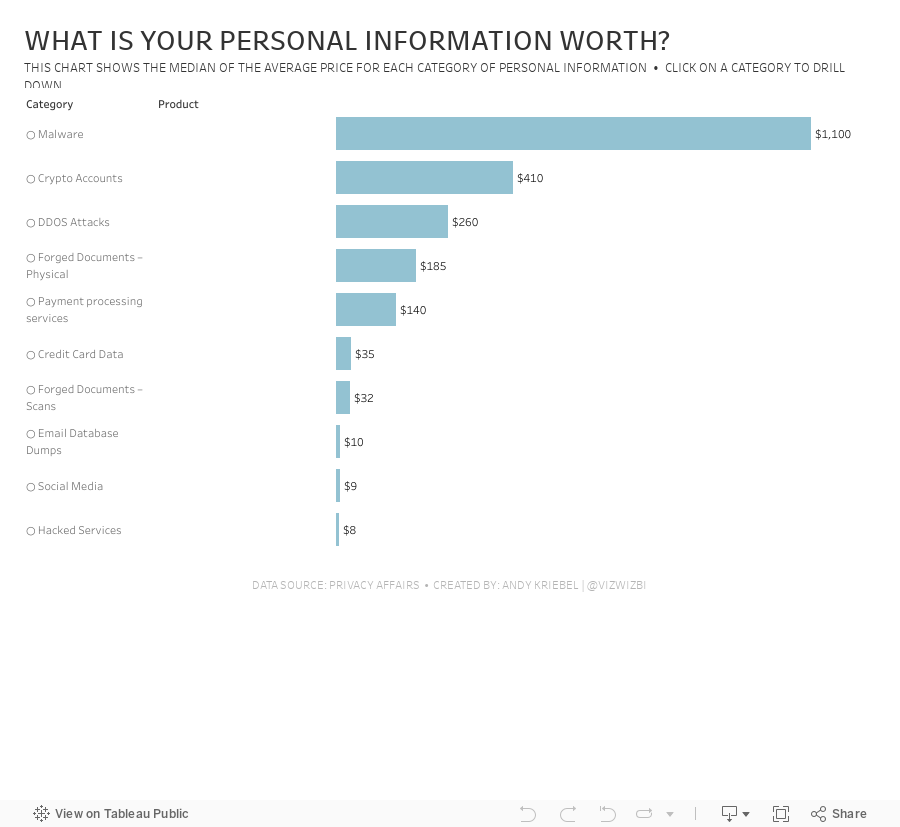
Short and sweet this week. The data set is about the price of personal information on the dark web. There are three fields: Category, Product, and Price. To me, this looks like Superstore, so that's how I approached it. How can I visualize two fields that have a hierarchy?
In the video, I show you how to create a drill down with both a set action and a parameter action. Here's the video and below is the visualization.
August 31, 2021
How to Compare to the Average with a Bar Chart
above
,
analysis
,
average
,
bar chart
,
below
,
boolean
,
chart
,
color
,
comparison
,
context
,
data visualization
,
graph
,
highlight
,
table calc
,
table calculation
,
tableau
,
tip
,
tutorial
,
window
,
window_avg
No comments

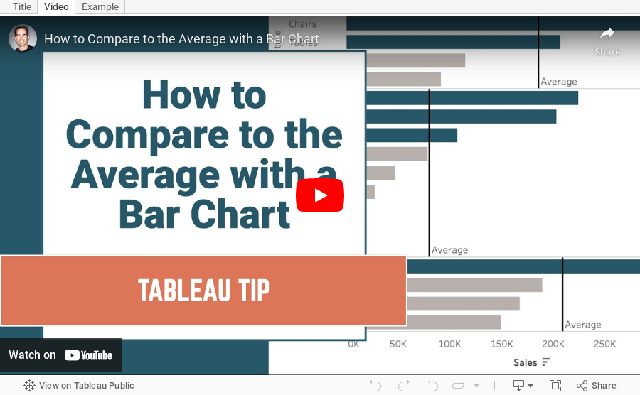
Context is important in data visualization. For every chart you create, consider asking yourself "compared to what?"
In this tip, I show you how to add context to a simple bar chart by showing whether a value is above or below the average.
June 14, 2021
#MakeoverMonday 2021 Week 24: Which States Have the Highest Average Student Loans?
average
,
BAN
,
big numbers
,
borders
,
color
,
containers
,
context
,
dashboard
,
debt
,
filters
,
hex map
,
Makeover Monday
,
student loan
,
United States
,
USA
,
WatchMeViz
No comments
If you watch this week's #WatchMeViz (below), you'll get a good look at how I use containers to create a dashboard. I didn't iterate very much this week, as far as the number of charts is concerned, but I did mess around way too long when trying to create a hex inside of a hex map. HINT: It turned out terrible.

Resources:
- Final workbook
- U.S. Hexmap Shapefile (credit: Joshua Milligan)
May 17, 2021
Designing for Mobile First - Sample Mobile Sales Dashboard
average
,
BAN
,
comparison
,
containers
,
design
,
KPI
,
layout
,
mobile
,
reference line
,
sparkline
,
tableau
,
usability
No comments

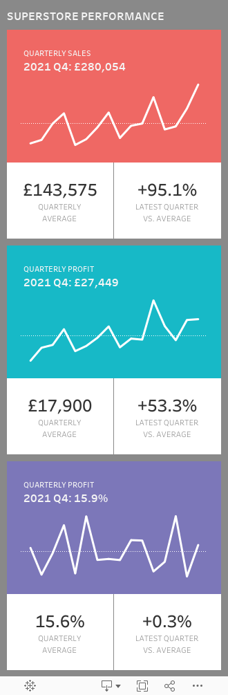
We then picked an image of a mobile dashboard we found on the internet and worked together to rebuild it. We started by creating a default dashboard, then looking at what Tableau's Device Designer would do to it.
We then decided to create a mobile-only dashboard as our use case what executives on the go. This also gave us a great excuse to practice using containers.
Enjoy!
Subscribe to:
Posts
(
Atom
)






