October 24, 2023
Master Containers: Build an Interactive Tableau Dashboard From Scratch

September 19, 2023
Mastering 4-Level Map Drill Downs in Tableau

If you've enjoyed my previous tutorials on 2-level and 3-level drill downs in Tableau, prepare to take your skills to the next level.
I've got something unique for you: a step-by-step guide on creating a 4-Level Map Drill Down in Tableau!
What You'll Learn:
- How to drill down from a region to a state
- How to further drill down from a state to a county
- Finally, how to drill down from a county to a city
Prerequisites:
This is an advanced tutorial. Make sure you're comfortable with Tableau basics and have seen my 2-level and 3-level drill down videos.
Previous Videos:
2-Level Drill Down Tutorial
- https://www.vizwiz.com/2022/08/two-level-drill-down.html
- https://www.vizwiz.com/2023/06/map-drill-down.html
3-Level Drill Down Tutorial
- https://www.vizwiz.com/2023/08/dzv-drilldown.html
Links & Resources:
Workbook - https://public.tableau.com/app/profile/andy.kriebel/viz/4-LevelMapDrilldown/MapDrilldown
July 11, 2023
Mastering Tableau: The Power of Context Filters

What are Context Filters?
A context filter in Tableau is a powerful feature that allows you to isolate a specific subset of data and create a temporary data subset
When you apply a context filter to your visualization, Tableau first applies the context filter and then performs calculations and aggregations based on the filtered subset of data.
How do they work?
By creating a context, you can optimize the performance of your visualizations by reducing the amount of data being processed.
When a context filter is applied, Tableau performs the following steps:
- Identifies the data that meets the context filter criteria.
- Performs calculations and aggregations based on the filtered data.
- Evaluates any other filters and calculations based on the context data subset.
A context filter allows you to control the order in which Tableau applies filters and calculations.
Tutorial
In this video, I'll explain:
- The difference between regular filters and context filters
- How context filters can significantly improve Tableau performance
I'll finish up by showing you a couple of the most common use cases for Context filters to drive the concept home.
Newsletter
Sign up for my newsletter. Every week I provide advice, tips, live stream videos, discounts on products I create, and much more.
Launch, grow, and unlock your career in data at andykriebel.com.
June 6, 2023
Mastering TABLEAU Dashboards from Scratch

This comprehensive video will help you create business dashboards that are more actionable and meaningful and that your users will find easy to use at first glance. You’ll be on your way to being a dashboarding expert!
You’ll learn:
- Building basic charts
- Formatting fundamentals
- Using layout containers
- Dashboard formatting
- Essential tips for padding
- Filter controls
We'll create an interactive sales dashboard for Adidas in Tableau that's going to dynamically update based on the filters on the side of the dashboard which will allow us to select specific years, regions, products, and more.
⏬ DOWNLOAD my preferences file, the data, and starter and solution workbooks for £2 (this covers the costs of making this and future videos):
https://andykriebel.gumroad.com/l/adidassalesdashboard
Sign up for my newsletter to get advance, exclusive viewing of all of my videos, tips for using Tableau, plus exclusive discounts on products that I create.
https://andykriebel.com/
August 19, 2021
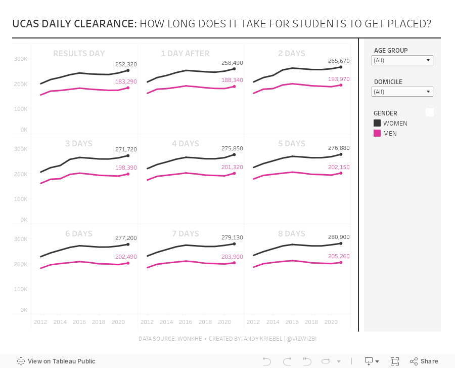
#MakeoverMonday 2021 Week 33 - UCAS Daily Placements

June 14, 2021
#MakeoverMonday 2021 Week 24: Which States Have the Highest Average Student Loans?
- Final workbook
- U.S. Hexmap Shapefile (credit: Joshua Milligan)

March 16, 2021
Mastering Containers in Tableau (Part 2) - Sales Performance Dashboard






