July 11, 2023
Mastering Tableau: The Power of Context Filters

What are Context Filters?
A context filter in Tableau is a powerful feature that allows you to isolate a specific subset of data and create a temporary data subset
When you apply a context filter to your visualization, Tableau first applies the context filter and then performs calculations and aggregations based on the filtered subset of data.
How do they work?
By creating a context, you can optimize the performance of your visualizations by reducing the amount of data being processed.
When a context filter is applied, Tableau performs the following steps:
- Identifies the data that meets the context filter criteria.
- Performs calculations and aggregations based on the filtered data.
- Evaluates any other filters and calculations based on the context data subset.
A context filter allows you to control the order in which Tableau applies filters and calculations.
Tutorial
In this video, I'll explain:
- The difference between regular filters and context filters
- How context filters can significantly improve Tableau performance
I'll finish up by showing you a couple of the most common use cases for Context filters to drive the concept home.
Newsletter
Sign up for my newsletter. Every week I provide advice, tips, live stream videos, discounts on products I create, and much more.
Launch, grow, and unlock your career in data at andykriebel.com.
September 15, 2022
Table Calculations vs. Level of Detail Expressions - % of Total
August 24, 2021
How to Automatically Exclude a Partial Week
March 29, 2021
#MakeoverMonday Week 13 - UK Trade With the EU Since the Brexit Referendum
I must admit I got a bit stuck with this week's dataset. It was very straightforward and I didn't like how anything turned out. With some ideas from the live audience on YouTube, I started comparing exports, imports and the trade balance. I then thought about a trick I had taught the Data School about using a timeline to filter.
Great, that's it! Wrong! The layout I had in my head was all wrong. I had to move some things around and then getting everything to line up took ages! Why or why isn't formatting easier???
Then, after creating the BANs, someone suggested that it would be good to show a zoomed in version of the line chart for the dates selected. I added those as sparklines with each BAN and it turned out so much better.
Check out and download the viz here.

March 26, 2018
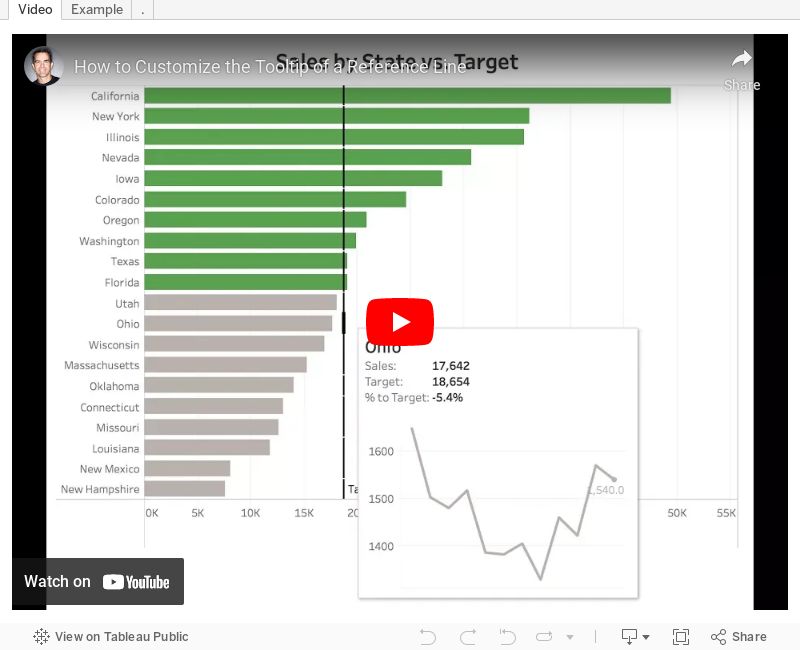
Tableau Tip Tuesday: How to Customize the Tooltip of a Reference Line
Enjoy!