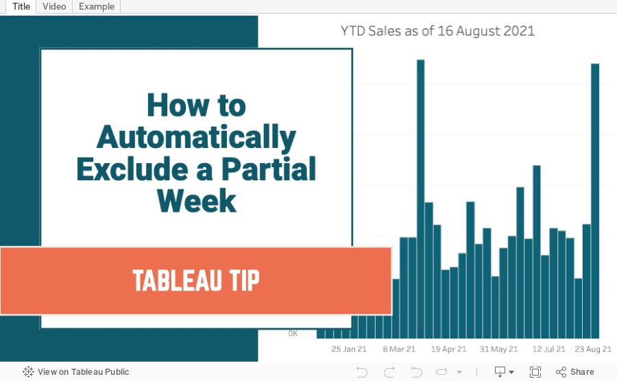
August 24, 2021
How to Automatically Exclude a Partial Week
January 31, 2019
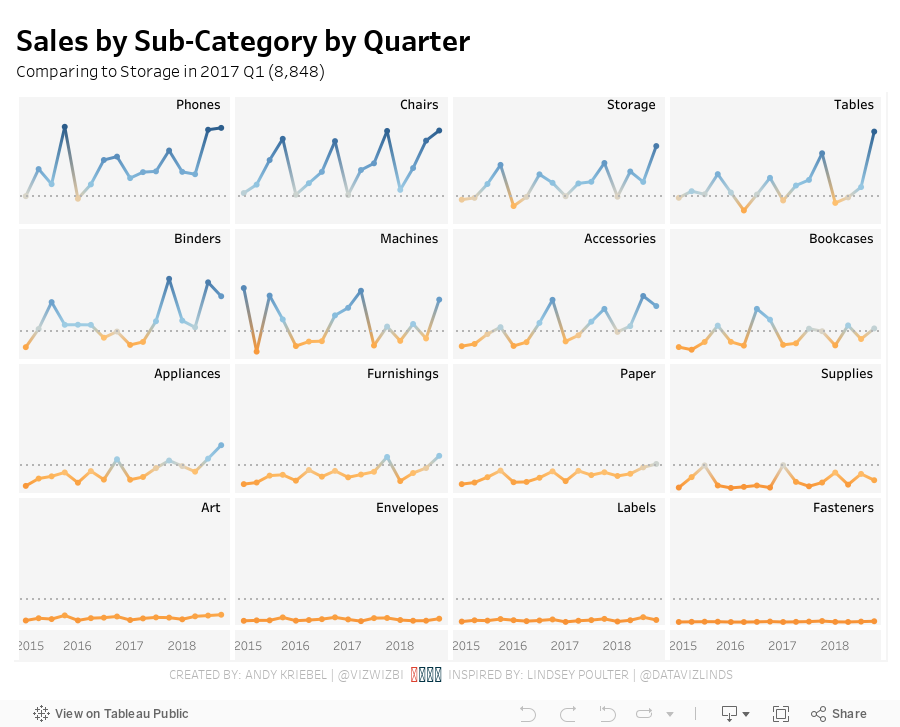
Set Actions: Dynamic Reference Lines and Coloring
Fortunately, we're surrounded by brilliant people at The Data School, so today Coach Carl asked Harry Cooney from DS11 (graduating tomorrow) to run a lesson for the team. Harry clearly understand them and walked us through several practical use cases to help us understand the basics. He then assigned each of us the task of recreating one of the vizzes from Lindsey Poulter's amazing resource of Set Action use cases. I was tasked with recreating her dynamic reference lines and colors viz.
I took on this challenge as I would a Workout Wednesday:
- Understand the requirements
- Play with the viz to see what it's doing
- Rebuild the viz
- Don't look at the method for the original until I'm done
- I built it all with one worksheet. Lindsey floated one sheet on top of another, meaning two sheets have to be maintained if changes need to be made.
- I labeled all of the sub-categories in the upper right of each box. Lindsey had it as a label for the last dot.
- I included tooltips and the x-axis.
- I added the circles directly on the line rather than as a separate chart. This allowed me to use the dual axis for labeling the sub-categories.

February 15, 2017
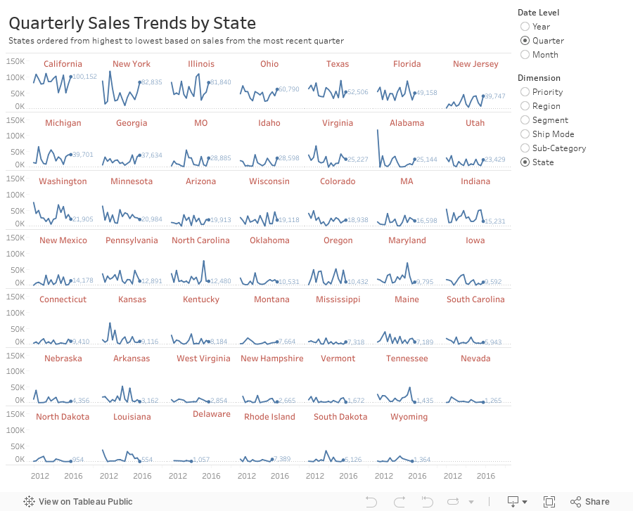
Workout Wednesday: Dynamic Trellis Chart
In this example, I'm using the same Superstore Sales I've used in previous Workout Wednesdays. Here are the guidelines:
- Match my colors.
- The user should be able to choose the level of detail they want for the date.
- The date axis format should not change, irrespective of the date level chosen.
- The user should be able to pick from the list of dimensions shown.
- The dimensions should be sorted from upper left to lower right based on the sales in the most recent time period.
- Match my tooltips. Note that they change based on the options the user selects. Pay attention to the date formats in particular.
- The title should update dynamically based on the date level and dimension selected.
- The end of each line should be labeled to the right of the last point.
- There should be a little circle on the end of each line.
- Each section of the trellis should include a label for the value of the dimension for that section. E.g., California should be on the upper left when you selected quarters by state.
- The dimension labels should be centered in each section.
- There should be no gridlines, but the zero line should be included.
- Each row should should have a light divider between them.
- My final view is 900x700.
July 31, 2012
Tableau Tip: Dynamic axis selections with parameters in less than five minutes
Here’s the situation: You have multiple measures that you want to view across time, but you don’t want to see all of the measures at the same time. Instead you want the user to be able to pick the measure to view.
Parameters to the rescue!
Andy Cotgreave blogged about user built views in his Data Studio days. In this blog post I will provide the step-by-step directions. The charts types you can create with the technique are seemingly endless, but I’ll go through a simple scenario.
Step 1 – Right-click anywhere in the Measures or Dimensions windows and choose Create Parameter. Create a parameter named “Choose a measure” with the settings below. Note that I am giving this a name that will instruction the user as to what to do.

Step 2 – Find the parameter you just created in the Parameters window. Right-click on it and choose “Create Calculated Field”.
Step 3 – Use a CASE statement to build the calculated field. This field is telling Tableau what measure to use based on the value chosen in the “Choose a measure” parameter.

Step 4 – Add Order Date to the column shelf and your new “Measure chosen” measure to the row shelf. For this example, I’ve expanded the Order Date field to Quarter.

Notice how the y-axis is labeled “Measure chosen”. We’ll clean that up in a bit.
Step 5 – Right-click on your “Choose a measure” parameter in the Parameter window and choose “Show Parameter Control”. It should appear on the upper-right of the window.
Make different selections in the parameter control and notice how the y-axis and the chart change dynamically.
Step 6 – Drag the “Choose a measure” parameter to the row shelf. Again, make different selections in the parameter control and watch the label change.
We’re almost done. Just a bit of formatting remains.
Step 7 – Clean up the chart.
- Right-click on the field that shows the “Choose a measure” value and select “Rotate Label”
- Right-click on the row label and choose “Hide Labels for Rows”.
- Double-click on the “Measure Chosen” axis to bring up the Edit Axis window. Delete the title.


That’s it. You’re final viz should look like this:

If you’re like me, once you saw this technique, you began thinking of all of the possible uses. Play around with lots of different use cases. Try scatter plots, dual-axis charts, bubble charts, etc. You can control ANY of the shelves using parameters. Imagine the guided analysis you can provide your users and the exploration they’ll be able to do on their own. It’s almost like creating a pivot table for them.
If you want a slightly more complex version, I created a scatterplot of NBA franchise values that allows you pick the x-axis, y-axis and size, all with parameters.
Parameters are quite powerful. Leverage them!
Download the sample workbook here.
April 19, 2012
Visualizing the Remarkable Declines in U.S. Teenage Pregnancies
We have one of those TVs in the elevators at work that flashes headlines. While these have kept me a bit more informed about current events, they’ve been detrimental to elevator conversations.
So I’m riding the elevator the other day, talking to no one, and a headline appears about the incredible decline in teen pregnancy rate. I thought this would be a perfect opportunity to “show” the results in Tableau.
The trend data comes from the Guttmacher Institute and the state-level data come from The National Campaign to Prevent Teen and Unplanned Pregnancy. Additional context comes from the CDC.
I used a couple of techniques in Tableau that I will explain after the viz. But first, some notes from explaining the situation.
- Despite legalized aborting in 1973, the significant increases in pregnancy rates in the the 1980s and early 1990s are explained by increased birthrates but stable abortion rates.(Guttmacher)
- Almost all of the decline in the pregnancy rate between 1995 and 2002 among 18–19-year-olds was attributable to increased contraceptive use. (Guttmacher)
- Among women aged 15–17, about one-quarter of the decline during the same period was attributable to reduced sexual activity and three-quarters to increased contraceptive use. (Guttmacher)
- The teen birth rate in the United States declined during 1991--2009 to its lowest level in the nearly 70 years. (CDC)
When looking at pregnancy rates what stuck out to me immediately is the clear dividing line between the north and the south. According to the CDC, teen birth rates in the United States have declined but remain high, especially among black and Hispanic teens and in southern states. Perhaps the higher rates are explained by race, but I wonder if the rates can be partly explained by the religious stigmas that are associated with abortion in the south. Or perhaps sex education programs are not as strongly emphasized. I haven’t found data to support my theories, but having lived here for almost 15 years, I notice what’s going on around me.

This blog post from Matt Stiles made me think not only the number of pregnancies, but also the rate. The rate gives you a much more accurate comparison across states.
You might notice that I have three maps, one for the continental US and then one for each of Alaska and Hawaii. This is done so that the map isn’t so zoomed out when looking at all of the states in one map. Tableau does not come with a map like this so I:
- Created a single map of all states,
- Zoomed in on the continent,
- Pinned the map, and
- Hid the zoom controls.
I then:
- Duplicated the map twice,
- Changed the zoom to Alaska and Hawaii respectively, and
- Placed all three maps on a dashboard.
The reason I duplicated the maps instead of filtering each of the maps is because the color scale would not be accurately represented on any of the maps. I want all states to use the same scale, therefore all states are actually on all of the maps.
I added a subtle feature you may not notice. As you change the statistic from the drop down on the upper left, the title for the color legend changes dynamically. Tableau doesn’t allow you to expose information from the viz in titles for the Size and Color cards like it does for captions, titles, tooltips, etc. Here’s the technique I used to work around this limitation:
1. Create a calculated field for a label based on the statistic selected (which is a parameter)

2. Create a blank worksheet and place this calculated field on the Level of Detail shelf
3. Updated the title of the worksheet to expose this field

4. Format the worksheet so that the rows and columns are as small as possible and the gridlines are removed
5. Place the worksheet on the dashboard above the color legend
6. Change the Fit to Entire View
7. Show the title
That’s it. I now have a dynamic title for the color legend.


