August 25, 2014
Tableau Tip: Month over Month KPI Movers
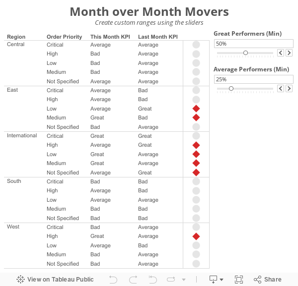
I'm currently running some monthly data where a list of records is assigned a KPI indicator like G/Y/R. I've been asked to produce a follow-up piece that would show "movers" from the prior month's data, just in a simple text view. So I guess what I need to try and do is figure out how to do a lookback/compare from prior month data to see who went from Y/R to G on the positive change side and who went from G to Y/R on the negative side.What Brian didn't realize was that answer to his question was pretty much in the question itself; he needs to use to LOOKUP() function. I sent Brian a solution, but decided to fancy it up a bit more and add some more functionality using parameters:
Step 1: On a PC, right-click drag Order Date to the Columns shelf. On a Mac, Option+Drag Order Date. Choose the continuous month option.

Step 2: Right-click on the Order Date pill on the Columns shelf and change it to Discrete.

Step 3: Right-click on the Order Date field on the Column shelf and choose Show Missing Values. This is important because it turns on data densification. Months where data does not exist get displayed.


Step 5: Create a calculated field called Last and change the Default Table Calculation to Order Date.


Step 6: Right-click on the Last field you just create in the Measures area of the Data window and choose Convert to Discrete.
Step 7: Drag the Last field to the Filters shelf and choose 0. This will change the view to only show the latest date.

Step 8: Create a calculated field to get the value for the most recent month. Notice that I'm using the LOOKUP function. Change the Default Table Calculation to Order Date.

Step 9: Create a calculated field to get the value for the previous month. The only difference here is we need to offset the LOOKUP by 1. Change the Default Table Calculation to Order Date.

Step 10: Create two parameters: one to determine the lower limit of the top KPI (Great Performers) and one to determine the lower limit of the middle KPI (Average Performers).


Step 11: Create the KPI calculations for the most recent month and the previous month. Notice that I'm using the parameters.


Step 13: Create a calculated field that returns a boolean to compare the values for this month to determine if they are a "Mover". I'm using Brian's definition for this example.

Step 14: Drag the Movers field to the Color shelf. I chose to set the colors to a light gray when True and red when False. This way only the Movers stand out.

Step 15: Optional - Change the Marks type to Shape and drag Movers to the Shape shelf as well, then pick shapes that give the affect your looking for. I chose diamonds for the Movers and circles for everything else.

Lastly I did a few cleanup items before placing the worksheet on the dashboard you see at the top of this post:
- Moved Order Date to the Detail shelf
- Reduced the level of the row divider
- Removed the bold text from Region
- Added a calculated field to the Filters shelf that checks that the value in the Great Performers parameter is larger than the value in the Average Performers parameter.

This method could easily be changed to accommodate many different scenarios like day over day, week over week or year over year.
Download the sample workbook here.
November 10, 2020
How I Use Layout Containers (Part 1) - Social Media KPI Dashboard


December 18, 2016
Makeover Monday: Historical Performance of the Washington Metro

Two weeks to go in one of the best projects I’ve ever been a part of. In fact, Andy Cotgreave and I are hosting a Twitter chat on Monday at 4pm GMT. Get all of the details here and join us in discussing the impact this amazing project has had on all of us.
For week 51, we’re looking at the Washington DC Metro Scorecard. This is basically a KPI dashboard of quality and safety for the Metro. Let’s have a look at their scorecard:


What works well?
- Nearly laid out and organized
- Thumbs up and down give the status at a glance
- Despite the rings, it’s visually appealing and draws you in
What could be improved?
- While the rings make the comparison to goal easy, they wouldn’t work if something has to go past a full circle of the ring.
- Inconsistent colors
- No sense for performance over time
- Can’t see all of the metrics in a single view; scrolling is generally a problem with KPI dashboards
- You can’t tell how far each metric is from the target
They didn’t make all of the data available for us to use in the makeover. For example, there is no data available for the entire people and assets section. So what you’ll see this week from everyone will be nine of the metrics. For my makeover, I wanted to create small multiples of each metric over time. I liked their blue and red colors, so I used similar colors. I also wanted this to look more like a newspaper, so I went with the American Typewriter font. Lastly, if you look at this on a phone, you’ll see it a long, scrolling dashboard. I really like how this turned out.
April 21, 2022
#B2VB - 2022/W4 - Design Some KPIs
Resources:
KPI Samples from Tableau Public:

March 10, 2020
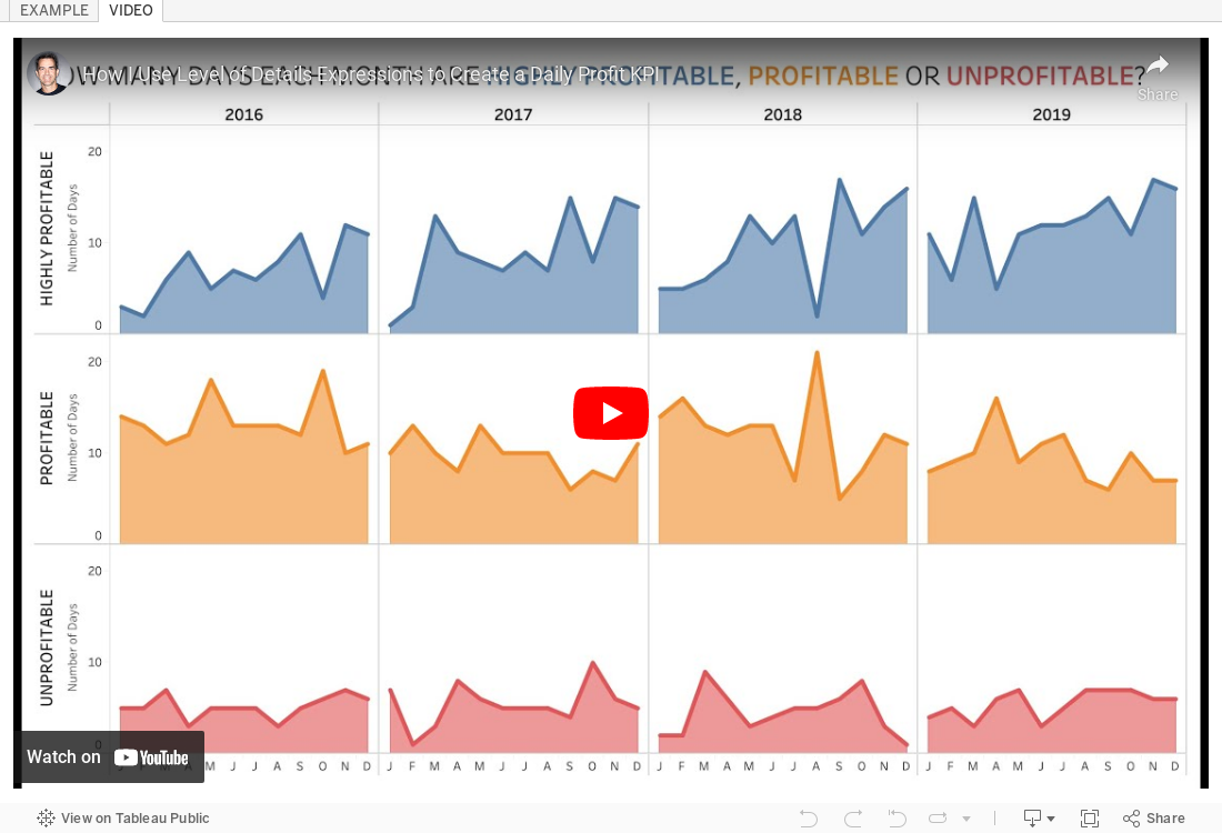
#TableauTipTuesday - How to Use Level of Detail Expressions to Create a Daily Profit KPI

December 24, 2014
Tableau Tip: How to make KPI donut charts
If you have any experience with floating objects in Tableau, you know the pain of taking lots of time to make a dashboard look perfect in Desktop with floating objects, only to have it get all messed up once you publish it to Server or Public. I rarely recommend using floating objects for just this reason; it's frustrating and can make your work look sloppy. Hopefully Tableau soon fixes this bug that has been around as long as floating objects have existed.
Another reason to avoid floating objects is that there are more objects that have to be drawn on the dashboard, which can potentially have a performance impact.
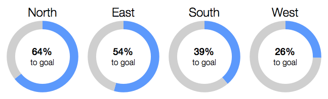
While I typically hate pie charts, I think that donut charts, used in this specific way, can indeed be effective. As Ryan says in his post:
When used for the specific purpose of showing a metric’s progress to goal, with one “slice” being the current state of the KPI and one “slice” being the remainder to goal, I think a donut chart works well.Here's how I would create a donut chart in Tableau using a single worksheet. The final product looks like this:
October 17, 2022
#MakeoverMonday 2022 Week 42 - Food & Drug Administration Inspections in America

Having looked at the original visualization this week (here), it was pretty clear to me that the creators desired to create a KPI style dashboard. In a way it's good that I picked up on it that way. However, it wasn't designed particularly uclarly well to communicate most efficiently.
I decided during Watch Me Viz that I would stick with their idea of a KPI dashboard, but design it in a way that I thought would be easier to understand.
As per normal, it took way too long to faff about with the formatting. I made a couple of small changes after I finished the live stream. Click on the image below the video to check it out. Leave a comment on the video on YouTube if you have any questions. (Comments aren't appearing on the blog for some reason).
Have a wonderful week!
November 19, 2015
Dear Data Two | Week 29: My Wife
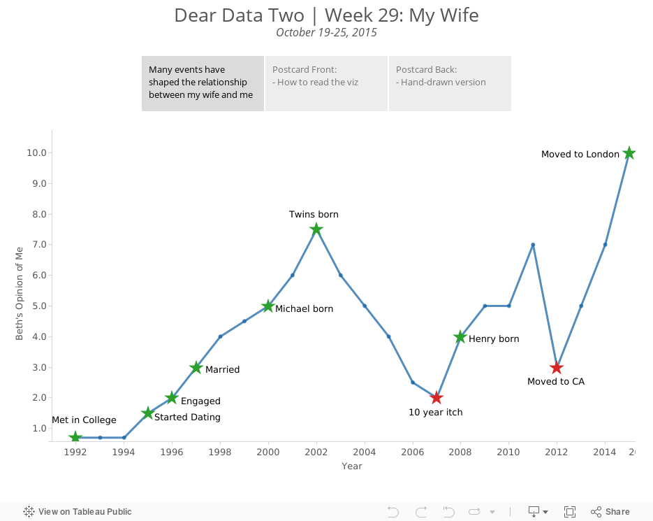
I then had a chat with my boss, Tom Brown, and in his Tom Brown way, he said that I should simply track the number of wives I’ve had over time. Well, I went with that idea and added a twist. At our #DATA15 presentation, I talked about the wife KPI, so what I decided to do is create a chart of the wife KPI since Beth and I first met in 1992.
From there I added major milestones to the dataset, categorised those event as positive or negative, then built a simple line chart. It's really interesting to me to see the ebbs and flows of our relationship. I would have never noticed it if I didn't see it depicted on a graph this way.
Note that on this postcard, I intentionally used red/green to indicate bad/good. I preach to people not to do this if they don’t know if their audience is colour-blind. In this case, my audience of 2 (Jeff and my wife) are not colour-blind, so I knew it would work.

November 12, 2020
How I Use Layout Containers (Part 2) - HR Analytics KPI Dashboard


November 17, 2020
How to Create a Single Column Hierarchy Drill Down Drill Up with Parameter Actions

Twice recently I've used parameter actions to create a single column drill down and drill up to mimic a hierarchy.
July 4, 2023
Create 10 ACTIONABLE & IMPACTFUL KPIs in Tableau

What is a KPI?
KPIs are measurable values that indicate how well a business is performing in achieving its key objectives and goals. They provide a clear and concise snapshot of critical areas within a business.
KPIs help to:
Monitor progress
Identify areas of improvement
Make data-driven decisions
In order to do this, KPIs must be tailored to specific goals and strategies.
Making KPIs Actionable
Here are 8 suggestions to ensure that KPIs are actionable and impactful.
Align with business objectives
Focus on relevance and simplicity
Set measurable targets
Collect accurate and timely data
Visualize your KPIs
Regularly review and update
Add context
Drill down
Actionable KPIs are vital for measuring performance and achieving results. You can drive your business forward by aligning data with goals and simplifying and visualizing KPIs effectively
Read more about KPIs in my newsletter here. Sign up so you don't miss any future newsletters at andykriebel.com.
⏬ DOWNLOAD the data, and starter and solution workbooks here. I would appreciate your support to continue making videos for you.
March 16, 2021
Mastering Containers in Tableau (Part 2) - Sales Performance Dashboard

June 30, 2021
Sample KPI Dashboard
- Mastering Containers (Part 1)
- Mastering Containers (Part 2)

November 12, 2019
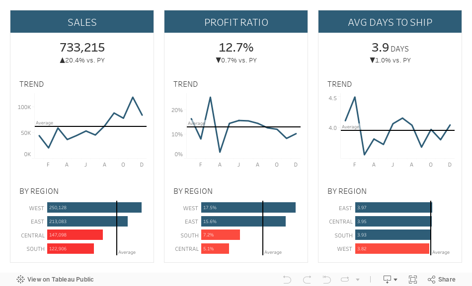
#MakeoverMonday: Literacy Rates Around the World

Here's the original viz:

What works well?
- The data by region is ordered alphabetically, making it easy to find each region.
- The bar chart is sorted by largest to smallest.
- Nice filtering options
What could be improved?
- A diverging color palette should only be used when there is a logical midpoint or goal. I don't see those in this viz.
- The squares are hard to understand.
- I don't find the map very useful. It would be more useful if it zoomed in when a region is selected.
- There's no title.
- There's too much text.
- The bar chart seems to go out past the edge, or at least visually it appears that way.
What I did
- I created a KPI scorecard so that I could understand the patterns for the overall or an individual country. Are literacy rates improving or regressing?
- Show the distribution of the rates of the countries within each region
- Within each region, which countries are above or below the median for that region?
- How has the literacy rate changed over time?
- Allow simple filtering options.
November 16, 2020
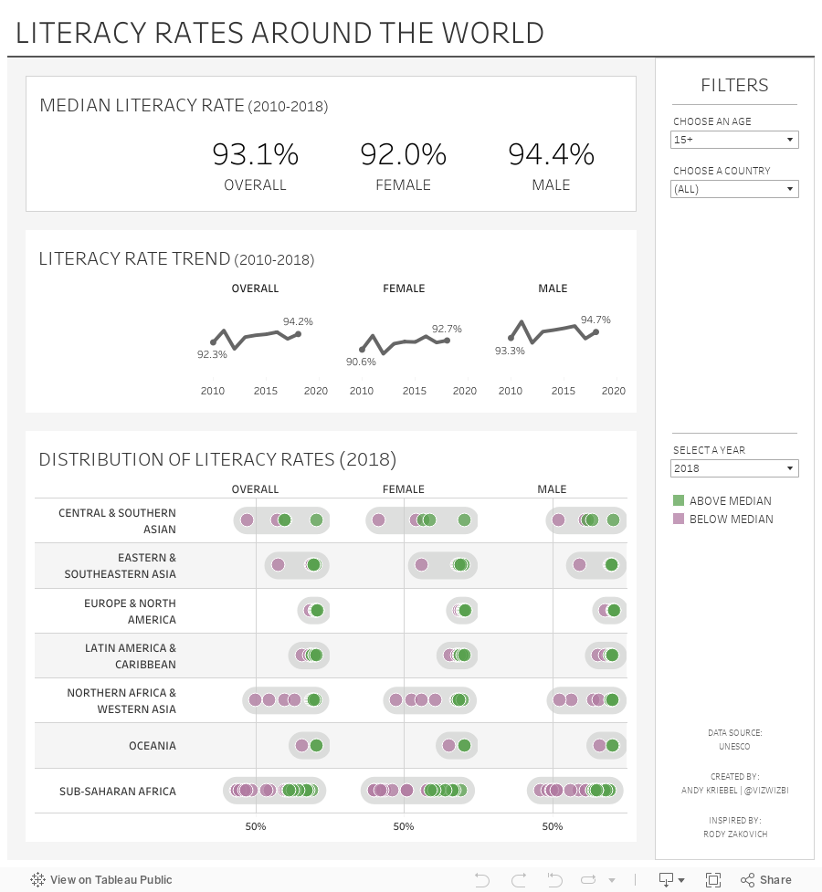
Visualizing a Profit & Loss Statement with KPI Cards
Data HAS to be consumed quickly to be understood and to make quick decisions. A "typical" profit and loss statement is on a spreadsheet. However, spreadsheets are notorious for (1) errors and (2) being very difficult to spot areas of concern.
That's where dashboards come into play. Back in July 2017 I proposed a new way to visualize a Profit & Loss Statement (P&L). The dashboard has been very well received and put into practice at many organizations. They've reported back to me how useful it has been.
But then I got thinking about an even easier way to visualize the data. I felt like the previous version was a bit chart heavy. So, while I've been creating templates for other areas of a business (HR, Social Media, Customer Service), I decided to also focus on a new version of a P&L statement with KPIs. This dashboard is based on a Finance Dashboard example from Excel Dashboard School.
You can download the data I used to build this template here. Click on the image below to interact with and download the workbook.






