November 16, 2020
Visualizing a Profit & Loss Statement with KPI Cards
Data HAS to be consumed quickly to be understood and to make quick decisions. A "typical" profit and loss statement is on a spreadsheet. However, spreadsheets are notorious for (1) errors and (2) being very difficult to spot areas of concern.
That's where dashboards come into play. Back in July 2017 I proposed a new way to visualize a Profit & Loss Statement (P&L). The dashboard has been very well received and put into practice at many organizations. They've reported back to me how useful it has been.
But then I got thinking about an even easier way to visualize the data. I felt like the previous version was a bit chart heavy. So, while I've been creating templates for other areas of a business (HR, Social Media, Customer Service), I decided to also focus on a new version of a P&L statement with KPIs. This dashboard is based on a Finance Dashboard example from Excel Dashboard School.
You can download the data I used to build this template here. Click on the image below to interact with and download the workbook.

July 20, 2017
Visualizing a Profit & Loss Statement
In the true Tableau spirit, I'd like to share it with everyone. The overall design is very similar to the Income Statement with a few differences/enhancements:
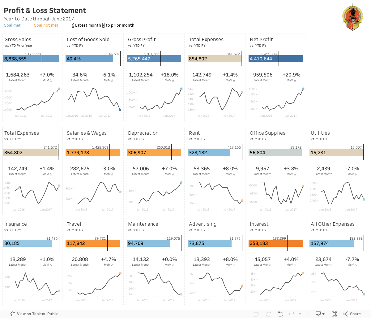
- The top section serves as a summary with the idea being to give a quick overview.
- The bottom section (below the line) are all of the expense categories, which could obviously change based on what a company tracks.
- I included BANs for the latest month and the change to prior month.
- There's no budget, so the sparklines simply show the raw values.
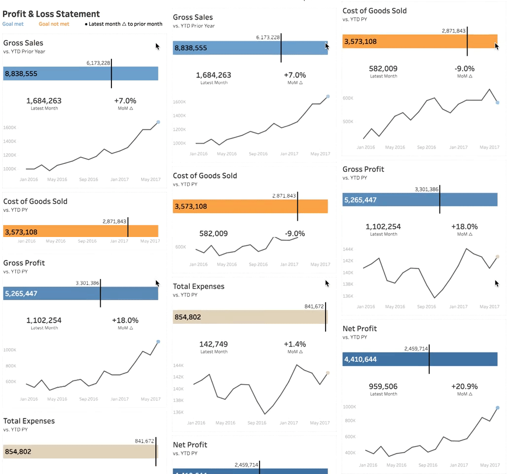
- The mobile version only shows the summary section as I couldn't fit all of the expenses within the 4000 pixel height limit and really, who's going to scroll that far anyway?
Ok, so now that you know how to read the viz, here's the full version. Click on the image for the interactive version (or if you're on mobile you will automatically see the mobile version). Scroll a bit farther down for a gif of the mobile version in action.
VIDEO OF MOBILE VERSION