July 20, 2017
Visualizing a Profit & Loss Statement
bullet graph
,
finance
,
financial statement
,
income statement
,
mobile
,
profit & loss
,
sparkline
,
tableau
26 comments
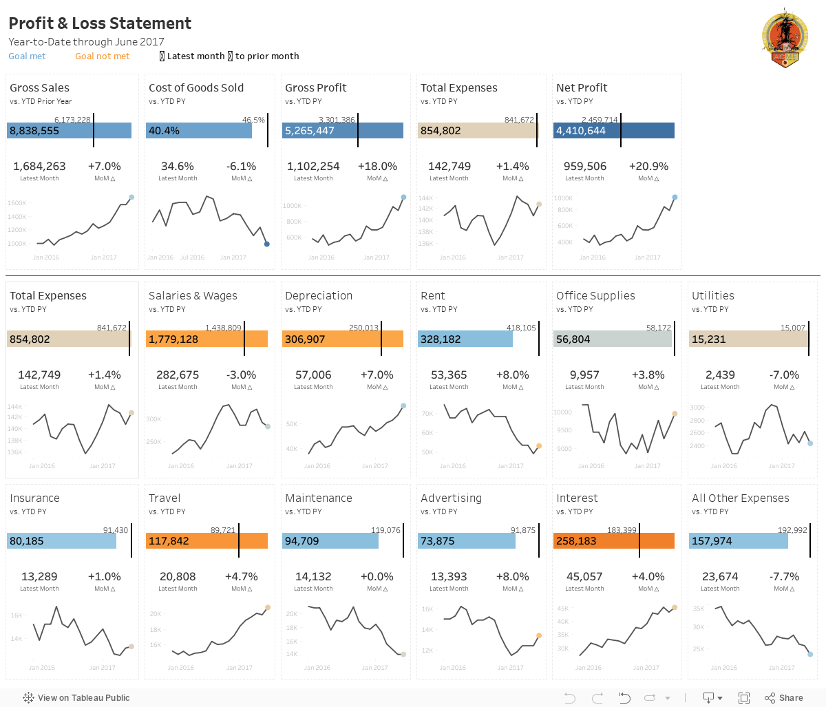
In the true Tableau spirit, I'd like to share it with everyone. The overall design is very similar to the Income Statement with a few differences/enhancements:
- The top section serves as a summary with the idea being to give a quick overview.
- The bottom section (below the line) are all of the expense categories, which could obviously change based on what a company tracks.
- I included BANs for the latest month and the change to prior month.
- There's no budget, so the sparklines simply show the raw values.
- The mobile version only shows the summary section as I couldn't fit all of the expenses within the 4000 pixel height limit and really, who's going to scroll that far anyway?
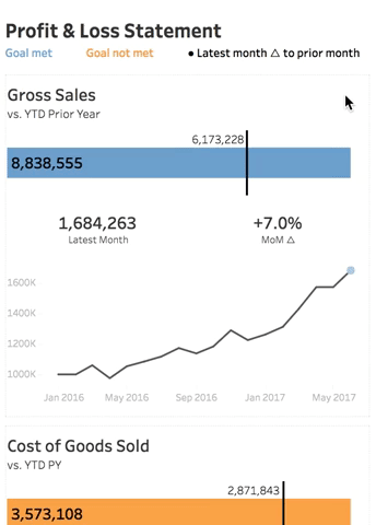
For this version, I've put together a "how to read" visual to help explain the visualisation.
Ok, so now that you know how to read the viz, here's the full version. Click on the image for the interactive version (or if you're on mobile you will automatically see the mobile version). Scroll a bit farther down for a gif of the mobile version in action.
VIDEO OF MOBILE VERSION
Subscribe to:
Post Comments
(
Atom
)


This couldn't have come at a better time! It's the best version of finance dashboard I've seen out there. If you don't mind, I'd love to incorporate this using our company's data.
ReplyDeleteThat's great to hear Nurul! The workbook is available for download. Go for it! Let me know how it goes.
DeleteAndy this is awesome! Thank you for all you do and for being my go to Tableau person/blog for the past 7 years.
ReplyDeleteMy pleasure! I appreciate the kind words.
DeleteAndy Really Great Work and i downloaded the workbook but not able to Open... :(
ReplyDeleteMake sure you have version 10.3 or newer.
DeleteThanks Andy its working in 10.3
DeleteHi Andy. I really appreciate your willingness to help people by faithfully and regularly transmitting your knowledge online. Could you show us how apply all of your presentation if the fiscal year starting month is other that January. For example the fiscal year start in July. It seems like Tableau always thinks that January is the start of the YEAR even thou the beginning of the fiscal year is set up from the Default Property as July. So it is some kind of difficult to have a dynamic comparison of year to data and prior year to date.
ReplyDeleteI'd recommend you search the Forums. Surely someone else has come across this before.
DeleteNice Work! This reminds me of the dashboard I made for our Revenue Management Team. Here is a link to it with Dummy data.
ReplyDeletehttps://public.tableau.com/profile/brents4997#!/vizhome/MultiMeasureKPI/RCMSummary
Good job!! Can u create tutorial about this in youtube??
ReplyDeleteAndy, could you tell me how to see the data source for this workbook? Did you start from a basic income statement and create a data source to use? I want to build this workbook out with my health center's income statement. Thanks for any input.
ReplyDeleteCody, you can download the workbook and unzip it and you'll see the Excel worksheet I created.
DeleteHi Andy, it looks like the workbook is currently 10.5 with a HyperDB extract. There is no Excel file in the TWBX. Any chance that you can publish it separately?
DeleteHi Daniel. I don't have the original data because it was based on the data from the original Tableau visualization. When you open the workbook, right click on the data source and choose Export to CSV.
DeleteAndy, this viz is great. Please put some financial data for makeover monday. It will be great to see and learn how people visualize financial data eg. financial liquidity
ReplyDeleteThanks! Find me a crappy viz and the data and we'll get it on the schedule.
DeleteAndy, thank you for making this available. A quick suggestion: many of the measures you show are more meaningful when shown as a percentage of total revenues. For example, an increase in Cost of Goods Sold (COGS) could be a good thing or a bad thing. If COGS are rising more slowly than revenues are rising (i.e. COGS are taking up less of every dollar sold), that's a good thing. If they're rising faster than revenues, however, that's probably a bad thing. This would be reflected in the change in COGS / Revenues.
ReplyDeleteIn any case, your dashboard has sparked some interesting thoughts for me. Thank you!
Ben
Good idea Ben. It'd be easy enough to take this and use it as a template and just swap out the metrics.
DeleteHi Benjamin, you can add a summary Viz of the percentages of total revenue at the top of phone view. Use a Table calculation for both months (Measure values> percent from > Category > Sales) then add the calculations to Measures , calculate the differences and put them on colors to see which percentage increase/decrease since last month.
DeleteHi, I can't see the download link, am I missing it?
ReplyDeleteClick on the image and it'll take you to Tableau Public where you can download it. Here's the link - https://public.tableau.com/views/ProfitLossStatement/PL?:embed=y&:display_count=yes&publish=yes
DeleteMan I wish this worked in Tableau 9.1 :(((
DeleteRebuild it Josh. You’ll learn a lot.
DeleteHi Andy , Thanks a lot for sharing such wonderful viz. I have incorporated the viz using our data and everyone loved it .
ReplyDeleteExcellent! Well done.
Delete