October 17, 2023
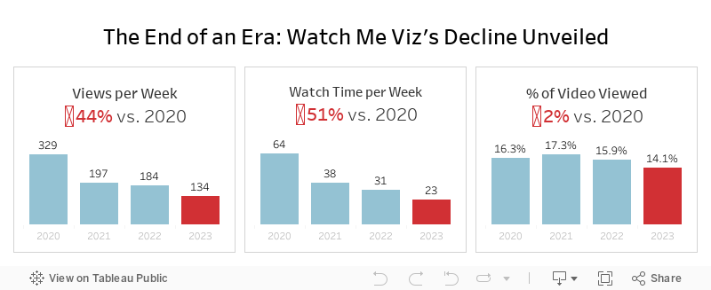
The End of an Era: Watch Me Viz's Decline Unveiled

That's a wrap. Watch Me Viz has retired, for good.
This week's data was about the performance of all of the WMV livestreams. There was some incredible viewer participation, which ultimately led to this viz that explains why WMV should quietly disappear.
Check out the livestream below.
July 25, 2023
The Big Thaw: Exploring the Disappearing Antarctic Sea Ice

- Visualizations from chapter 12 of the Makeover Monday book that showed how to add context to visualizations
- Several of the vizzes from 2018 week 15, each with their own unique take on the data
- The original viz by The Guardian
June 12, 2023
#MakeoverMonday 2023 Week 24 - Cereal and the Green Revolution: Yields vs. Land Use

At the global level, how has crop production changed over the last fifty years?
In this Watch Me Viz live stream, I analyzed how the yield and land use of producing cereal has changed over the last 50 years.
I really liked the original visualization, so I rebuilt it in Tableau. I learned how to use dynamic zone visibility, layout containers, and more. Check it out.
Resources:
1. Data - https://data.world/makeovermonday/2023w24
2. Final Dashboard - https://tabsoft.co/3P3Sdl3
===============
Watch Me Viz is a weekly live stream where I help people become better at #Tableau, #PowerBI and data analysis. I show how I take an existing visualization, critique it, analyze the data, and build several visualizations all the while looking for a "better" visualization than the original.
If you are considering participating in Makeover Monday, you can get started by downloading data sets from the Makeover Monday website. I promise you'll become better at data analysis and data visualization by practicing every week.
Data sets - https://www.makeovermonday.co.uk/data/
===============
LEARN FROM ME
Join my newsletter. Sign up at andykriebel.com.
ARE YOU INTERVIEWING FOR A NEW JOB?
Contact me for more information about how I can help you prepare for that big interview.
===============
CONNECT WITH ME
More Watch Me Viz - https://bit.ly/WatchMeViz2023
October 17, 2022
#MakeoverMonday 2022 Week 42 - Food & Drug Administration Inspections in America

Having looked at the original visualization this week (here), it was pretty clear to me that the creators desired to create a KPI style dashboard. In a way it's good that I picked up on it that way. However, it wasn't designed particularly uclarly well to communicate most efficiently.
I decided during Watch Me Viz that I would stick with their idea of a KPI dashboard, but design it in a way that I thought would be easier to understand.
As per normal, it took way too long to faff about with the formatting. I made a couple of small changes after I finished the live stream. Click on the image below the video to check it out. Leave a comment on the video on YouTube if you have any questions. (Comments aren't appearing on the blog for some reason).
Have a wonderful week!
June 20, 2022
#WatchMeViz - Workout Wednesday 2022 Week 1






