July 25, 2023
The Big Thaw: Exploring the Disappearing Antarctic Sea Ice

- Visualizations from chapter 12 of the Makeover Monday book that showed how to add context to visualizations
- Several of the vizzes from 2018 week 15, each with their own unique take on the data
- The original viz by The Guardian
May 21, 2018
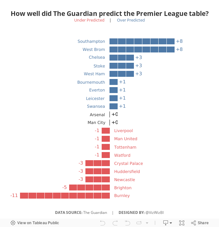
Makeover Monday: How well did The Guardian predict the Premier League table?


What works well?
- Sorting the teams by prediction makes sense since this is an evaluation of their performance against their prediction.
- Including the logos so people can find their favorite team
- Including the numbers for the table position so that the reader doesn't have to count as they go
- Shading every other row helps break up the view
What could be improved?
- If you don't know the team logos, it can be hard to track a team across the table.
- It's hard to see which team did better and worse than expected.
- There's no scale for how "well" The Guardian predicted the table.
My Goals
- Focus on the difference between the predicted and actual results
- Try to create some sort of unit chart (I didn't have time to figure out the calcs, so I cheated with distribution bands)
- Make it easier to see if team finished above or below the predictions
- Finish in under an hour because we did MM live at the Data School and had to present to Eva at the end of the hour
June 29, 2016
WTF Wednesday: Misconceptions About Muslim Population

This morning I was going through the backlog of Makeover Monday candidates that I have saved in Pocket and it’s quite an extensive list. So I thought I’d knock one off the list and start up #WTFWednesday for those of us that just can’t have enough Tableau in our lives.
For this makeover, I look back at this viz from The Guardian about the misconceptions about Muslims by Europeans. If you’d like to have a go at it, the data is here (XLS) and here (TDE).

What works well?
- It’s neatly organised by the amount of misconception
- Colors follow Guardian standards
- Nice title that sets the story
What doesn’t work well?
- When I first read it, I assumed the darker blue was the average guess, but that’s not the case. This should be made clearer.
- Comparing countries could be made easier
- Stacked bars with overlapping labels look very cluttered
I didn’t want to spend a lot of time on this so I decided to make a simple barbell chart sorted by the largest misconception. This was also the first time that I’ve put bar charts in tooltips, which works well for allowing the user to see the precise values.
March 21, 2016
Makeover Monday: Women's Rights Around the World - An Interactive Graphic

Wow! This week’s Makeover Monday was a really tough data set. I struggled to come up with something that I thought communicated effectively. I had an idea in my head, yet when I tried to execute that idea, it simply didn’t work.
But first, let’s take a look at the original graphic from the Guardian Datablog.

What works well?
- The interaction is fantastic.
- It’s colourful, which captured my attention immediately.
- I really like the pop up list of rights you see when you click on a specific bar.
What doesn’t work well?
- There are way too many colours.
- Arranging the countries in an arc makes it difficult to compare countries. For example, the United States is on the outside, which automatically makes it look larger than any country farther inside the circle even though they may take up the same percentage of the arc.
- The equal scaling makes no sense at all. Why would you want to scale them equally?
- Does the population scaling scale by total population or female population?
- Comparing countries across women’s rights is basically impossible.
I started with the idea of a long infographic and quickly realised that this would hinder the interactivity I was after. If I want you to compare countries, then I should have them all in a single screen. I then thought about creating a bump chart. Here’s the result of that…not so good!

Back to the drawing board I went. I knew I wanted to include a few things in particular:
- A way to filter by region
- A way to show and compare all countries within a category of women’s rights
- A map to display possible geographic concentrations
- Emphasis on the countries that are performing worst
- Interactivity, like the original, that displays each question and if the criteria is met
- Action filters where it makes sense
- Simple instructions
For my viz, I also made the assumption, for the sake of time, that Yes responses were the only positive responses. Given all of those criteria, here is my submission for this week’s Makeover Monday. Enjoy!
June 22, 2015
Makeover Monday: Historical Rainfall in 3 of Australia's Largest Cities


- They are not too dissimilar from geographical heatmaps in that they tend to skew towards the segments that cover the most surface area, in this case 2015.
- It’s difficult to compare across years, across months, and across months and years.
- Your eyes are drawn all over the place.
- There’s very little sense for trends.
- Like a pie chart, you’re trying to compare the angles of the slices, which is nearly impossible.
- The hover does not work once you get to the smaller segments.
- The labels are quite hard to read.
- When I hover, all I get is the value. This means that I have to look back to the labels to see which month and year it refers to.
- Taken the radial heatmap and flattened it out. I liked their idea of using a heatmap, but needed it to be easier to read.
- Added two trend charts: (1) cumulative rainfall, (2) monthly rainfall
- Added a selector for the city
- Added a highlight action on the year
- Included informative tooltips
- Improved the title
You can download the viz from Tableau Public here. What would you do differently? What could be improved in my version?
April 13, 2015
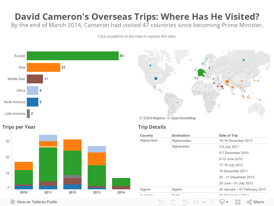
Makeover Monday: David Cameron's Overseas Trips


First, bubbles make comparisons harder than they need to; bar charts are much better for comparisons. This view also doesn't provide any addition insight. I can't answer a simple question like "Which countries did Cameron visit in Europe and when?"
I only had a few minutes this morning to create an alternative and here's what I came up with in about 15 minutes.
September 3, 2014
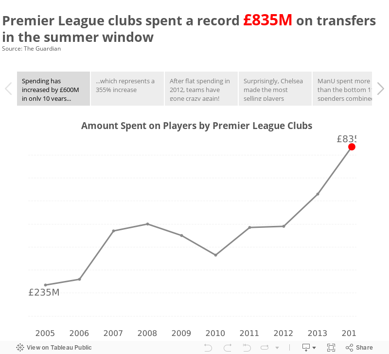
Premier League summer spending was out of control - A Story
I created most of the charts you see on my commute into work on the shuttle and polished it up after breakfast. What was most fun about creating this story was the process itself; I went from idea to data to vizzes to story in a very short amount of time.
My advice to you: If you hear an interesting fact, look into it. Find some data. Tell the story in your own words. It's a great way to practice and develop your craft.
February 8, 2013
Taking the Kraken to U.S. federal government spending
I was watching a video from Simon Rogers the other day about data journalism and how he got started. During his TEDx talk he showed this bubble chart that he created on government spending in the UK.

This reminded me that Tableau 8, the Kraken, now has the ability to create bubble charts. They’re not quite as sophisticated as what Simon created, they’re more like what you can build with ManyEyes, yet, like most of Tableau’s features, they’re unbelievably simple to build.
I downloaded data about US federal government spending in the 2013 budget from Wikipedia, connected to it with Tableau and within 3 clicks I had my bubble chart.
Clicks 1 & 2 – Select Agency and Total (which is total spending)

Click 3 – Click the packed bubbles option from Show Me

And here’s what you get:

This is pretty boring, so I placed Total on the color shelf and changed the color palette to red-blue diverging and reversed them.

That’s about six clicks and I have something pretty interesting. But that’s not enough for me. I wanted some interactivity. A few minutes later and this is what I created:

Is it perfect? No. Give it a whirl.
- Play around with the selectors. Notice how the sheet colors change from a measure to a dimension. Download the workbook and see if you can figure out how I did it.
- Click on a department in the table to highlight it’s bubble.
- Notice how the table sorts based on the spending type you pick. This makes finding the top few bubbles much easier.
These new bubble charts are going to be pretty useful, though I can totally see them get wildly misused.
December 14, 2012
VizWiz Contest: Electric City has been eaten by pies and donuts. Save it!
Tufte says “Pie charts are bad and that the only thing worse than one pie chart is lots of them.” Well, I think pies inside donuts and lots of them is even worse.
In the spirit of thrashing incredibly crappy visualization, I thought I’d run a data viz contest. The goal is simple – redesign this visualization from the Guardian.

Download the data here. I have transcribed the numbers exactly from the Guardian’s “viz”, so don’t shoot the messenger if the numbers don’t seem to quite add up to 100% in some cases.
I hate rules, but it seems like this contest probably needs a few.
- Deadline: December 31, 2012 @ 11:59pm ET (assuming we all make it past December 21st)
- Email me your submission or a link to it here.
- One entry per person. Send me more than one and I’ll ignore your entries.
- I don’t care what tool you use. It’s your choice. Draw it on paper if that’s your preference. Using Tableau will NOT give you an advantage over others.
- Judging is based solely on my personal opinion of your design. If you’ve been following this blog, then you probably have a good feel for what I like, and maybe more importantly what I don’t like.
- The winner will receive an embroidered Facebook zip up hoodie. Retail value $750. Facebook swag is priceless so I may be over exaggerating a bit.
- The winner will be announced sometime in the first two weeks of January.
Good luck! Hopefully this doesn’t turn out to be a disaster (and don’t complain if you don’t win).
June 13, 2012
Are you considering relocating to another country? Maybe one of these cities is a good fit.
Timely that Mercer published its World Cost of Living Survey yesterday (12 June 2012) as I’ll be moving to San Francisco soon for a super cool data viz opportunity with Facebook. I thought for sure that San Francisco would be in the top 50 (we had some serious sticker shock look at houses out there!!), but it’s not.
Select data was released by the Guardian. They posted this infographic (click to enlarge), but I found it a bit difficult to circumnavigate. It’s challenging to find patterns and compare the data. For me, there’s too much information in one view. It’s good for an overview and to print, but challenging for analysis.
Note that the data is a subset of countries; it does not represent the top 50.
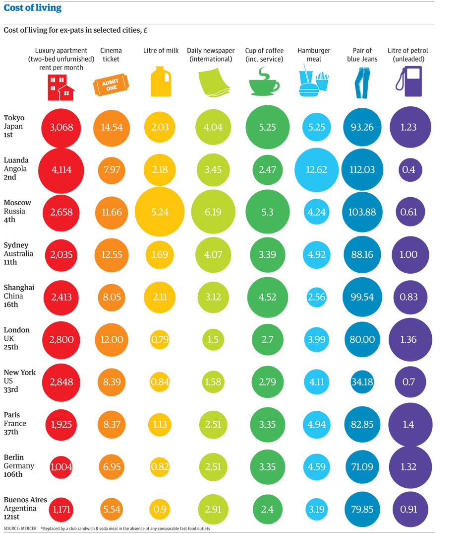
I downloaded the data and built this simple viz in Tableau.

I wanted to be able to compare countries and two expenditures simultaneously, so I used Tableau’s parameters feature to allow you to choose the what you want to compare.
I intentionally included both a map and scatterplot so that you have multiple methods for comparing the data. Click on a country on the map or a circle in the scatterplot to highlight the country. Hover over a circle for more information.
The 2nd tab is a reproduction of the infographic the Guardian produced. It’s for reference only. I doubt you can glean much insight from it.
There are some expenditures that I would have expected to correlate highly that don’t. Blue jeans vs. cinema is a good example of this. Or a cup of coffee and a newspaper. Don’t those two go hand in hand?
June 14, 2011
How wide is the UK education gap? Hint: It’s wider than you think
Back in December I critiqued a viz about the gap between the Russell Group of universities and several of the rest. The postgrad.com Data Visualization Challenge sparked me work on part 2 of my analysis.
Over here in the States, when you hear of Oxford or Cambridge, you think of exclusivity and an incredible (and incredibly expensive) education. I never knew much about the UK educational system until recently, thanks to the Guardian Datablog.
I’ve once again turned to the flexibility of Tableau (the parameters feature is a huge help) to create this viz which details the gap between what is essentially the rich and the poor. Play around with the colors, shape sizes and the scatter plot. Click on a bubble and its stats will appear at the bottom.
You’ll certainly find something interesting including:
- Kings College London has the highest % of free school meal students, but only at 5.3% (the average is 6.47%)
- Oxford is indeed elitism, at least the data suggest such: 47% of students are independent while only 0.8% are FSM
- 60 of the 87 schools in the dataset (69%) have a below average % of independent students, none of the schools being in the Russell Group
What do you see?
June 6, 2011
The most dangerous States (if you don’t like disasters)
The news cycle has been focused on weather disasters lately, particularly tornados. Thanks to the Guardian (get the data here) we can now “see” the trouble. The data covers 1959-2010. It’d be nice to have 2011 YTD in the dataset as well since there seem to have been so many tornados.
There are many options with which to filter on the right and if you want to see the list of disasters for a state or county, simply click on the bubble.
There are some really cool cuts of the data:
- Filter by hurricanes; the gulf coast lights up!
- I didn’t know North Dakota, Minnesota and Iowa had so many floods
- Avoid any states along the Mississippi River if you don’t like tornados (and Georgia too)
- Georgia has had the most recorded tornados since 1959…that both surprises and scares me, especially since they’re in North Georgia
- There have been more earthquakes in Washington state than California. Who would have thought that?
- 9/11 is categorized as a Terrorist attack in Virginia, yet it’s listed as a Fire in New York. Data cleanliness at its finest!
Do you see anything else interesting? There is so much to explore.
May 24, 2011
The World’s Deadliest Roads – Watch out for cars in Africa
Before you travel around the world, you may want to consider where you are safest. According to the Guardian, road traffic accidents “kill more people around the world than malaria”. While China would obviously have the highest number of accidents based on the size of the population, I was surprised that many countries in Africa and the Middle East have such a high incidence of deaths (measured as deaths per 100K of population).
Use the interactive viz below to see if anything stands out to you. One good way to look at the data to really make the death rate in Africa stand out is to choose “Estimated Deaths per 100K” for both the color and the size. What do you see?
May 20, 2011
Are you a data rock star? If so, strut your stuff for a chance to win an iPad2
All of the details can be found here.
Enter Now to Win…
It's easy to enter the competition and you could win:
- Recognition from a panel of industry experts in journalism, data visualization and design
- Your name and work promoted across the web
- A proud and noteworthy addition to your portfolio, website or CV
- A full post profiling you and your work, and the design process you followed
- A signed copy of Information is Beautiful by David McCandless
- A brand new iPad2
It's An Open Brief
- The competition is based on the data collected by David, and other sources listed within the dataset. However, you are free to mash up the data with any other source you wish, provided the sources are publicly available and cited in your entry to the competition.
- Your visualization can be static, moving or interactive
- You can include as little or as much text as you like
- It can be as simple as a single chart or a full-blown infographic
The Datasets
- You can find find the data collected by David McCandless here
You may also find the following resources useful
And Remember, the Competition Closes at 11pm GMT on Monday 20th June 2011.
February 11, 2011
Who owns America’s debt?
Another great set of data from the Guardian, this time tracking the owners of America’s debt. Probably not a shock to anyone is that America is hugely indebted to Asian countries, China and Japan in particular. As of October 2010, China owns 23% ($907B) of the debt, while Japan is closely behind at 22% ($877B). That’s right, two countries own 45% of America’s debt, a concerning situation indeed.
Simon Rogers of the Guardian posted a visualization using Many Eyes. Once again the viz of choice is bubbles. This time you get a decent idea that three countries account for a huge proportion, but the bubbles are missing the percentage of the total, which in my opinion would give much more perspective. Also, the data provided goes back to July 2008, so why not use all of it? Here is Simon’s viz, but there’s no real need to interact with it; that doesn’t add any value.
Naturally, with country level data being available, I’m led to starting with a map. From there I added:
- A bar chart, colored by the amount of debt, to show the rank each country has within its region
- A Pareto chart to illustrate which countries have the greatest cumulative influence on America’s financial well-being
- A line chart to track the amount of debt owned over time. Initially the line represents the total US debt, but click on a country and you can see how their debt ownership has changed.
Of particular interest is China, since it owns the most debt. It maxed out at $940B in July 2009, decreased its ownership by 10% over the next year, and has since begun purchasing more treasury bonds.
Be sure to look at the UK, which has increased by 450% in just 12 months. I wonder who the sucker is over there.
What do you see?
December 30, 2010
UK University Elitism? Independent vs. Free Meal Students – Part 1
This is part one of a two part analysis of private education in the UK. The chart below was published on Flickr by li_jacq.

Two simple improvements:
- A bar chart would be more effective than a column chart because you don’t have to turn your head to read the labels
- The data should be ranked. This seemingly sporadic display does not provide any insight
I pulled down the data to reconstruct the chart.

As you can see, I’ve made the adjustments I noted above and now you can make more sense of the data.
My curiosity is leading me to look into this further. My questions include:
- Why are only 16 universities listed? These don’t represent the top 16 for this measure, so what’s their significance versus the others?
- What’s the relationship between Independent and Free Meal school students?
- Does the region of the UK impact anything?
I’ll answer these questions and more in a future post.
December 9, 2010
It’s cold here in Georgia, but how about Britain?
According to the Guardian Data Blog on December 1st “The freezing weather, which fell to -20C in parts of Scotland, continues to severely disrupt travel across the country. The problem is the ground temperature is lower than the air temperature [which] makes thawing difficult.”
This impacted me since the Manchester United vs. Blackpool match was not shown on Fox Soccer Channel. Apparently Blackpool doesn’t have an underground heating system to keep the pitch from freezing. It stinks when you set your DVR and get some other crappy game instead.
The Guardian presented the data via a Google map, which is not surprising since this is such a simple way to present the information. The problem with presenting the data this way is that you can’t determine how cold it really was nor how much the weather changed; the data is represented merely as points on a map. If you look at this map, it could mean just about anything: vacation spots, lighthouses, you name it.

I wanted to understand how the temperature changed day to day from December 1-3. I wish they posted the data for more days so that I could see what happened over the weekend as well (to justify the game getting canceled). I loaded the data into Tableau and changed the measurement to be the change from day to day. This means that December 1 doesn’t have anything to compare to.
It’s incredibly clear that there was a bit of a warm up in many places in the UK with the exception of the northwest. However, the temperature dropped dramatically on December 3, but with a warming occurring in the northwest. Scroll through the days to see it for yourself.

November 24, 2010
Failed Banks in the US: Popping the Bubbles
Simon Rogers from the Guardian created a visualization of failed banks in the US using Many Eyes. The article can be found here. Before I critique the visualization, take a minute to interact with the bubbles.
A quick word about data integrity. The article on the Guardian references the data going back to 1935, and in fact, the data compiled does go back to 1935. I made the assumption that the viz created by Simon went back that far as well, but then I couldn’t find a year filter. If you look at the data that built the bubble chart, it only covers 2008-2010 and all three years are combined. But 2010 isn’t even a complete year. Come on already! This can be extremely misleading and should be clearly noted, but it’s not!
The initial view above is assets in failed banks as dollars per person.
- The huge bubble for Nevada surely stands out, but why not a simple bar chart?
- Notice that Total is listed as a State; that doesn’t make any sense.
- Which state is #2? How about #5? It takes some work.
- Do we really care about all 50 States or maybe just the top 10?
- How much bigger is Nevada than the #2 state?
It’s so much easier to compare the size of the bars than the size of the bubbles. From the bar chart, you can easily see the rank and the relative size of each bar. It turns out that Nevada is 20x larger than Alabama. There’s absolutely no way you can identify that in the bubble chart.

Change the Bubbles Size option to Number of failed banks. Holy smokes! What state is collapsing? Oh, it’s not a state; it’s that pesky Total again. The Total completely distorts the view and makes all other comparisons impossible. Again, a simple bar chart will suffice.

Finally, since there are two data points that are highlighted by the article (assets per person and number of failed banks), a scatter plot provides one of the best means of seeing the relationship between the two. In this view, you immediately see the five outliers I have labeled below.

Scroll through the other filters and you continue to see that including Total as a State completely wrecks any insight that could be gleamed from the viz.
The viz below was built with Tableau Public and it includes the data all the way back to 1935. However, I decided to only focus on the last 20 years; this time period represents the most volatility since the Great Depression.
NOTE: 2005 and 2006 are not included since there were not any bank failures listed on the FDIC website for those years. I also excluded 2010 since the year is not complete.
There are three visualizations included. The line chart (and size) represents the number of bank failures. The color indicates the estimated loss (adjusted to the value of the dollar as of 31 Dec 2009). When you choose a Year, you will get the corresponding map and bar charts. The map and bar chart are sized and colored in the same manner as the line chart.

Naturally, I went straight to 1989. Texas had 224 bank failures! Then I went to the surrounding years and Texas was at the top of the list again. It turns out that there was a banking collapse in Texas in the middle 1980s to early 1990s.
According to the Dallas Morning News: “In the state's 1980s collapse, an energy bust and a subsequent real-estate wreck leveled hundreds of Texas banks, including longtime pillars of the economy.”
Sound familiar?
November 2, 2010
Transparency International: Corruption Perceptions Index
According to Transparency International:
- The 2010 Corruption Perceptions Index shows that nearly three quarters of the 178 countries in the index score below five, on a scale from 10 (highly clean) to 0 (highly corrupt). These results indicate a serious corruption problem.
To summarize the 2010 results:
- Denmark, New Zealand and Singapore are tied at the top of the list with a score of 9.3, followed closely by Finland and Sweden at 9.2.
- The most corrupt country is Somalia with a score of 1.1. Only slightly less corrupt are Myanmar and Afghanistan, with a score of 1.4, and Iraq at 1.5.

Immediately obvious to me are that:
- The rankings haven't changed much over the past three years.
- You should avoid nearly all of Africa and Asia.
- Western Europe, particularly the Scandinavian countries, are relatively devoid of corruption.
If you want to see a horribly create bubble chart from which you cannot infer anything, go to Many Eyes.
July 12, 2010
World Cup of Doughnuts
George Primentas of The Missing Graph blog is a consistent contributor to the Datastore, but recently I think he must have started going to Dunkin' Donuts. I've read four blog posts of his about the World Cup and all four of them have doughnut charts. I've been wracking my brain trying to understand why he keeps using them, but I guess it must be because they're cute...or he has a sweet tooth.
In a way I like this particular infographic. It's visually appealing and the level of detail on the background photo interests me as a photographer, but it's a poor visualization of the data. The distinction I'm making is between an infographic and a visualization.
Much like pie charts, doughnut charts are almost always better represented as bar or column charts. Here is his latest example from the post World Cup 2010: Representation of the Continents.

In the blog post, there's a set of "interesting facts" presented, but really, George is just stating the facts; there's not anything to gleam from them. That's not George's fault, the data simply isn't interesting.
I've come up with two ways to more effectively present the data for quicker interpretation of the performance of the different continents/confederations (though they don't make the data any more interesting).
In this line chart, you can quickly see the trends. The chart is clean and it tells the story the data wants to tell. I can get away with a line chart because this is a time-series across sequential points in time.

I prefer this bar chart over the line chart. For me, I can more clearly differentiate the continents and it's easy to see how far each continent went in the tournament; the more bars, the farther along they went in the tournament.

In the end, keep in mind whether you want to tell a story with the data or present an aesthetically pleasing graphic. They each have their place, but care must be taken when combining the two.


