April 13, 2015
Makeover Monday: David Cameron's Overseas Trips
bar chart
,
bubble chart
,
David Cameron
,
detail
,
Guardian
,
Makeover Monday
,
makeovermonday
,
map
,
Prime Minister
,
table
,
UK
No comments


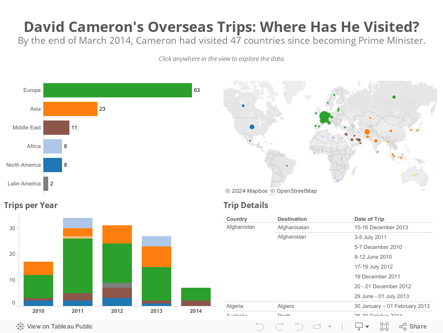
First, bubbles make comparisons harder than they need to; bar charts are much better for comparisons. This view also doesn't provide any addition insight. I can't answer a simple question like "Which countries did Cameron visit in Europe and when?"
I only had a few minutes this morning to create an alternative and here's what I came up with in about 15 minutes.
Subscribe to:
Post Comments
(
Atom
)


No comments
Post a Comment