Showing posts with label flickr. Show all posts
September 22, 2014
My week at #DATA14 in photos
#DATA14 was nothing short of incredible. In the past, I have regretted not taking more pictures with people I know, so this year I vowed to do better. I pestered people, hopefully not in a creepy way, for their pictures with me. So, here's an album from my week.
Enjoy!
July 12, 2010
World Cup of Doughnuts
barchart
,
doughnut
,
flickr
,
football
,
GeorgePrimentas
,
Guardian
,
linechart
,
soccer
,
TheMissingGraph
,
worldcup
No comments
Since I am an avid follower of the Guardian Datablog, I have also become a follower of the Guardian Datastore on flickr so that I can see how people interpret the data provided.
George Primentas of The Missing Graph blog is a consistent contributor to the Datastore, but recently I think he must have started going to Dunkin' Donuts. I've read four blog posts of his about the World Cup and all four of them have doughnut charts. I've been wracking my brain trying to understand why he keeps using them, but I guess it must be because they're cute...or he has a sweet tooth.
In a way I like this particular infographic. It's visually appealing and the level of detail on the background photo interests me as a photographer, but it's a poor visualization of the data. The distinction I'm making is between an infographic and a visualization.
Much like pie charts, doughnut charts are almost always better represented as bar or column charts. Here is his latest example from the post World Cup 2010: Representation of the Continents.

In the blog post, there's a set of "interesting facts" presented, but really, George is just stating the facts; there's not anything to gleam from them. That's not George's fault, the data simply isn't interesting.
I've come up with two ways to more effectively present the data for quicker interpretation of the performance of the different continents/confederations (though they don't make the data any more interesting).
In this line chart, you can quickly see the trends. The chart is clean and it tells the story the data wants to tell. I can get away with a line chart because this is a time-series across sequential points in time.

I prefer this bar chart over the line chart. For me, I can more clearly differentiate the continents and it's easy to see how far each continent went in the tournament; the more bars, the farther along they went in the tournament.

In the end, keep in mind whether you want to tell a story with the data or present an aesthetically pleasing graphic. They each have their place, but care must be taken when combining the two.
George Primentas of The Missing Graph blog is a consistent contributor to the Datastore, but recently I think he must have started going to Dunkin' Donuts. I've read four blog posts of his about the World Cup and all four of them have doughnut charts. I've been wracking my brain trying to understand why he keeps using them, but I guess it must be because they're cute...or he has a sweet tooth.
In a way I like this particular infographic. It's visually appealing and the level of detail on the background photo interests me as a photographer, but it's a poor visualization of the data. The distinction I'm making is between an infographic and a visualization.
Much like pie charts, doughnut charts are almost always better represented as bar or column charts. Here is his latest example from the post World Cup 2010: Representation of the Continents.
In the blog post, there's a set of "interesting facts" presented, but really, George is just stating the facts; there's not anything to gleam from them. That's not George's fault, the data simply isn't interesting.
I've come up with two ways to more effectively present the data for quicker interpretation of the performance of the different continents/confederations (though they don't make the data any more interesting).
In this line chart, you can quickly see the trends. The chart is clean and it tells the story the data wants to tell. I can get away with a line chart because this is a time-series across sequential points in time.
I prefer this bar chart over the line chart. For me, I can more clearly differentiate the continents and it's easy to see how far each continent went in the tournament; the more bars, the farther along they went in the tournament.
In the end, keep in mind whether you want to tell a story with the data or present an aesthetically pleasing graphic. They each have their place, but care must be taken when combining the two.
June 17, 2010
Something's missing
energy
,
flickr
,
oil
No comments
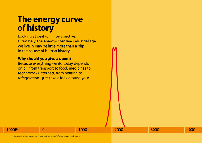
I like the message in this graph, but the chart itself is missing something very fundamental...the scale. How can we possibly compare values without the scale? The scale could be 0-1, it could be 0-1,000,000,000 or it could be 500-1,500. Who knows?

May 24, 2010
Breast Augmentation
Conrad Quilty-Harper created this hilarious visualization of breast augmentation data from the Guardian. Very creative I must say.


February 2, 2010
Problems with Line Charts Over Time
barchart
,
chartjunk
,
flickr
,
linechart
,
politics
,
timeseries
,
variance
No comments
In order to accurately display a data series over time when comparing two dimensions, it's absolutely critical to have data for both dimensions for the same periods of time. Here is an example of a poor use of a time series:

In this example, the author has one line for Republicans and one line for Democrats. Each line has a point for each year. We all know that only one party can hold the presidency. The author should NOT plot a point for the years in which a party is not in power.
The author presents the data properly (though with a slightly different take on the data itself) with this bar chart, though the vertical axis does not include the entire range of values:


In this example, the author has one line for Republicans and one line for Democrats. Each line has a point for each year. We all know that only one party can hold the presidency. The author should NOT plot a point for the years in which a party is not in power.
The author presents the data properly (though with a slightly different take on the data itself) with this bar chart, though the vertical axis does not include the entire range of values:

December 12, 2009
The Best Pie Chart Ever
This is so perfect!
The genius that created this said: "Needed to do a pie chart... so bought an apple pie at M&S, cut the percentages, and shot the pic. Pudding was served later with custard! ;-)"

The genius that created this said: "Needed to do a pie chart... so bought an apple pie at M&S, cut the percentages, and shot the pic. Pudding was served later with custard! ;-)"

October 18, 2009
October 9, 2009
Afghanistan Troop Deployments
afghanistan
,
barchart
,
bubblechart
,
contribution
,
davidmcandless
,
flickr
,
Guardian
,
military
,
war
No comments
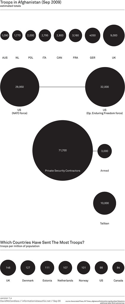
My favorite bubble man uploaded another doozy. This time he's displaying troop deployments to Afghanistan.

The first message that the bubbles are trying to communicate is simply the number of troops deployed.
I can see why he has the bubbles across the top; they're in a neat ascending order, but then the US is show below all of the other countries? Why aren't they all arranged together?
Also, what is the purpose of having all of the other types of "troops" on the chart? Finally, there is one pretty big issue with the data; where are all of the other countries that have sent troops?
Bubbles are a poor method of showing relative size. A simple bar chart works much better. Unlike the author, I have included "all other" countries.

The second message, which I cannot make heads or tails of, is the number of troops per million of the population. What is the purpose of this data and what insight can you possibly gain from it?
When I first saw this chart, I immediately tried to connect the bubbles at the top to the bubbles at the bottom, but it's impossible.
The title of the second chart is "Which countries have sent the most troops?" Ok, one more time, how could anyone possibly answer that question based on the troops per million of the population?
When I saw the question, I immediately though of a bar chart showing the percent of the total troops that each country has sent. I created this visualization below and added color to emphasize those countries that have more skin in the game.
From my visualization, you can see that the US has sent about 47% of the troops. In the bubble chart, I see the number 98. Which one do you think answers the question more appropriately?

If you really want to get sick, check out the rest of the author's bubble charts on this topic. I don't get the fascination with the bubbles...
* Data courtesy of The Guardian DataBlog
The first message that the bubbles are trying to communicate is simply the number of troops deployed.
I can see why he has the bubbles across the top; they're in a neat ascending order, but then the US is show below all of the other countries? Why aren't they all arranged together?
Also, what is the purpose of having all of the other types of "troops" on the chart? Finally, there is one pretty big issue with the data; where are all of the other countries that have sent troops?
Bubbles are a poor method of showing relative size. A simple bar chart works much better. Unlike the author, I have included "all other" countries.
The second message, which I cannot make heads or tails of, is the number of troops per million of the population. What is the purpose of this data and what insight can you possibly gain from it?
When I first saw this chart, I immediately tried to connect the bubbles at the top to the bubbles at the bottom, but it's impossible.
The title of the second chart is "Which countries have sent the most troops?" Ok, one more time, how could anyone possibly answer that question based on the troops per million of the population?
When I saw the question, I immediately though of a bar chart showing the percent of the total troops that each country has sent. I created this visualization below and added color to emphasize those countries that have more skin in the game.
From my visualization, you can see that the US has sent about 47% of the troops. In the bubble chart, I see the number 98. Which one do you think answers the question more appropriately?
If you really want to get sick, check out the rest of the author's bubble charts on this topic. I don't get the fascination with the bubbles...
* Data courtesy of The Guardian DataBlog
October 5, 2009
Follow up: Evolution of the Ozone Hole
bubblechart
,
davidmcandless
,
flickr
,
Guardian
,
ozone
,
pollution
,
tableau
1 comment
You know, I really love it when people discuss issues and share solutions. Joe Mako and I had a great discussion on my last two posts regarding the most effective visual representation of the ozone hole over time. Joe create an OUTSTANDING representation of the data using floating bars.

Joe created this visual using Tableau. I had not seen anyone do this in Tableau before. I had thought about doing stacked bars and making the lower of the two bars white, but this is way better. Joe has also provided the Tableau Packaged Workbook. I have posted this on a Google Group that I just created.
Thanks Joe! Excellent work!
Joe created this visual using Tableau. I had not seen anyone do this in Tableau before. I had thought about doing stacked bars and making the lower of the two bars white, but this is way better. Joe has also provided the Tableau Packaged Workbook. I have posted this on a Google Group that I just created.
Thanks Joe! Excellent work!
Size Evolution of the Ozone Hole
bubblechart
,
davidmcandless
,
flickr
,
Guardian
,
ozone
,
pollution
2 comments
Joe Mako left a comment on my previous post critiquing the use of bubbles to represent the size evolution of the ozone hole. I agree with what Joe said: "a bar or line would have been better." The only problem with using a line is that there is not a consistent time measure (1996 throws it off...yes I know, a minor issue).
So I recreated the data with two bar charts. (1) Representing the actual values and (2) the change from the previous measure. I like (1) better. How about you?

So I recreated the data with two bar charts. (1) Representing the actual values and (2) the change from the previous measure. I like (1) better. How about you?
October 4, 2009
Quick, help save the bubbles
bubblechart
,
davidmcandless
,
flickr
,
Guardian
,
ozone
,
pollution
1 comment
Someone, please help explain this to me. There is no legend to reference the colors, the data, nothing.
Why 1996 instead of 1995? What do the numbers represent? What do the colors signify? Why is the last bubble green instead of hot pink?
If the dark grey in the middle four circles represents the ozone hole and the total size of the circle is earth (which I can only assume), then I think it's a poor representation of the problem. Is the ozone layer really that huge? No, it's not.
Please someone, save me! No wait, don't save me, save the bubbles!

Why 1996 instead of 1995? What do the numbers represent? What do the colors signify? Why is the last bubble green instead of hot pink?
If the dark grey in the middle four circles represents the ozone hole and the total size of the circle is earth (which I can only assume), then I think it's a poor representation of the problem. Is the ozone layer really that huge? No, it's not.
Please someone, save me! No wait, don't save me, save the bubbles!

October 1, 2009
Pop the Afghanistan War Bubbles
afghanistan
,
barchart
,
bubblechart
,
davidmcandless
,
flickr
,
Guardian
,
military
,
war
No comments
Flowing Data had a post today listing resources to find data. One of these sources was the Guardian Datablog.
The image below caught my eye. It's from a Flickr pool for the Guardian datablog.

The author's says "Latest military casualty figures in proportion to each force's troop numbers. I think this gives a clearer sense of which armies are taking the most flak."
Ok, I get the intent, but why the bubbles? Doesn't a simple bar chart provide a much simpler method for communicating the data?

Here's what I see in the data: the US provides the bulk of the forces, but loses the fewest casualties as a percentage of the total force. It's known across the world that the US military is one of the most prepared, so this shouldn't surprise anyone. I don't see any enlightening information in the author's analysis, other than simply giving us a pretty report.
The image below caught my eye. It's from a Flickr pool for the Guardian datablog.

The author's says "Latest military casualty figures in proportion to each force's troop numbers. I think this gives a clearer sense of which armies are taking the most flak."
Ok, I get the intent, but why the bubbles? Doesn't a simple bar chart provide a much simpler method for communicating the data?
Here's what I see in the data: the US provides the bulk of the forces, but loses the fewest casualties as a percentage of the total force. It's known across the world that the US military is one of the most prepared, so this shouldn't surprise anyone. I don't see any enlightening information in the author's analysis, other than simply giving us a pretty report.
Subscribe to:
Posts
(
Atom
)






