Showing posts with label pollution. Show all posts
May 27, 2019
#MakeoverMonday: What has happened since people started paying attention to climate change?
carbon dioxide
,
carbon footprint
,
climate change
,
co2
,
data studio
,
environment
,
Makeover Monday
,
pollution
,
world bank
No comments

What works well?
- Using a line chart over time helps show the trends
- Including a slider filter for the user to zoom in on a specific period
What could be improved?
- Using dotted lines indicates there are breaks in the timeline, but there aren't. Therefore, a solid line should be used.
- The labels on the ends of the lines hide the data.
- It could use an impactful title and subtitle. Though I suppose this is just a report, not analysis.
What I did
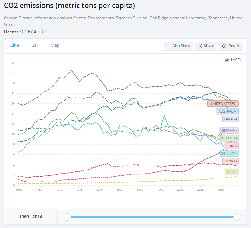
I created a map to ensure that the country names were correct. When I did this, I then saw that there were lots of aggregations of countries. For some reason, the income level categories captured my attention so I filtered down to just those items.
The years 2015-2018 were include and didn't have any values. I filtered those out. There were years when no data was captured for some countries. I filtered those out.
I plotted the data as a line chart and created a calculation to show the change vs. the first year for each country. I noticed that there was a spike in CO₂ per capita in 1973 for high income countries. This reminded me of the oil crisis of 1973, but that wouldn't have anything to do with carbon emissions I wouldn't think.
That got me thinking about climate change in general. I entered "when did people start paying attention to climate change" into Google and the first search result was an article from National Geographic titled "Climate Change First Became News 30 Years Ago. Why Haven’t We Fixed It?"
This particular line was what I was looking for: "The Intergovernmental Panel on Climate Change was established in late 1988..."
So, back to the data I went and I filtered the data to 1988-2014 and compared every subsequent year to 1988 in order to see how much things have changed since climate change started garnering some attention. I expected high income countries to have ever increasing CO₂ per capita. I was wrong.
It turns out that the middle income countries have had the largest change in CO₂ per capita. So that became the focus of this analysis.
March 30, 2019
Groundwater Contamination and Cow Poo: A Major Contributor to Global Warming
cow poop
,
environment
,
EPA
,
groundwater
,
methane
,
nitrate
,
pollution
,
United States
No comments

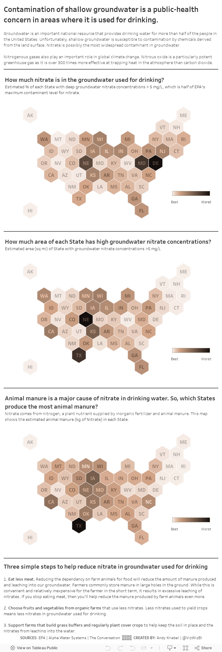
While watching a documentary, they mentioned how methane from cows (i.e., cow farts) are a major contributor to the greenhouse gasses and how cow manure is a major source of nitrate released into groundwater used for drinking. Fortunately, there is tons of data available, the primary source being the Environmental Protection Agency (EPA).
I wanted to understand the geographical distribution of three factors:
- The percentage of each State with high groundwater nitrate concentrations.
- The total area (square miles) of each State with high groundwater nitrate concentrations.
- Where the cow crap comes from that pollutes groundwater used for drinking.
I decided to create a map for each of these topics, as a scrolling story, with three actions you can take to help reduce the impact of cow manure pollution. We all want safe drinking water after all.
June 19, 2017
Makeover Monday: Is America Improving Its Ozone Air Quality?
actions
,
cycle plot
,
Data Duo
,
dot plot
,
EPA
,
Makeover Monday
,
ozone
,
pollution
,
sparkline
,
United States
,
USA
2 comments
The EPA website also contained some basic reporting, which is the focus for this week's makeover.
What works well?
- Simple layout. It's easy to see you have days within months going left to right and years going down.
- Colors match the official EPA colors for the AQI categories
- Including the ranges we know what constitutes a good reading vs. a bad reading
- The title tells me what I'm looking. Including the date range is a nice touch too.
- Using a strip plot along with the colors helps reveal seasonal patterns
- Including the source in the footer
What could be improved?
- Make the colors color-blind friendly
- It's difficult to see how a month has changed across the years.
- I can't hover to see the values.
- It says each “tile” represents one day of the year and is color-coded based on the AQI level for that day, but I think it's actually showing the max measurement for each day. It should be more clear what they are representing.
- There's very little context. How does one county compare to others? How does one county compare to the national average?
What were my goals?
- Last year I challenged The Data Duo to visualise an almost identical data set. Pooja created a pretty amazing viz (of course), so I wanted to pick some parts off of it. Particularly, the State selectors on each site and the dot plot.
- I wanted to understand how each month changed across the years, which is pretty much exactly what a cycle plot was created for. I used a trend line instead of an average though because that seemed to show the patterns better.
- I wanted to add context for comparisons to the national average and to the state average (which appears when you click on a state).
- I wanted to use color-blind friendly colors.
- I wanted a small sparkline-type chart to show how things have changed since 1990.
With these goals in mind, here is my Makeover Monday week 25 submission. Click on the image for the interactive version.
October 5, 2009
Follow up: Evolution of the Ozone Hole
bubblechart
,
davidmcandless
,
flickr
,
Guardian
,
ozone
,
pollution
,
tableau
1 comment
You know, I really love it when people discuss issues and share solutions. Joe Mako and I had a great discussion on my last two posts regarding the most effective visual representation of the ozone hole over time. Joe create an OUTSTANDING representation of the data using floating bars.

Joe created this visual using Tableau. I had not seen anyone do this in Tableau before. I had thought about doing stacked bars and making the lower of the two bars white, but this is way better. Joe has also provided the Tableau Packaged Workbook. I have posted this on a Google Group that I just created.
Thanks Joe! Excellent work!
Size Evolution of the Ozone Hole
bubblechart
,
davidmcandless
,
flickr
,
Guardian
,
ozone
,
pollution
2 comments
Joe Mako left a comment on my previous post critiquing the use of bubbles to represent the size evolution of the ozone hole. I agree with what Joe said: "a bar or line would have been better." The only problem with using a line is that there is not a consistent time measure (1996 throws it off...yes I know, a minor issue).
So I recreated the data with two bar charts. (1) Representing the actual values and (2) the change from the previous measure. I like (1) better. How about you?

So I recreated the data with two bar charts. (1) Representing the actual values and (2) the change from the previous measure. I like (1) better. How about you?
October 4, 2009
Quick, help save the bubbles
bubblechart
,
davidmcandless
,
flickr
,
Guardian
,
ozone
,
pollution
1 comment
Someone, please help explain this to me. There is no legend to reference the colors, the data, nothing.
Why 1996 instead of 1995? What do the numbers represent? What do the colors signify? Why is the last bubble green instead of hot pink?
If the dark grey in the middle four circles represents the ozone hole and the total size of the circle is earth (which I can only assume), then I think it's a poor representation of the problem. Is the ozone layer really that huge? No, it's not.
Please someone, save me! No wait, don't save me, save the bubbles!

Subscribe to:
Posts
(
Atom
)


