Showing posts with label carbon footprint. Show all posts
May 27, 2019
#MakeoverMonday: What has happened since people started paying attention to climate change?
carbon dioxide
,
carbon footprint
,
climate change
,
co2
,
data studio
,
environment
,
Makeover Monday
,
pollution
,
world bank
No comments

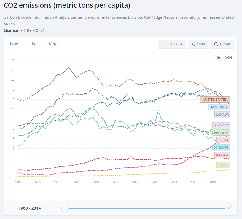
What works well?
- Using a line chart over time helps show the trends
- Including a slider filter for the user to zoom in on a specific period
What could be improved?
- Using dotted lines indicates there are breaks in the timeline, but there aren't. Therefore, a solid line should be used.
- The labels on the ends of the lines hide the data.
- It could use an impactful title and subtitle. Though I suppose this is just a report, not analysis.
What I did
I created a map to ensure that the country names were correct. When I did this, I then saw that there were lots of aggregations of countries. For some reason, the income level categories captured my attention so I filtered down to just those items.
The years 2015-2018 were include and didn't have any values. I filtered those out. There were years when no data was captured for some countries. I filtered those out.
I plotted the data as a line chart and created a calculation to show the change vs. the first year for each country. I noticed that there was a spike in CO₂ per capita in 1973 for high income countries. This reminded me of the oil crisis of 1973, but that wouldn't have anything to do with carbon emissions I wouldn't think.
That got me thinking about climate change in general. I entered "when did people start paying attention to climate change" into Google and the first search result was an article from National Geographic titled "Climate Change First Became News 30 Years Ago. Why Haven’t We Fixed It?"
This particular line was what I was looking for: "The Intergovernmental Panel on Climate Change was established in late 1988..."
So, back to the data I went and I filtered the data to 1988-2014 and compared every subsequent year to 1988 in order to see how much things have changed since climate change started garnering some attention. I expected high income countries to have ever increasing CO₂ per capita. I was wrong.
It turns out that the middle income countries have had the largest change in CO₂ per capita. So that became the focus of this analysis.
I created a map to ensure that the country names were correct. When I did this, I then saw that there were lots of aggregations of countries. For some reason, the income level categories captured my attention so I filtered down to just those items.
The years 2015-2018 were include and didn't have any values. I filtered those out. There were years when no data was captured for some countries. I filtered those out.
I plotted the data as a line chart and created a calculation to show the change vs. the first year for each country. I noticed that there was a spike in CO₂ per capita in 1973 for high income countries. This reminded me of the oil crisis of 1973, but that wouldn't have anything to do with carbon emissions I wouldn't think.
That got me thinking about climate change in general. I entered "when did people start paying attention to climate change" into Google and the first search result was an article from National Geographic titled "Climate Change First Became News 30 Years Ago. Why Haven’t We Fixed It?"
This particular line was what I was looking for: "The Intergovernmental Panel on Climate Change was established in late 1988..."
So, back to the data I went and I filtered the data to 1988-2014 and compared every subsequent year to 1988 in order to see how much things have changed since climate change started garnering some attention. I expected high income countries to have ever increasing CO₂ per capita. I was wrong.
It turns out that the middle income countries have had the largest change in CO₂ per capita. So that became the focus of this analysis.
January 21, 2019
Makeover Monday: Electricity Use at 10 Downing Street
10 Downing Street
,
carbon footprint
,
energy
,
Makeover Monday
,
money
,
Prime Minister
,
UK
,
united kingdom
No comments

Here's the viz Eva chose:

What works well?
- Really nice BANs that also have context included. I give people feedback quite often that BANs can be great, but they're meaningless without context.
- Nice filter options with the buttons at the bottom
- The chart shows the peaks and troughs well.
- Using different colors for peak usage
- Data updates as you click on the BANs
What could be improved?
- Include a legend so you know what the colors signify
- A better x-axis is needed
- Remove the buttons that don't have any data, District Heat and Gas in this case
My Plan
- Hold off on working on my viz until we have our weekly Makeover Monday time at the Data School. I've written this section and the two above Sunday night.
- Explore the data with line charts to get a sense for the patterns in the data.
- Keep something similar to the BANs; consider different or additional context.
- Should the timeline show all of the data? Play about with different filter options.
- Consider a heatmap that shows usage by hour of the day compared to day of the week or perhaps month.
- Will reporting energy use, money, and carbon impact in the same dashboard be too crowded?
- Explore relationships between the metrics with scatterplots. Is a connected scatterplot an option?
- Would a mobile version be better so that people can look at it on the go?
- Is there any additional data?
What I Uncovered
- The data set only included 2017, so I downloaded back to 2008 as well. But data only existed back to 2013, so I had to deleted 2008-2012. Tableau Prep doesn't allow you to skip the first three rows, which is required for 2013-2016, so I used Alteryx instead and then unioned those years with 2017.
- Only data for electricity usage is consistent across the years; I was expecting to see money and carbon impact as well. I wonder why don't they include those as well. Anyway, this eliminates a scatter plot.
- Data was missing for December 2015, so I excluded that month from the data set.
- There were lots of zeros, so I removed those as well.
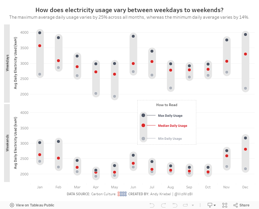
And here's my viz after working on it for 60 minutes at the Data School.
June 5, 2016
Makeover Monday: Facebook’s Drive Towards Clean & Renewable Energy Sources
bar chart
,
carbon footprint
,
donut chart
,
facebook
,
line chart
,
Makeover Monday
,
slope graph
,
sustainability
2 comments

My process works like this:
- Evaluate the existing visualisation - What works well? What needs improvement?
- Rebuild the original chart in Tableau
- Capture each version of the chart along the way and indicate what I changed
- Finish with the final makeover
This process also helps me iterate quickly and keep as close to the one hour “recommended” time as possible. Without further ado, here’s my makeover for this week.
Subscribe to:
Posts
(
Atom
)






