February 5, 2011
The Smartphone Wars Could Soon Look Radically Different…if you destroy the pies!
@furtado tweeted today about an article from Business Insider. The very first line says “The smartphone wars could look a lot different soon…” They then go on to publish these horrific pie charts:

The smartphone wars can indeed look radically different…by obliterating the pie charts and replacing them with bar chart:

With the bar charts, you can much more easily see the variances in the rankings, the sort order is clear and you can quickly see that it goes from six manufacturers to four. I had to count around the pie in their chart, which is much more time consuming.
I’m begging people, please, please, please stop publishing pie charts! You’re taking years off my life.
February 4, 2011
Mr. Nielsen, a simple bar chart is so much better!
Another fantastic article from Nielsen, tainted by a pie chart. Want to Increase Store Traffic, Loyalty and Growth? Re-Think the Center Store

The purpose of Nielsen’s pie charts is to compare the % of total trips to the % of total sales. But there’s no way to do it effectively or quickly if your eyes are having to constantly scan back and forth in an attempt to compare their sizes.
Any of the bar/column charts below is a considerable improvement over the pie charts. My favorite of the options below is the bar-in-bar chart. You can quickly see that fill-in/errand trips are the most frequent, but food trips dominate sales. Which is your favorite?

January 9, 2011
Shouldn’t I expect better from Nielsen?
The image below is from an article on Nielsen, but that’s not important. I can’t make any sense whatsoever of this chart.

I’m stumped because the gray area is for under 24, the blue is for under 15 and the light blue is for under 15. Huh? I was hoping for a legend, but nope, there isn’t one.
There’s only one word to describe this chart: AWFUL!
September 13, 2010
Energy Generated by a Pie
In the September edition of Georgia Magazine, they published a pie chart of the fuel sources of energy generated (see p. 15).

When I first looked at this I thought Coal was the #1 fuel source. Why? Because Coal was on the top of the pie and it just looks like it was the largest. Fortunately there are labels that let me know otherwise. If I was forced to use a pie chart (i.e., if the purpose was to establish a parts-to-whole relationship), I would present it like this:

Some improvements include:
- Displaying the data largest to smallest starting at the 0 degree mark.
This allows you to quickly see that a great, great majority of the fuel comes from two sources. It's much harder to see in their pie chart. - The 3D view has been removed.
- The spaces between the slices have been removed.
If I were to present this data, I would present it in a ranking relationship with a bar chart. I would want to convey to the reader the fuel sources that provide the most energy, not necessarily the contribution to the total.

To me, it's much easier and quicker with the bar chart to see how much more energy comes from nuclear and coal than from natural gas and hydroelectric sources. I'm going to write to the editor.
May 27, 2010
A "sweet" infographic?
The very first "Inspirational Infographic" I saw on the blog post was the "Die Hard Index."

Apparently this was a student project, so I'll cut the creator of the viz a bit of slack, but @datavis should know better. While this is a "pretty" graphic, it is very difficult to gleam any insight. I just so happened to read Stephen Few's article "Our Irresistible Fascination with All Things Circular" in which he states "the primary goal of any data visualization is to inform, and that it should be carefully and knowledgably designed to support this goal based on the principles that we’ve learned through years of research about graphical perception."
The problem with this visualization is that it takes too much work to find anything useful.
- You have to look back and forth between the infographic and the legend.
- It's nearly impossible to compare the size of the circles. If you can do it, you're a genius. Compare the Phillies and the Cardinals. Can you tell the difference?
- The labels for the points are quite confusing. For example, look at the Cubs and White Sox. Which dot represents which circle?
April 9, 2010
The Earth is a Giant Pie

It's frightening that someone would publish a sphere-like pie chart; this was a new approach to me and possibly the worst yet. Come on, at least put the data in order. The KISS method is so much better:
A simple bar chart based on the data table would look like:

What are the top 5 categories? Takes you a while to figure it out, doesn't it? The most effective way to display this data to communicate the message is:

Why overcomplicate things when simple is clearly the best approach?
March 3, 2010
I almost got sick

Some of the issues I see:
- Of course, the 3D perspective. BARF!
- The data labels on the bars...Are they really necessary to communicate the message?
- The background color choice gives me the impression I'm somewhere deep in space with all of that black.
- Stop-light colors. We all understand why people use stop light colors, but this doesn't work for those that are color blind.
- The cylinders. A flat bar is always a better choice.
- The angle of the chart leads you to believe the height of the bars is different, when in fact, they're all the same height.
Here are some options:


However, given the small set of data, would a simple table be best? Really all I care about are the problems. None of the charts above give that "pop." What would I do? I would create two tables.
First, the raw values.

Second, the percent of the total for each claim type.

Does anything stand out to you in these tables?
February 19, 2010
Improving Graphs in College Textbooks
Quantitative Literacy Across the Curriculum: Improving Graphs in College Textbooks
To subscribe to Few's monthly Visual Intelligence Newsletter, click here.
February 2, 2010
Problems with Line Charts Over Time

In this example, the author has one line for Republicans and one line for Democrats. Each line has a point for each year. We all know that only one party can hold the presidency. The author should NOT plot a point for the years in which a party is not in power.
The author presents the data properly (though with a slightly different take on the data itself) with this bar chart, though the vertical axis does not include the entire range of values:

November 2, 2009
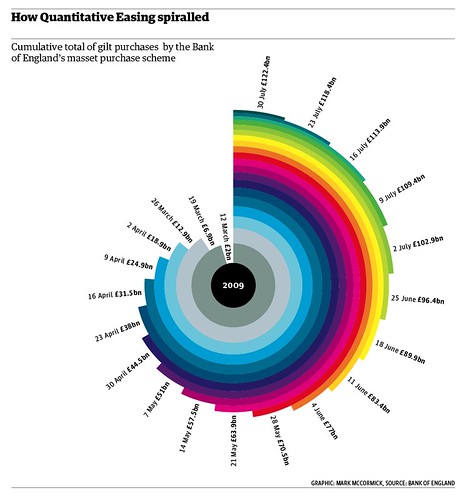
I'm Dizzy
October 28, 2009
Chocolate Cream Pie

Some things I like (wink, wink):
- The colors get darker the farther out from the radius you go. I guess you could say they radiate.
- The pie doesn't start at the zero degree mark for easier ranking/comparisons.
- The level of precision...people must really care about the 1/10,000th of a percent of an award.
- What takes the cake, I mean pie, is the interactivity. You have to try it out; it's worth the giggle.
Don't fret. There's more pie on the buffet:
Nobel Peace Prize Winners by Gender (I like how this chart sort of "swirls" in when the page loads...fancy stuff!)
Nobel Prize Winners in Physics by Gender (The 1.0695% of women who won are probably more upset about this pie chart than any apparent sexism.)
I will give ChartsBin some credit though. Their interactive maps are quite good. They're very similar to the maps on Google Analytics.
October 7, 2009
Cell Phone Usage
Here is how AT&T presents the data:

Icky, icky! Where are the dates? I can't tell the difference between some of the bars. Why are long distance and roaming included? You'd never be able to see them anyway. Why not use a simple line graph?

Come on AT&T, get your act together. Although I suspect these were created by a developer that only knows how to use the default graphs in Excel and thought "Oh, I can make these so pretty with the 3D bar charts."
Why the big spike in September? Conference calls...boooooo!
August 17, 2009
Pie Chart Abuse

Answer this question for me by looking at the pie chart: Which player had the 5th most RBIs?
Pie charts are designed to represent parts of a whole. Does this chart present the data this way? Well, I suppose it does, but is it done effectively? Certainly not. It appears the data is sorted in alphabetical order, but that doesn't provide any insight. If insisting on a pie chart, why not sort it descending by % of total RBI? Pie charts should be used sparingly, if ever. A simple bar graph displays the data much more effectively.
Answer this question for me again by looking at the bar chart below: Which player had the 5th most RBIs? Which chart made it easier to find the answer?






