November 18, 2019
#MakeoverMonday: Tween and Teen Smartphone Ownership

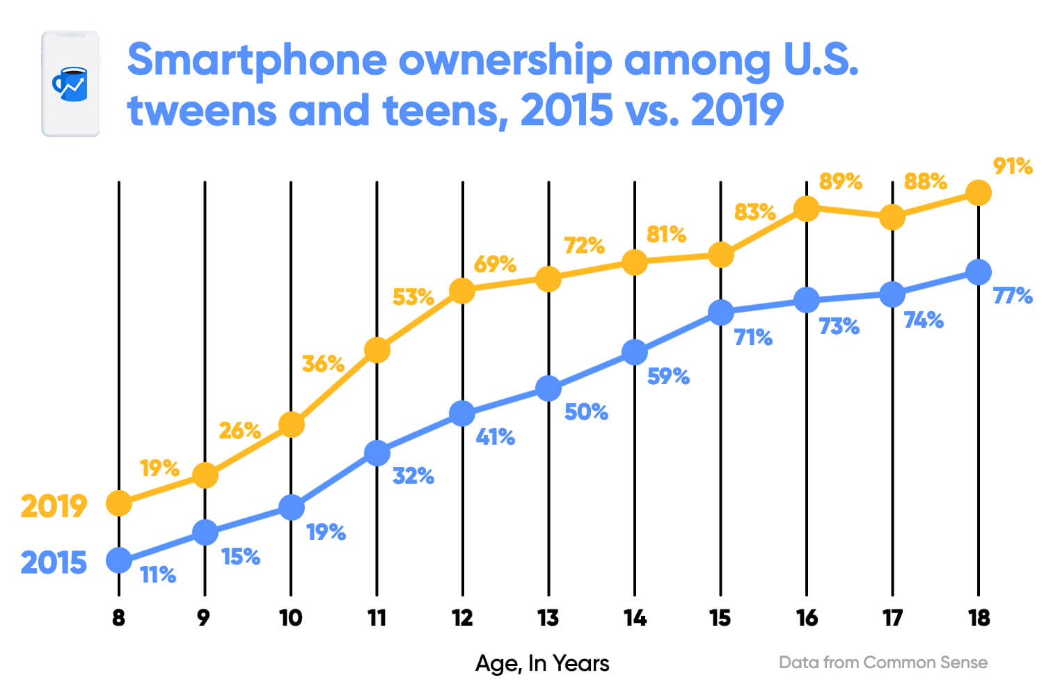 |
| SOURCE: Morning Brew |
What works well?
- Clear title
- X-axis is clearly labeled
- Including the data source
- Colors are easy to distinguish
- Vertical lines help draw the eye to compare the years within each age
- Including labels since the y-axis is hidden
What could be improved?
- The title could be less bold.
- The title uses the color for 2015, but it's not related to one year only.
- The dots are distracting since they are so large.
- The labels are helpful, but do they need to be so big?
- With the vertical lines connecting the dots within the year, and the line connecting the ages across the years, I'm not sure which is more important. Given the title, the focus seems like it should be on comparing years within an age.
- The vertical lines don't need to be so broad.
What I did
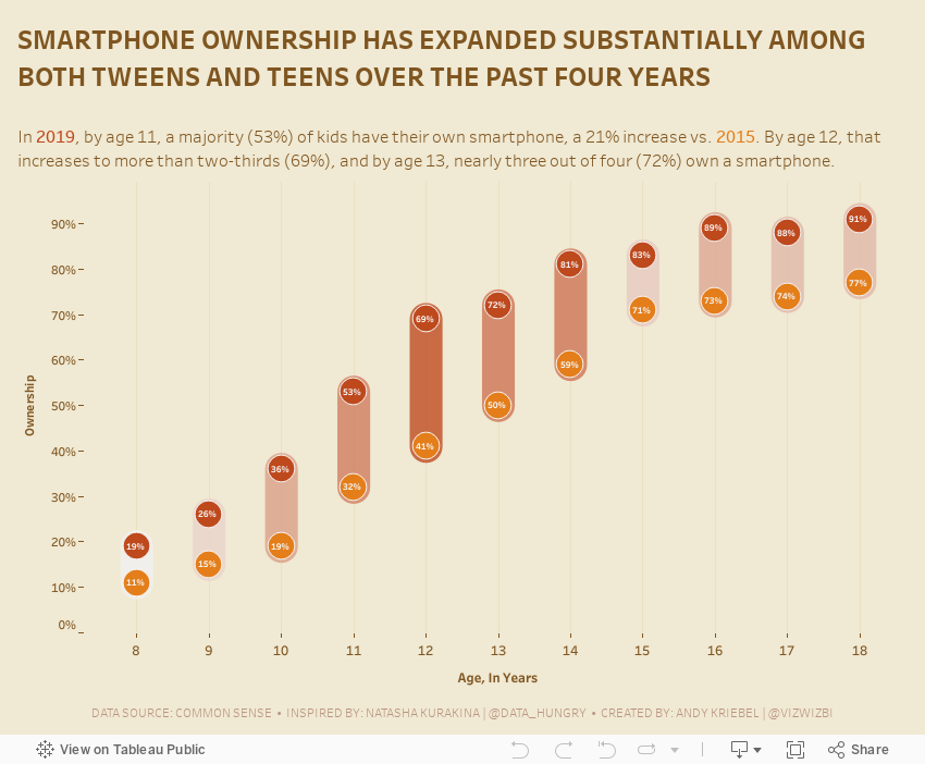
- Removed the lines to make the focus comparing the ownership within an age group
- Surrounded the dots with a band to ensure the user reads the data within each age group
- Colored the bands by the change to accentuate the ages that have changed the most
- Included the labels, but made them very small as to not distract from the analysis
- Created a mobile version for practice
April 4, 2011
A Nielsen Table Improved - Number of Americans Watching Mobile Video
A blog post from Nielsen says:
According to a new mobile video report from The Nielsen Company, the number of U.S. mobile subscribers watching video on their mobile devices rose more than 40 percent year-over-year in both the third and fourth quarters of 2010, ending the year at nearly 25 million people.
They presented their results with this table:

What’s wrong here?
- Their summary says watching improved in both the third and fourth quarters of 2010, but why isn’t Q3 09 on the table?
- Why do they include Q3 10 if they don’t include the quarter to quarter comparison?
- The table is quite dark and dreary, with unnecessary color
I would reformat the table like this.

I have:
- Added Q3 09 along with quarter over quarter comparisons (% diff on the right) and year over year comparisons (% diff at the bottom)
- Removed any unnecessary color
While Nielsen’s report says “the number of U.S. mobile subscribers watching video on their mobile devices rose more than 40 percent year-over-year in both the third and fourth quarters of 2010”, they fail to point out that growth has actually slowed in 2010, both quarter over quarter and year over year.
Bottom line, be careful what you read. I hope not, but Nielsen may have intentionally left out Q3 09 to paint a better picture.
February 5, 2011
The Smartphone Wars Could Soon Look Radically Different…if you destroy the pies!
@furtado tweeted today about an article from Business Insider. The very first line says “The smartphone wars could look a lot different soon…” They then go on to publish these horrific pie charts:

The smartphone wars can indeed look radically different…by obliterating the pie charts and replacing them with bar chart:

With the bar charts, you can much more easily see the variances in the rankings, the sort order is clear and you can quickly see that it goes from six manufacturers to four. I had to count around the pie in their chart, which is much more time consuming.
I’m begging people, please, please, please stop publishing pie charts! You’re taking years off my life.






