Showing posts with label teens. Show all posts
November 18, 2019
#MakeoverMonday: Tween and Teen Smartphone Ownership
change
,
level of detail
,
LOD
,
Makeover Monday
,
mobile phones
,
smartphone
,
teens
,
trend
,
tweens
No comments

 |
| SOURCE: Morning Brew |
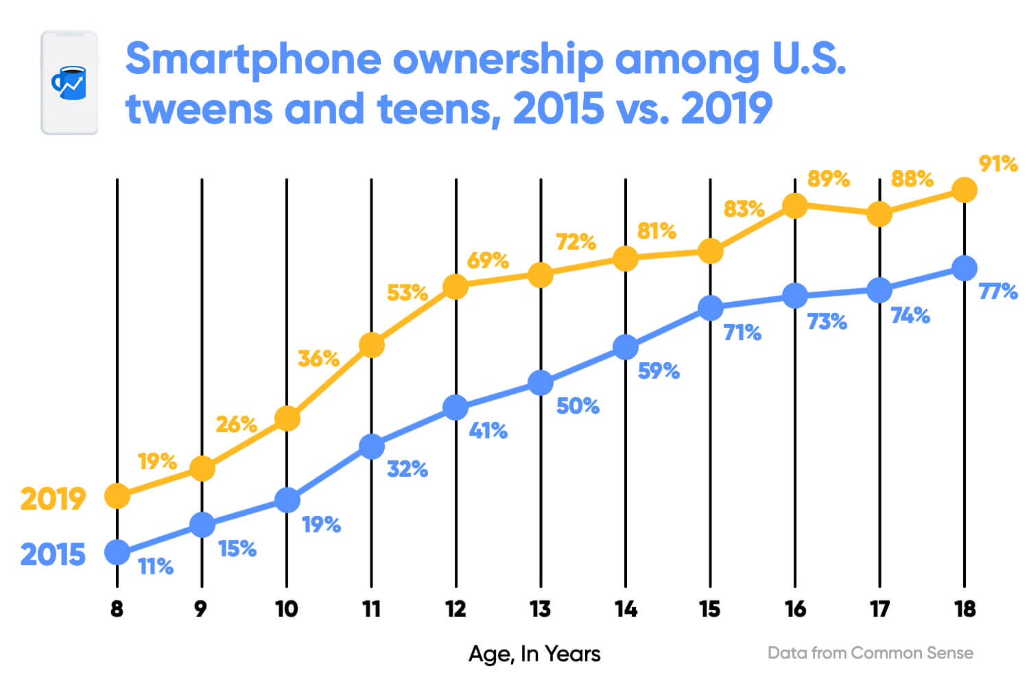
What works well?
- Clear title
- X-axis is clearly labeled
- Including the data source
- Colors are easy to distinguish
- Vertical lines help draw the eye to compare the years within each age
- Including labels since the y-axis is hidden
What could be improved?
- The title could be less bold.
- The title uses the color for 2015, but it's not related to one year only.
- The dots are distracting since they are so large.
- The labels are helpful, but do they need to be so big?
- With the vertical lines connecting the dots within the year, and the line connecting the ages across the years, I'm not sure which is more important. Given the title, the focus seems like it should be on comparing years within an age.
- The vertical lines don't need to be so broad.
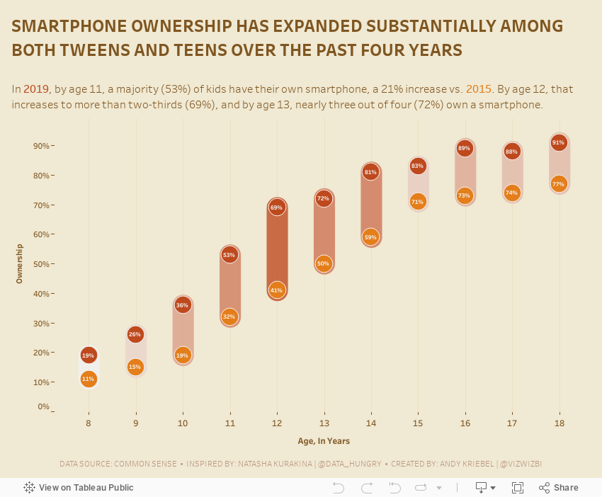
What I did
- Removed the lines to make the focus comparing the ownership within an age group
- Surrounded the dots with a band to ensure the user reads the data within each age group
- Colored the bands by the change to accentuate the ages that have changed the most
- Included the labels, but made them very small as to not distract from the analysis
- Created a mobile version for practice
November 20, 2017
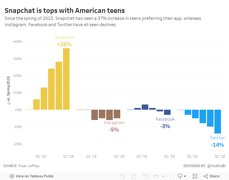
Makeover Monday: Snapchat is tops with American teens
Business Insider
,
facebook
,
instagram
,
Makeover Monday
,
snapchat
,
social media
,
teens
,
trends
,
twitter
4 comments
The original viz comes to us from Business Insider:

What works well?
- Catchy title that quickly tells the story of the viz
- Bar charts are simple to understand and they show the pattern well
- Sorting the apps by the most recent value
- Including the axis, otherwise we wouldn't know what the labels mean on the top of the bars
What could be improved?
- The fading colors across the time periods are unnecessary. Include a time axis instead.
- Change the numbers above each bar to percentages
- The color legend doesn't match any of the bar charts and should be removed.
My Ideas
I started by looking at slope graph comparing the starting and ending periods.
This tells the story simply, but also doesn't show enough of the change over time. Next, I took the original and turned it into a line chart, labeling only the start and the end and also changing the colors to match the official colors of each app.
I think the line charts help make the change and trends much more obvious than the bar charts in the original. From there, I decided to look at the change since the starting period (spring 2015) to make the growth or decline of each app easier to understand. And with that, here's my Makeover Monday week 47.
February 15, 2016
Makeover Monday: How Does Video Game Playing Vary by Demographic?
adults
,
bar chart
,
comparison
,
demographics
,
Makeover Monday
,
parents
,
radial chart
,
teens
,
video games
5 comments

This week’s Makeover Monday has a mix of good and bad parts. It comes to use from Forbes.

Let’s review this from top to bottom.
- The video game font they chose for the title is cute, yet the title itself doesn’t reflect what contained in the entire visualisation.
- I don’t understand why they chose to use a grey-to-white background. What value does that add? Remember, everything you include in a viz should have a purpose. If not, remove it.
- I really like the adults vs. teens section. In particular, I like how the bars start on opposite ends and come towards each other.
- Then we get to the parents vs. non-parents section. Why didn’t they continue the theme from the adults vs. teens section? Instead they chose some weird radial chart type thing that makes comparisons very difficult both between parents and non-parents and across platforms within a single category. Basically, this section is a disaster.
- The images of people playing videos games on a giant screen is cute, but it doesn’t enhance the viz in my opinion.
Click here to download the Tableau workbook.

Subscribe to:
Posts
(
Atom
)






