Showing posts with label contribution. Show all posts
October 13, 2025
Proportional Brushing in Tableau with Set Actions
analysis
,
contribution
,
how to
,
parts-to-whole
,
proportional brushing
,
set
,
set action
,
tableau
No comments

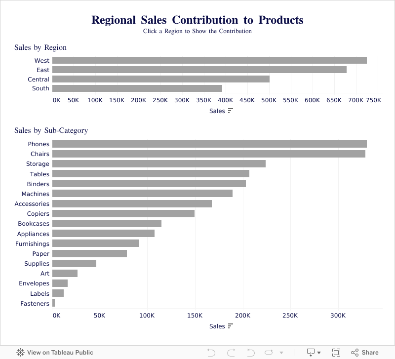
In this video, you'll learn how to use Proportional Brushing in Tableau to show contribution without filtering your data.
Most dashboards rely on filters. But sometimes your users need context, not isolation. In this tutorial, I’ll walk you step by step through how to build a proportional brushing interaction using Set Actions in Tableau.You’ll learn how to:
✅ Highlight a selected value in one chart
✅ Show how it contributes to a second chart
✅ Keep the full dataset visible without filtering
✅ Create a smooth, intuitive user experience with simple calculations
This technique is perfect for comparative dashboards, contribution analysis, and performance insights across categories.
Whether you’re building dashboards for executives, product teams, or sales leaders, this approach will help them see the full picture.
 🔗 Exclusive access to the workbook
---------
🔗 Exclusive access to the workbook
---------
To go deeper, check out my courses:
→ Tableau Starter Kit - A beginner-friendly course designed to help you understand Tableau quickly
→ Tableau Core Concepts - A comprehensive, self-paced course for Tableau users ready to level up
→ Join Next-Level Tableau - My most comprehensive Tableau program to help analysts become industry leaders, with the support of a like-minded community, and 1-to-1 help from me
📩 The Dual Axis Newsletter
Each week, I'll send you Tableau tips, tutorials, and strategies to design better dashboards, have more impactful, and stand out in your career: https://nlt.kit.com/
🔽 CONNECT WITH ME
• Official website - https://www.nextleveltableau.com/
• LinkedIn - https://www.linkedin.com/in/andykriebel/
April 18, 2024
Which chart would you like to show?
chart chooser
,
comparison
,
contribution
,
data visualization
,
dimension
,
distribution
,
relationship
,
tableau
No comments
Beginners and advanced designers alike get stuck deciding which chart is right for their data. Next time you're stuck, try this chart guide by Damola Ladipo.
Check it out on Tableau Public here. Click the image below for a hi-res version to print.

September 27, 2017
Workout Wednesday: Are the contributions of top sellers increasing throughout the year?
This week we delve into some tricky calculations for Workout Wednesday week 39. My goal for this analysis was to understand:
If you have any questions, let me know. Please tweet a picture of your attempt, include a link to the viz on Tableau Public and be sure to tag @EmmaWhyte and @VizWizBI.
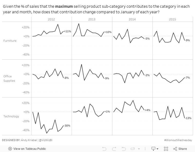

- How much the maximum selling product sub-category accounts for in a given month.
- How much that contribution has changed throughout the year.
The idea being that you would hope that irrespective of WHICH sub-category is the top selling, the contribution of the top selling product would remain steady. It's generally not good for one sub-category to account for too much in sales because then it could be a sign that you need to diversify. (Correct me if I'm wrong please).
Requirements:
- The line chart shows how the contribution of the top selling sub-category within each month has changed since January. That means you'll need to first figure out the value of the top selling category, then figure out the contribution of that sub-category within each month, then figure out how that contribution has changed compared to January within each year.
- Label the ends of each line. The label need to be right-justified horizontally and center-justified vertically. The label MUST NOT overlap the line at all.
- Match the format of my numbers.
- Match the tooltips.
- Match the title (easy peasy, just write what I wrote).
- Product categories are listed down the left.
- Years and Months are listed across the view.
- Month labels are hidden.
Download the data here.
If you have any questions, let me know. Please tweet a picture of your attempt, include a link to the viz on Tableau Public and be sure to tag @EmmaWhyte and @VizWizBI.
Good luck!!
March 3, 2010
I almost got sick
barchart
,
chartjunk
,
columnchart
,
contribution
,
excel
,
tables
No comments
This morning, I was on a conference call and someone presented this chart (I've changed the data and the data reviewed to keep me from getting in trouble, but the format of the chart remains intact).

Some of the issues I see:
Here are some options:


However, given the small set of data, would a simple table be best? Really all I care about are the problems. None of the charts above give that "pop." What would I do? I would create two tables.
First, the raw values.

Second, the percent of the total for each claim type.

Does anything stand out to you in these tables?
Some of the issues I see:
- Of course, the 3D perspective. BARF!
- The data labels on the bars...Are they really necessary to communicate the message?
- The background color choice gives me the impression I'm somewhere deep in space with all of that black.
- Stop-light colors. We all understand why people use stop light colors, but this doesn't work for those that are color blind.
- The cylinders. A flat bar is always a better choice.
- The angle of the chart leads you to believe the height of the bars is different, when in fact, they're all the same height.
Here are some options:
However, given the small set of data, would a simple table be best? Really all I care about are the problems. None of the charts above give that "pop." What would I do? I would create two tables.
First, the raw values.
Second, the percent of the total for each claim type.
Does anything stand out to you in these tables?
October 9, 2009
Afghanistan Troop Deployments
afghanistan
,
barchart
,
bubblechart
,
contribution
,
davidmcandless
,
flickr
,
Guardian
,
military
,
war
No comments
My favorite bubble man uploaded another doozy. This time he's displaying troop deployments to Afghanistan.

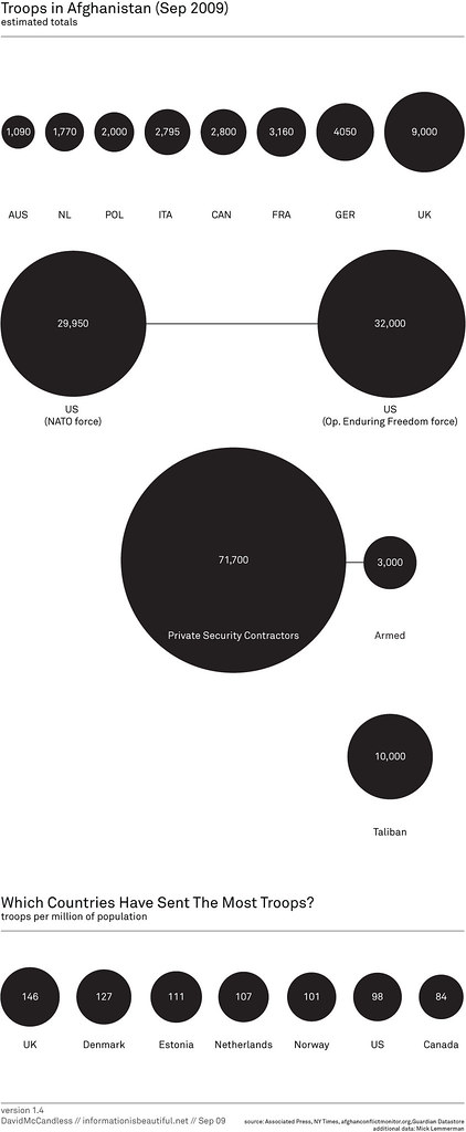
The first message that the bubbles are trying to communicate is simply the number of troops deployed.
I can see why he has the bubbles across the top; they're in a neat ascending order, but then the US is show below all of the other countries? Why aren't they all arranged together?
Also, what is the purpose of having all of the other types of "troops" on the chart? Finally, there is one pretty big issue with the data; where are all of the other countries that have sent troops?
Bubbles are a poor method of showing relative size. A simple bar chart works much better. Unlike the author, I have included "all other" countries.

The second message, which I cannot make heads or tails of, is the number of troops per million of the population. What is the purpose of this data and what insight can you possibly gain from it?
When I first saw this chart, I immediately tried to connect the bubbles at the top to the bubbles at the bottom, but it's impossible.
The title of the second chart is "Which countries have sent the most troops?" Ok, one more time, how could anyone possibly answer that question based on the troops per million of the population?
When I saw the question, I immediately though of a bar chart showing the percent of the total troops that each country has sent. I created this visualization below and added color to emphasize those countries that have more skin in the game.
From my visualization, you can see that the US has sent about 47% of the troops. In the bubble chart, I see the number 98. Which one do you think answers the question more appropriately?

If you really want to get sick, check out the rest of the author's bubble charts on this topic. I don't get the fascination with the bubbles...
* Data courtesy of The Guardian DataBlog
The first message that the bubbles are trying to communicate is simply the number of troops deployed.
I can see why he has the bubbles across the top; they're in a neat ascending order, but then the US is show below all of the other countries? Why aren't they all arranged together?
Also, what is the purpose of having all of the other types of "troops" on the chart? Finally, there is one pretty big issue with the data; where are all of the other countries that have sent troops?
Bubbles are a poor method of showing relative size. A simple bar chart works much better. Unlike the author, I have included "all other" countries.
The second message, which I cannot make heads or tails of, is the number of troops per million of the population. What is the purpose of this data and what insight can you possibly gain from it?
When I first saw this chart, I immediately tried to connect the bubbles at the top to the bubbles at the bottom, but it's impossible.
The title of the second chart is "Which countries have sent the most troops?" Ok, one more time, how could anyone possibly answer that question based on the troops per million of the population?
When I saw the question, I immediately though of a bar chart showing the percent of the total troops that each country has sent. I created this visualization below and added color to emphasize those countries that have more skin in the game.
From my visualization, you can see that the US has sent about 47% of the troops. In the bubble chart, I see the number 98. Which one do you think answers the question more appropriately?
If you really want to get sick, check out the rest of the author's bubble charts on this topic. I don't get the fascination with the bubbles...
* Data courtesy of The Guardian DataBlog
September 7, 2009
Bubbles Bubbles Everywhere
aoscott
,
barchart
,
bubblechart
,
contribution
,
internet
,
media
,
newyorktimes
,
piechart
,
stats
,
stephenfew
,
tableau
,
television
4 comments
The New York Times ran an article written by A.O. Scott back in November. The purpose is not to critique the article, but rather the, gasp, bubble chart used to rank media consumption hours.

I'm a big fan of Stephen Few and have learned a lot from Stephen and his books about effective visual design. Stephen point out that "Visual perception in humans has not evolved to support the comparison of 2-D areas, except as rough approximations that are far from accurate."
As soon as I saw this ranked bubble chart, I immediately began exploring other, more effective display mediums. Here are some examples.
I wanted to start by trying to find a way to use the bubble charts. The only method I could employ was to add color to the bubble charts, but I don't gain much at all.

Of course, the simplest way to rank data is through a simple bar chart. The first example is as intuitive as it gets; it's very easy to compare the relative size of the bars. The only purpose of this graph is to emphasize the rank.

I took this a step further. When reviewing Scott's bubble chart, I had the impression that he was emphasizing the percentage of time that we spend in each of the different medium. That led me to a bar chart that shows the contribution to the total. It's the same graphic as the ranking chart above, but this time I intentionally labelled the bars to emphasize the contribution of each activity.

I'll conclude with one of the least effective displays, the dreaded pie chart, but I think one of the pie charts is actually a bit effective. The first pie chart displays every category, which makes it impossible to compare the sizes and has way too much information.

I decided to group all but the top two categories into an "other" category to simplify the pie chart and I also ensured that they were ranked by contribution as you made your way around the pie.

Which display do you like best? Which display is most effective? My vote is for the bar chart displaying the contribution to the total.

I'm a big fan of Stephen Few and have learned a lot from Stephen and his books about effective visual design. Stephen point out that "Visual perception in humans has not evolved to support the comparison of 2-D areas, except as rough approximations that are far from accurate."
As soon as I saw this ranked bubble chart, I immediately began exploring other, more effective display mediums. Here are some examples.
I wanted to start by trying to find a way to use the bubble charts. The only method I could employ was to add color to the bubble charts, but I don't gain much at all.
Of course, the simplest way to rank data is through a simple bar chart. The first example is as intuitive as it gets; it's very easy to compare the relative size of the bars. The only purpose of this graph is to emphasize the rank.
I took this a step further. When reviewing Scott's bubble chart, I had the impression that he was emphasizing the percentage of time that we spend in each of the different medium. That led me to a bar chart that shows the contribution to the total. It's the same graphic as the ranking chart above, but this time I intentionally labelled the bars to emphasize the contribution of each activity.
I'll conclude with one of the least effective displays, the dreaded pie chart, but I think one of the pie charts is actually a bit effective. The first pie chart displays every category, which makes it impossible to compare the sizes and has way too much information.
I decided to group all but the top two categories into an "other" category to simplify the pie chart and I also ensured that they were ranked by contribution as you made your way around the pie.
Which display do you like best? Which display is most effective? My vote is for the bar chart displaying the contribution to the total.
Subscribe to:
Posts
(
Atom
)






