Showing posts with label parts-to-whole. Show all posts
October 13, 2025
Proportional Brushing in Tableau with Set Actions
analysis
,
contribution
,
how to
,
parts-to-whole
,
proportional brushing
,
set
,
set action
,
tableau
No comments

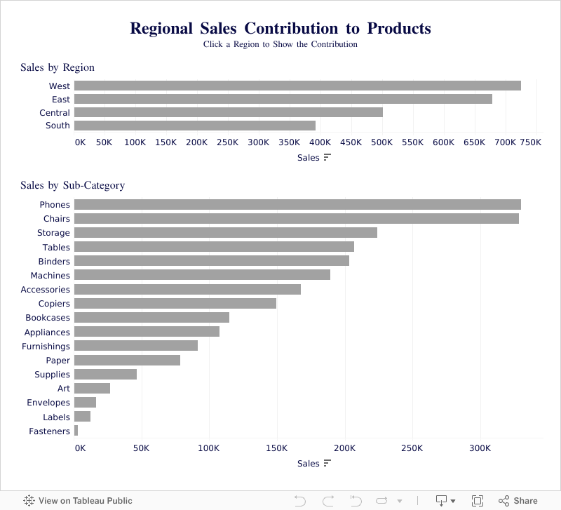
In this video, you'll learn how to use Proportional Brushing in Tableau to show contribution without filtering your data.
Most dashboards rely on filters. But sometimes your users need context, not isolation. In this tutorial, I’ll walk you step by step through how to build a proportional brushing interaction using Set Actions in Tableau.You’ll learn how to:
✅ Highlight a selected value in one chart
✅ Show how it contributes to a second chart
✅ Keep the full dataset visible without filtering
✅ Create a smooth, intuitive user experience with simple calculations
This technique is perfect for comparative dashboards, contribution analysis, and performance insights across categories.
Whether you’re building dashboards for executives, product teams, or sales leaders, this approach will help them see the full picture.
 🔗 Exclusive access to the workbook
---------
🔗 Exclusive access to the workbook
---------
To go deeper, check out my courses:
→ Tableau Starter Kit - A beginner-friendly course designed to help you understand Tableau quickly
→ Tableau Core Concepts - A comprehensive, self-paced course for Tableau users ready to level up
→ Join Next-Level Tableau - My most comprehensive Tableau program to help analysts become industry leaders, with the support of a like-minded community, and 1-to-1 help from me
📩 The Dual Axis Newsletter
Each week, I'll send you Tableau tips, tutorials, and strategies to design better dashboards, have more impactful, and stand out in your career: https://nlt.kit.com/
🔽 CONNECT WITH ME
• Official website - https://www.nextleveltableau.com/
• LinkedIn - https://www.linkedin.com/in/andykriebel/
May 1, 2024
Which chart should you use for your analysis?
analysis
,
chart chooser
,
charts
,
comparison
,
correlation
,
data analysis
,
data visualization
,
distribution
,
flow
,
geography
,
graphs
,
hierarchy
,
parts-to-whole
,
tableau
,
time series
No comments

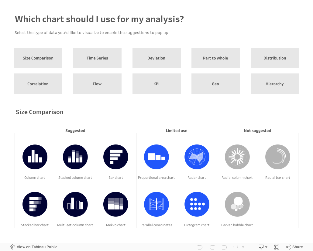
Over on Tableau Public, Judit Bekker create this fantastic directory of charts to help you pick the one that's most appropriate for your analysis.
Check it out below.
July 18, 2018
Financial Times Visual Vocabulary: Tableau Edition
alan smith
,
change over time
,
chart doctor
,
charts
,
correlation
,
deviation
,
distribution
,
financial times
,
flow
,
FT
,
magnitude
,
parts-to-whole
,
ranking
,
spatial
,
visual vocabulary
2 comments


Over the past month, I've been building all of these charts in Tableau so that everyone in the Tableau Community would have examples they could use and learn from. This has been quite the labor of love and I would like to thank the (best) team at The Information Lab for their support, reviews and feedback along the way.
There are 72 charts in total, most of which I built myself or with help of tutorials from the community. To build the violin plot, equalized cartogram, and heat map examples, I prepared the data in Alteryx and the output was shape files. The scaled cartogram was built using Tilegrams by Pitch Interactive based on this tutorial from Ken Flerlage.
While the people listed below may not have been the original creators of the charts, they are the resources I used to create the charts in my workbook.
Chart
|
Person
|
Link
|
|---|---|---|
| Diverging Stacked Bar | Steve Wexler | Data Revelations |
| Surplus/Deficit Filled Line | Jeffrey Shaffer | Data +Science |
| Violin Plot | Ben Moss | YouTube / Alteryx App |
| Sunburst Chart | Leonid Golub | Super Data Science |
| Arc Chart | Ken Flerlage | KenFlerlage.com |
| Venn Diagram | Leonid Golub | Super Data Science |
| Radar Chart | Adam McCann | Dueling Data |
| Scaled Cartogram | Ken Flerlage | KenFlerlage.com |
| Sankey Diagram | Leonid Golub | Super Data Science |
| Chord Diagram | Noah Salvaterra | DataBlick |
How to use this workbook
- Start on the Visual Vocabulary tab.
- Click on the text in any section to get to the chart types associated with that topic.
- To go back to the beginning, click on the Visual Vocabulary tab (NOTE: I'll add dashboard navigation buttons once Tableau releases that feature.)
- You should be able to swap your data out for any chart type fairly easily.
- Give credit to the creator of the chart as appropriate.
- If you want to see how that charts are built, email me and I'll we can have a chat.
Notes
- This is NOT meant to be an exhaustive list of charts that can be built with Tableau. This is based on the charts created by the Financial Times for the Visual Vocabulary.
- Actions are quite slow to respond on Tableau Public. If you download the workbook, it's much more responsive.
- There's a mobile version as well.
- Images of each set of charts can be found on Google Photos.
If you find what I've created useful, please share a link to this blog post to them. Any feedback you have is very much appreciated. Click on the gif below for the interactive version. Enjoy!
September 14, 2015
Makeover Monday: How Does Your State Size Up?
bar chart
,
economy
,
filled maps
,
gdp
,
howmuch.net
,
Makeover Monday
,
parts-to-whole
,
pie chart
,
population
,
treemap
,
United States
3 comments

After last week’s Makeover Monday, several people pointed me to this tweet from World Economic Forum, asking me to immediately give it some love.
It looks like WEF hired howmuch.net to create this tree-map pie chart thingy, as they have a more extensive write up about it here. I’ve used story points to review the visualisation, walk through a series of alternatives, and then conclude with an interesting tidbit about how uninteresting their data is.
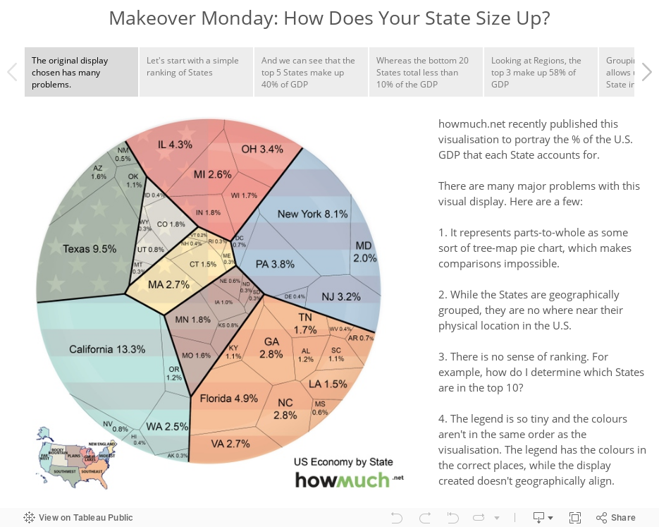
How much does each state contribute to the US economy? http://t.co/aykgGdkdMN #economics pic.twitter.com/07RHuVxtK6— World Economic Forum (@wef) September 7, 2015
It looks like WEF hired howmuch.net to create this tree-map pie chart thingy, as they have a more extensive write up about it here. I’ve used story points to review the visualisation, walk through a series of alternatives, and then conclude with an interesting tidbit about how uninteresting their data is.
September 7, 2015
Makeover Monday: The United Nations of Debt

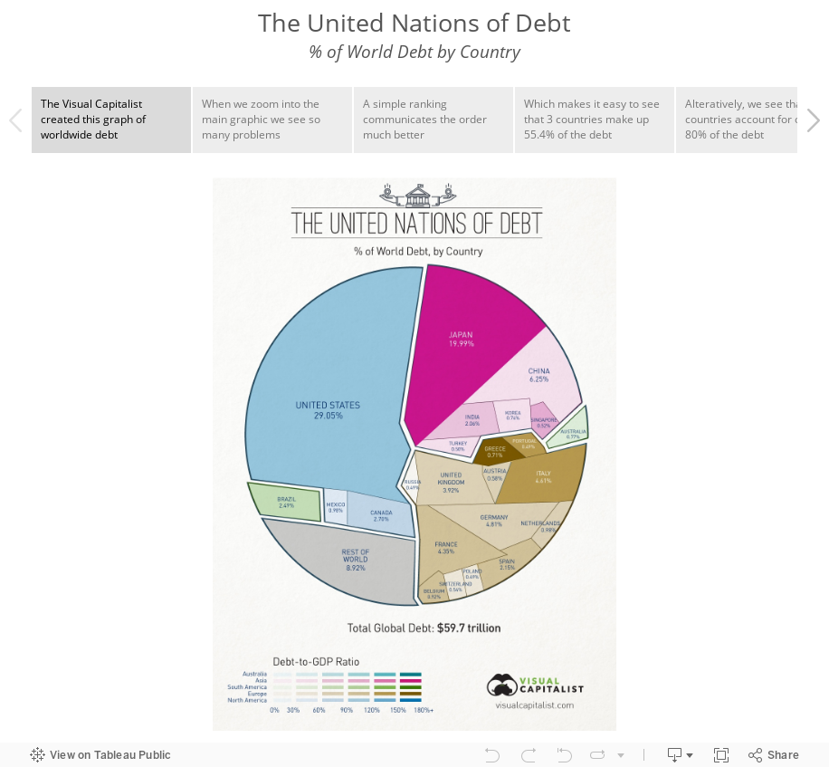
Several people pointed me to this graphic by Visual Capitalist. It's quite a bad way to represent parts-to-whole. In short, it's basically impossible to make any comparisons. I'm using story points this week to walk you through the makeover.
Subscribe to:
Posts
(
Atom
)






