Showing posts with label financial times. Show all posts
November 20, 2018
Fanalytics: Why I created the FT Visual Vocabulary in Tableau

On the last day of TC18, I had the honor of presenting at Fanalytics, the post-TC wrap up about the Tableau Public Community. The team asked me to present about the FT Visual Vocabulary that I built in Tableau, my motivations for doing so, and my thoughts about learning in general. For those that missed it, here are my slides and the presentation. Enjoy!
July 18, 2018
Financial Times Visual Vocabulary: Tableau Edition
alan smith
,
change over time
,
chart doctor
,
charts
,
correlation
,
deviation
,
distribution
,
financial times
,
flow
,
FT
,
magnitude
,
parts-to-whole
,
ranking
,
spatial
,
visual vocabulary
2 comments


Over the past month, I've been building all of these charts in Tableau so that everyone in the Tableau Community would have examples they could use and learn from. This has been quite the labor of love and I would like to thank the (best) team at The Information Lab for their support, reviews and feedback along the way.
There are 72 charts in total, most of which I built myself or with help of tutorials from the community. To build the violin plot, equalized cartogram, and heat map examples, I prepared the data in Alteryx and the output was shape files. The scaled cartogram was built using Tilegrams by Pitch Interactive based on this tutorial from Ken Flerlage.
While the people listed below may not have been the original creators of the charts, they are the resources I used to create the charts in my workbook.
Chart
|
Person
|
Link
|
|---|---|---|
| Diverging Stacked Bar | Steve Wexler | Data Revelations |
| Surplus/Deficit Filled Line | Jeffrey Shaffer | Data +Science |
| Violin Plot | Ben Moss | YouTube / Alteryx App |
| Sunburst Chart | Leonid Golub | Super Data Science |
| Arc Chart | Ken Flerlage | KenFlerlage.com |
| Venn Diagram | Leonid Golub | Super Data Science |
| Radar Chart | Adam McCann | Dueling Data |
| Scaled Cartogram | Ken Flerlage | KenFlerlage.com |
| Sankey Diagram | Leonid Golub | Super Data Science |
| Chord Diagram | Noah Salvaterra | DataBlick |
How to use this workbook
- Start on the Visual Vocabulary tab.
- Click on the text in any section to get to the chart types associated with that topic.
- To go back to the beginning, click on the Visual Vocabulary tab (NOTE: I'll add dashboard navigation buttons once Tableau releases that feature.)
- You should be able to swap your data out for any chart type fairly easily.
- Give credit to the creator of the chart as appropriate.
- If you want to see how that charts are built, email me and I'll we can have a chat.
Notes
- This is NOT meant to be an exhaustive list of charts that can be built with Tableau. This is based on the charts created by the Financial Times for the Visual Vocabulary.
- Actions are quite slow to respond on Tableau Public. If you download the workbook, it's much more responsive.
- There's a mobile version as well.
- Images of each set of charts can be found on Google Photos.
If you find what I've created useful, please share a link to this blog post to them. Any feedback you have is very much appreciated. Click on the gif below for the interactive version. Enjoy!
October 9, 2016
Makeover Monday: How satisfied are people with public transportation in some of Europe's biggest cities?
bar chart tooltip
,
Data Revelations
,
financial times
,
FT data
,
Likert
,
Makeover Monday
,
net promoter score
,
NPS
,
slope graph
,
stacked bar chart
,
survey
3 comments


I first saw this survey in print at Gatwick airport on my way to Prague, then it appeared in feedly. I know from speaking to John Burn-Murdoch that the print and online graphics standards are different. The print version I actually found easier to understand because it used blue for negative sentiment.
What works well?
- Clear sorting by very satisfied
- Sticks to their color guidelines
- Simple title
What could be done differently?
- Use different colours for the negative and positive sentiment
- Add an overall score (like net promoter score)
- Include 2012 for comparison so that you can see which of these cities improved
- Add a more descriptive title so it's even more clear what the audience is looking at
I used a few resources to help me create my final visualisation:
- Steve Wexler's post about Likert scales and Net Promoter Scores
- This Github page that has the official FT colors
- This knowledge base article for including barcharts in tooltips
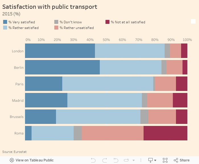
First, I recreated the FT viz, but with different colors for negative and positive sentiment. I also included bar charts in the tooltips.
Next, I included 2012 and labeled the bars where they fit.
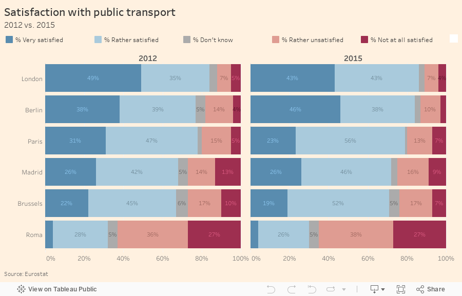
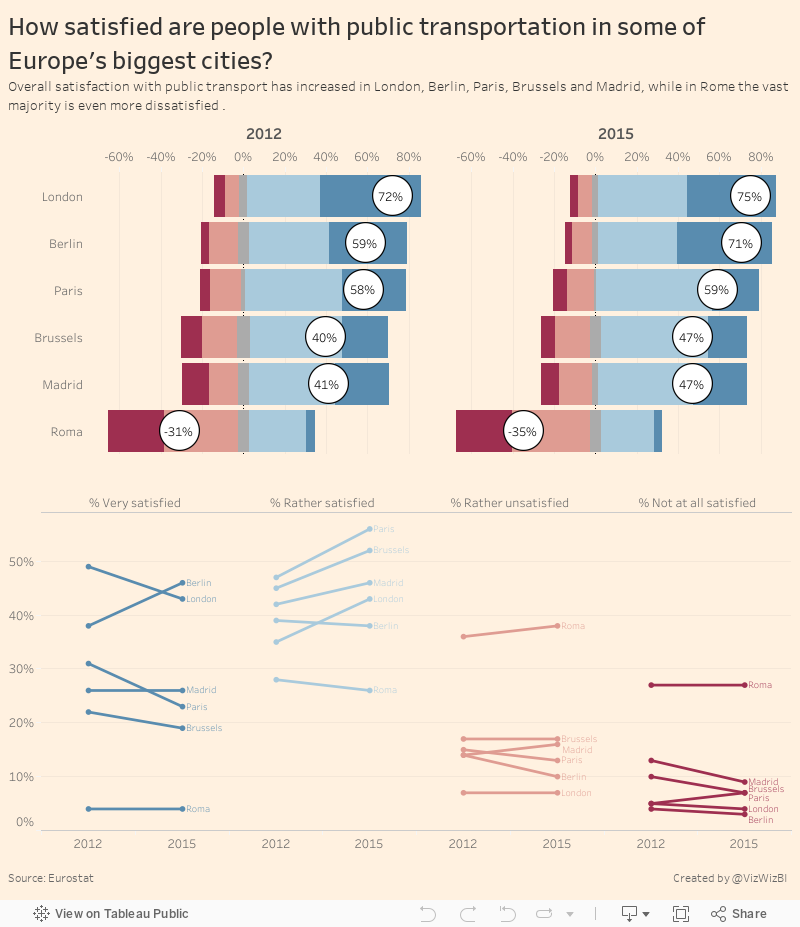
I don't particularly like the labels on the bars, so I've removed them from the final version. I also changed the bars to a Likert scale, which moves the negative to the left and positive to the right, and helps shows the discrepancy better. I also included the net promoter score.
Last, I added a slope graph to help show the change and included a more descriptive title and subtitle. You can click on any bar and it'll highlight in both places.
Subscribe to:
Posts
(
Atom
)






