Showing posts with label Likert. Show all posts
September 22, 2020
#TableauTipTuesday: How to Visualize Survey Data on a Likert Scale and Include a Net Promoter Score
diverging bar chart
,
Likert
,
negative
,
neutral
,
positive
,
responses
,
scale
,
survey
,
survey results
,
surveymonkey
,
tableau
,
Tableau Tip Tuesday
,
tip
,
visualization
No comments

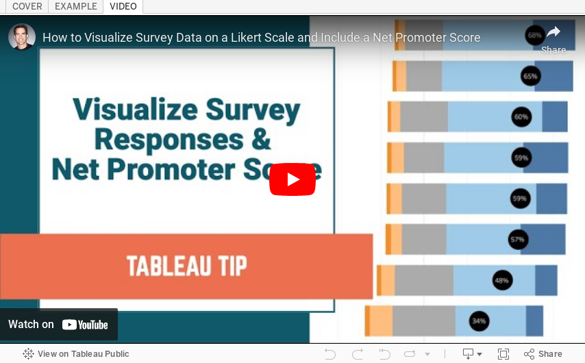
We've all answered Likert scale questions. These are questions like "How likely are you to recommend our product?" and they are typically on a five point scale (e.g., from not at all to very highly likely).
In this video, I show you how to visualize Likert scale data and how to include a Net Promoter Score (NPS). To get the data that I used, simply download the workbook and unzip it. You will then see a folder named "Data".
Useful links:
1. What is a Likert Scale? http://bit.ly/LikertSurveyMonkey
2. What is a Net Promoter Score? https://www.netpromoter.com/know/
October 9, 2016
Makeover Monday: How satisfied are people with public transportation in some of Europe's biggest cities?
bar chart tooltip
,
Data Revelations
,
financial times
,
FT data
,
Likert
,
Makeover Monday
,
net promoter score
,
NPS
,
slope graph
,
stacked bar chart
,
survey
3 comments


I first saw this survey in print at Gatwick airport on my way to Prague, then it appeared in feedly. I know from speaking to John Burn-Murdoch that the print and online graphics standards are different. The print version I actually found easier to understand because it used blue for negative sentiment.
What works well?
- Clear sorting by very satisfied
- Sticks to their color guidelines
- Simple title
What could be done differently?
- Use different colours for the negative and positive sentiment
- Add an overall score (like net promoter score)
- Include 2012 for comparison so that you can see which of these cities improved
- Add a more descriptive title so it's even more clear what the audience is looking at
I used a few resources to help me create my final visualisation:
- Steve Wexler's post about Likert scales and Net Promoter Scores
- This Github page that has the official FT colors
- This knowledge base article for including barcharts in tooltips
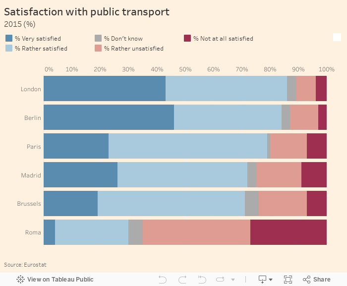
First, I recreated the FT viz, but with different colors for negative and positive sentiment. I also included bar charts in the tooltips.
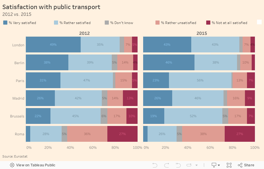
Next, I included 2012 and labeled the bars where they fit.
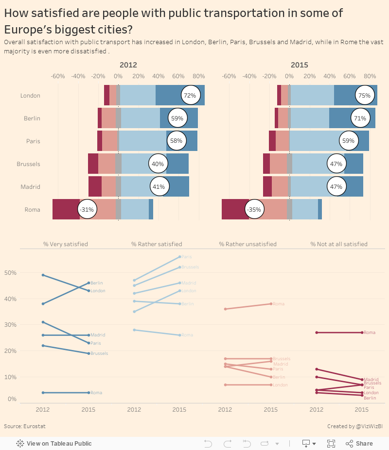
I don't particularly like the labels on the bars, so I've removed them from the final version. I also changed the bars to a Likert scale, which moves the negative to the left and positive to the right, and helps shows the discrepancy better. I also included the net promoter score.
Last, I added a slope graph to help show the change and included a more descriptive title and subtitle. You can click on any bar and it'll highlight in both places.
Subscribe to:
Posts
(
Atom
)






