October 9, 2016
Makeover Monday: How satisfied are people with public transportation in some of Europe's biggest cities?


I first saw this survey in print at Gatwick airport on my way to Prague, then it appeared in feedly. I know from speaking to John Burn-Murdoch that the print and online graphics standards are different. The print version I actually found easier to understand because it used blue for negative sentiment.
What works well?
- Clear sorting by very satisfied
- Sticks to their color guidelines
- Simple title
- Use different colours for the negative and positive sentiment
- Add an overall score (like net promoter score)
- Include 2012 for comparison so that you can see which of these cities improved
- Add a more descriptive title so it's even more clear what the audience is looking at
- Steve Wexler's post about Likert scales and Net Promoter Scores
- This Github page that has the official FT colors
- This knowledge base article for including barcharts in tooltips
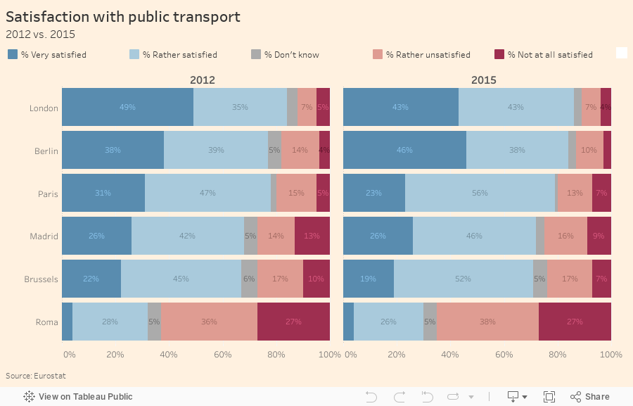
Next, I included 2012 and labeled the bars where they fit.
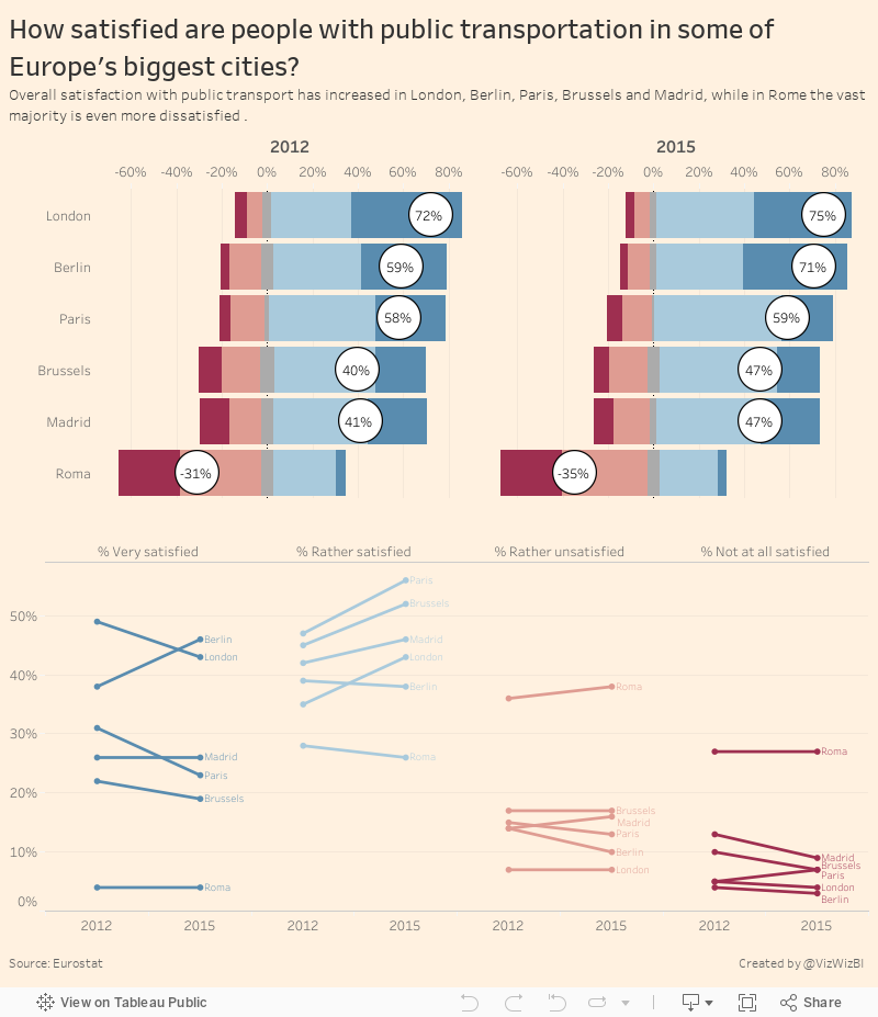
I don't particularly like the labels on the bars, so I've removed them from the final version. I also changed the bars to a Likert scale, which moves the negative to the left and positive to the right, and helps shows the discrepancy better. I also included the net promoter score.
Last, I added a slope graph to help show the change and included a more descriptive title and subtitle. You can click on any bar and it'll highlight in both places.
November 7, 2011
Makeover of a Makeover – Waterfall vs. Side-by-side Bar Chart
One of the great things about the data viz world is that people are always willing to listen, learn and share. Cole Nussbaumer over at storytelling with data (a great blog you should follow) recently conducted a visual makeover on some horrible charts submitted during a class she was teaching. and she was willing to share her data with me so that I could make my own viz. Where else do you experience such camaraderie?
The improvements she recommends are fantastic, but I recommended one improvement to this chart she created:

Typically when I see side-by-side bar charts I’m looking to compare the bars that are next to each other. However, in this case, the bars are not necessarily related; they are simply a list of expenses and income next to each other. I recommended she create a waterfall chart like this one done with Tableau:

To me, a waterfall chart communicates the expenses vs. income story of this data more effectively
- The bar sizes make comparisons easy. It’s clear that Programs are the largest expense and Grants are the largest income.
- You can easily see the total variance without having to do the math in your head.
- Other Expenses are much larger than Other Income. I wonder what’s included in those expenses. Looks like an area for investigation.
- This group should probably focus a bit more on Sponsorships so that they’re not so dependent on Grants.
I could have included labels for all of the bars, but I wanted to show the patterns and relative sizes without the numbers being a distraction.
You can download the original Excel data here and/or the Tableau workbook here.
P.S. I chose red/green bars for two reasons: (1) most people understand red as negative and green as positive when reading financial figures and (2) to annoy my friend Steve Wexler of the Data Revelations blog (another you should follow), who hates this color scheme more than anyone I know.






