October 2, 2018
Storytelling With Data Challenge: Annotated Line Graph
I'm going all the way back to her first challenge in January: Annotated Line Graph. For me, it's been tough to learn the balance between enough text for context and too much that overwhelms. I feel like I'm splitting the difference here, by highlighting the highs and lows of Tableau's stock price.
Thanks for the challenge Cole! Click on the image for the interactive version.

June 1, 2015
Makeover Monday: China Is Poised to Surpass the Americas as Apple's Largest Market


- It’s very hard to compare stacks in a bar chart over time because each stack is influenced by those stacks below it.
- The title of the article and the chart don’t match. The article says China vs. the US, but the chart is China vs. the Americas.
- There is not enough emphasis on the comparison. The rest of the regions should fall to the background.
- I don’t like the legend above the chart in this case because I’m constantly having to go back and forth.
For the makeover, I’m going back to some of the things I learned in Cole Nussbuamer’s fantastic course about emphasising the data that you want people to pay attention to.
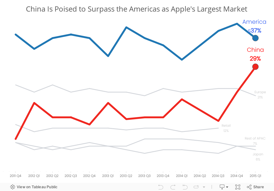
Here’s what I’ve done differently:
- I changed the title to reflect the purpose of the story.
- I changed the chart to a line chart to make it easier to see the trends for each region.
- I’m only emphasising the Americas and China. The rest of the regions are in a light grey.
- I’ve added annotations to make it easier for the reader to see the values.
- I removed the color legend as it’s not necessary since I’ve labeled the end of each line.
Which version do you prefer? What would you do differently? There are so many ways to redesign charts and no single way is 100% correct.
November 7, 2011
Makeover of a Makeover – Waterfall vs. Side-by-side Bar Chart
One of the great things about the data viz world is that people are always willing to listen, learn and share. Cole Nussbaumer over at storytelling with data (a great blog you should follow) recently conducted a visual makeover on some horrible charts submitted during a class she was teaching. and she was willing to share her data with me so that I could make my own viz. Where else do you experience such camaraderie?
The improvements she recommends are fantastic, but I recommended one improvement to this chart she created:

Typically when I see side-by-side bar charts I’m looking to compare the bars that are next to each other. However, in this case, the bars are not necessarily related; they are simply a list of expenses and income next to each other. I recommended she create a waterfall chart like this one done with Tableau:

To me, a waterfall chart communicates the expenses vs. income story of this data more effectively
- The bar sizes make comparisons easy. It’s clear that Programs are the largest expense and Grants are the largest income.
- You can easily see the total variance without having to do the math in your head.
- Other Expenses are much larger than Other Income. I wonder what’s included in those expenses. Looks like an area for investigation.
- This group should probably focus a bit more on Sponsorships so that they’re not so dependent on Grants.
I could have included labels for all of the bars, but I wanted to show the patterns and relative sizes without the numbers being a distraction.
You can download the original Excel data here and/or the Tableau workbook here.
P.S. I chose red/green bars for two reasons: (1) most people understand red as negative and green as positive when reading financial figures and (2) to annoy my friend Steve Wexler of the Data Revelations blog (another you should follow), who hates this color scheme more than anyone I know.






