March 27, 2024
8 Reasons Power BI isn't "FREE"
September 22, 2020
#TableauTipTuesday: How to Visualize Survey Data on a Likert Scale and Include a Net Promoter Score

We've all answered Likert scale questions. These are questions like "How likely are you to recommend our product?" and they are typically on a five point scale (e.g., from not at all to very highly likely).
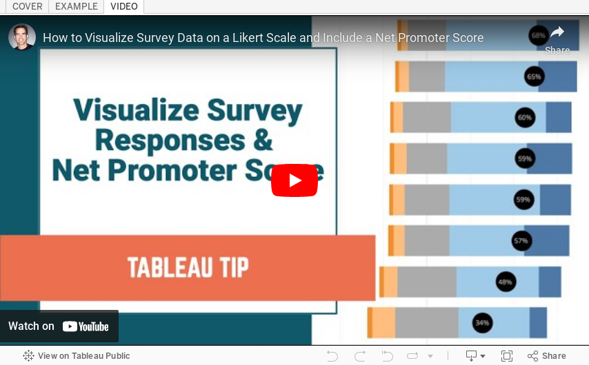
In this video, I show you how to visualize Likert scale data and how to include a Net Promoter Score (NPS). To get the data that I used, simply download the workbook and unzip it. You will then see a folder named "Data".
Useful links:
1. What is a Likert Scale? http://bit.ly/LikertSurveyMonkey
2. What is a Net Promoter Score? https://www.netpromoter.com/know/
August 15, 2012
Data viz exercise: Find all possible ways to visualize a ludicrously small data set of two numbers
I was teaching a data viz class at work yesterday and I tried an exercise that I’ve never done before. The idea came from this blog post by Santiago Ortiz on visual.ly.
To set that stage, we covered attentive vs. preattentive processing, three forms of preattentive processing (I skipped motion), and the Gestalt principles of visual perception. Nothing ground breaking there, but a necessary base/toolkit that everyone should have.
After the initial training, I had them grab some markers, head to the white board, and think of as many possible ways to visualize two simple numbers: 75 and 37.
At the end, we picked the best visualization.
Here’s a sample of what they came up with (there was plenty more to the left and right):

Like the author of the blog post, I had no idea how this would go. It could have been a total flop, but it was the exact opposite. We spent a good hour discussing two simple numbers! And it was incredibly rich discussion. We went through each and every sample, discussed the pros and cons, and compared them all to determine which one we like best.
What I found very interesting was that everyone made an assumption that the base was 100, but the directions never said that. All I gave them was two numbers. This led to an awesome discussion about needing context when presenting data.
Give it a shot! Grab a few fellow data viz nerds and do this at lunch. Or better yet, over dinner and beers.
May 11, 2012
Get your Tableau Viz of the Day and get Tableau daily goodness
As of today, Tableau will be "sharing one beautiful visual story a day". How cool is that?
Subcription/follow options include:
May 20, 2011
Are you a data rock star? If so, strut your stuff for a chance to win an iPad2
All of the details can be found here.
Enter Now to Win…
It's easy to enter the competition and you could win:
- Recognition from a panel of industry experts in journalism, data visualization and design
- Your name and work promoted across the web
- A proud and noteworthy addition to your portfolio, website or CV
- A full post profiling you and your work, and the design process you followed
- A signed copy of Information is Beautiful by David McCandless
- A brand new iPad2
It's An Open Brief
- The competition is based on the data collected by David, and other sources listed within the dataset. However, you are free to mash up the data with any other source you wish, provided the sources are publicly available and cited in your entry to the competition.
- Your visualization can be static, moving or interactive
- You can include as little or as much text as you like
- It can be as simple as a single chart or a full-blown infographic
The Datasets
- You can find find the data collected by David McCandless here
You may also find the following resources useful
And Remember, the Competition Closes at 11pm GMT on Monday 20th June 2011.
September 14, 2010
David McCandless: The beauty of data visualization
Some quotes that stuck with me:
- Relative figures are needed to connect to other data so we can see a fuller picture that can lead to us changing our perspective.
- Data can change your perspective and change your mind midstream.
- Design is about solving problems and providing elegant solutions. Information design is about solving information problems.
- Visualizing information can give us a very quick solution to problems. We can get clarity or the answer to a simple problem very quickly.
Pass it along!






