August 22, 2014
Spreading the Gospel of Data Viz & Tableau at Facebook: The VizWiz Tour
My first stop was back at my old stomping grounds at the Atlanta Tableau User Group, where Andy Piper and John Hoover of Norfolk Southern hosted over 100 people. A few days later I was preaching again to a group of about 50 at the San Diego Tableau User Group, where Matt Shoemaker of Interactions Marketing and Ben Sullins of Pluralsight hosted the event.
Tuesday marked the culmination of the mini-tour, with 2014 IronViz contestant Jeffrey Shaffer of Unifund and Jonathan Pickard, the leader of the Cincinnati Business Intelligence & Analytics group, hosting the event at the amazing Linder College of Business at the University of Cincinnati. They really have something special going on at UofC in the business analytics space. If you're looking for great analytical talent, they definitely need to be on your list of places to visit and connect with.
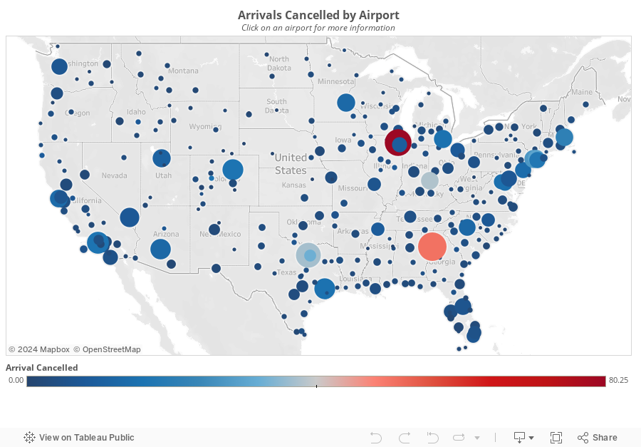
There were about 100 people in attendance, all armed with Tableau Public, data about airline delays, great questions and an incredible appetite to learn.

The format of my talks during this tour generally followed this three-hour agenda:
- Hour 1: Presentation – Building a data viz & Tableau culture; How we did it at Facebook & how you can do the same
- Hour 2: Tableau Training - Fundamentals for analyzing an unfamiliar data set
- Hour 3: Group exercise and viz presentations
One of the things I like to do when giving these talks is to ask the audience why they are there. This way, I can customize the talk along the way to make it more suitable for them and to ensure they get the most value out of it. The drawback of this approach is that the talk tends to go on longer than one hour, which was the case Tuesday.
To accommodate for my long-windedness, we decided as a group to skip the group activity and focus on the Tableau training. The fact that every person in the audience came prepared with Tableau installed was a HUGE help and a big time-saver. When I teach, my goal is to overwhelm the class. I have always felt that when learning Tableau, you should drink from the fire hose. I move very fast in the training, yet I don't leave anyone behind. The class will often feel that I'm moving way too quickly at the start, but I do that intentionally, so that they learn how easy it is to build in Tableau.
The class of 100 was comprised of only a handful of people that had been using Tableau for more than one year, with about 80% of the class getting a taste of Tableau for the very first time. In 90 minutes, we build 17 different worksheets and one interactive dashboard. You can download the workbook here. This training session was really fun because I had to hold a mic the whole time; this meant I was teaching and building vizzes one-handed. We covered a few major areas, while using the Show Me only once (I like to teach people how to build visualizations without it):
- Bar charts: Ranked bars, Small multiples, Stacked bars, Side by side bars, Stacked % of Total, Bar in bar, histograms
- Line charts: Basic line chart, Multiple lines, Year over year, Small multiples, Forecasting, Moving avg, Area chart
- Maps: Dot maps, Colored dot map, Sized dot map, Sized and colored dots
November 4, 2013
Data Viz, Facebook, and you. Join our awesome team!
An overview of the role can be found on Facebook Careers.
It's been quite challenging to find strong candidates.
Why don’t people meet the bar?
- Overstating Tableau skills
- Overstating SQL skills
- Too much dependency on tools to do the thinking
- Lack of product sense
- Too much dependency on data engineers
- Strong ability to tell stories with data
- Strong in data visualization
- Competent in SQL
- Be able to demonstrate excellent product sense (i.e., Can you pick up products goals, concepts and requirements quickly?)
- Tool-agnostic critical thinkers
June 13, 2013
How many ways can Facebook Dublin team visualize simple data?
After an incredible Tableau conference in London, I headed to Dublin for two more days of data viz and Tableau training. Today’s class was about brain games and data visualization, my favorite class to teach.
I end the class with a simple exercise that I want to share.

I don’t remember where I found this idea on the web, but credit to whoever came up with the idea. (UPDATE 14-Jun: Thank you to readers Michael Cristiani and Joey for reminding me that it came from this post from Santiago Ortiz on the visual.ly blog!)
It always amazes me how many different ideas people come up with. The purpose isn’t necessarily to get them to only use what they’ve learned; it’s more of a way for them to be creative and have some fun. Inevitably several people create pie charts, the only reason being that they know I hate them.

There were about 25 people in the class and they came up with 73 ideas in about 10 minutes. Pretty good ROI!
April 23, 2013
Notes from the Visual Business Intelligence Workshop: Day 3 – Now you see it
Day 3 of the Visual BI workshop was the day I was looking forward to the most. I was very interested in hearing Stephen’s approach for analyzing data, which he covers in his book Now you see it. There was one common theme throughout: keep things simple and clear, but don’t dumb it down.
Here are my key takeaways/notes:
- The word “see” in the title represents the analytical thought process: Search => Examine => Explain (SEE)
- Things to look for in a skilled data analyst: interested in the data, curious, self-motivated, imaginative, open minded and flexible, skeptical, honest, has a sense of what’s worthwhile, attentive, methodical, analytical, synthetical, has an eye for patterns, knowledge of the data, knowledge of effective data analysis practices
- The context we perceive is influenced by the surroundings.
- Exceptions can be a result of:
- Erroneous data
- Extraordinary events
- Extraordinary entities
- Randomness
- Highlight exceptions that are out of the range of “normal” or “standard”
- Always ask “Compared to what?”
- The tools we use need to make common interactions easy. The tools should allow the train of thought to continue.
- Cycle plots are useful for cyclical and linear patterns.
- Linear trend lines on time series can be misleading; use with caution! Consider moving averages as an alternative.
- Log scales are useful for measuring rates of change. Lines with similar slopes will have similar rates of change.
- When looking for leading and lagging indicators, it can be useful to shift the time of one of the indicators.
- Bump charts are a good way to see how rankings change across different dimensions or measures. Learn how to build one in Tableau here.
- The mean represents the quantitative center and is highly influenced by outliers. If you want to look at dispersion around the mean, use standard deviation.
- The median represents the ordinal center and is better than the mean for showing the “typical” value. If you want to look at dispersion around the median, use percentiles.
- It’s a good to idea to start an analysis by looking at a distribution of all values. This will help you quickly identify outliers and the overall shape of the data.
- You shouldn’t remove outliers from an analysis until you understand why they are outliers.
- This is a really cool analysis of pay ranges by level and gender. You could easily include a strip plot on this.

That’s it! Three days of learning that I’ll never forget. These courses were easily worth the money. You’ll be able to apply so much immediately upon returning to your regular job.
April 22, 2013
Notes from the Visual Business Intelligence Workshop: Day 2 – Information Dashboard Design
Day two of Stephen Few’s three-day Visual Business Intelligence Workshop centered around his book Information Dashboard Design. This class included quite a bit of critiquing of dashboards from “BI” vendors, a look at some of the better work, and a bit of hands on creating our own designs.
Like day one, these are the key points I wrote down (nowhere near the entire content of the course) that we should all reinforce in our work.
- Well designed dashboards and well designed software allow for rapid visual monitoring, which has a three-phase analytical approach:
- Scan the big picture
- Zoom in on important details
- Links to supporting detail
- The visual display of a dashboard needs to match the reader’s mental model. If the reader does not have a mental model, then you should sit with them to develop one. Avoid asking them “What do you want your dashboard to look like?”, rather get a sense for what questions the reader expects to be able to answer.
- Be aware of the 13 common mistakes in dashboard design
- A great way to convince people of how simple data visualize can be is through Stephen’s “Graph Design IQ Test”. Answering the questions wrong is pretty funny.
- There are four characteristics of a good dashboard design:
- Exceptional organization
- Data is condensed in summaries
- Data is specific to and customized for the task at hand
- Concise, clear and often contain small display mechanisms
- Never ask people what they want their dashboard to look like.
- Common dashboard data consists of:
- Measures of what’s currently going on
- Each compared to something to provide context
- Each evaluated to declare its qualitative state
- Don’t design a dashboard only to highlight problems and exceptions. The dashboard should be meaningful even when all is well.
- Objectives of visual design:
- Eliminate clutter and distraction
- Group data into logical sections
- Highlight what’s most important (Place what’s always important on the upper-left)
- Support meaningful comparisons / give your data context (this was a them that came up over and over again)
- Design for aesthetic appeal (but don’t add fluff to add fluff)
- Use soft, natural colors
- Soften the background of the dashboard (Stephen likes to use a soft yellow)
- Charts and text should be crisp and clear
- Use good fonts (stick to Sans Serif on dashboards)
- Only include one font style per screen
- Navigating to additional important needs to be easy and should support our train of thought.
- Scan the big picture
- Zoom in on important specifics
- Link to supporting details
April 17, 2013
Notes from the Visual Business Intelligence Workshop: Day 1 – Show Me the Numbers
Stephen Few is running his three-day Visual Business Intelligence Workshop this week in Austin, TX. He and I had been emailing back and forth and he thought maybe this wouldn’t be a worthwhile course for me, but I told him that I strongly believe that seeing someone teach in person is way better than reading books and sitting on webinars. You simply can’t get the same level of interaction and communication without attending or conducting training live, in person. I see this every time that I run training classes; those classes that are in person are way better.
Day one of the course, based on Stephen’s book Show Me the Numbers, has exceeded my expectations. I’ve read all of Stephen’s books, so yes, much of the material was repeat, but the discussions in the class and hearing Stephen explain, in detail, his beliefs, extended the content way beyond what the book could possibly cover.
Here are some of the key reinforcements and takeaways I noted from Tuesday’s class. Many of these are “duh, of course” type of notes, yet good to always be reinforced. This is a brain dump, so don’t expect any semblance of fluidity in my notes.
- You should strive to include context and comparisons in every table of chart you create.
- Line charts do NOT have to start at zero because you’re looking at patterns, unlike bars, which must start at zero because you’re comparing lengths.
This was a big question I had before the course. I typically always create line charts that include zero, but now I understand better why that’s not always necessary. In the end, the patterns of the lines are easier to see when you do not start at zero. Be careful though, you may have to alert your audience that the axis does not start at zero if they’re unfamiliar with the data.
- There are eight types of relationship graphs:
- Time series
- Ranking
- Part-to-whole or contribution
- Deviation
- Distribution
- Correlation
- Geospatial (note this is different than geographical)
- Nominal comparison
- “Don’t bury the truth under a layer of beauty or abstraction.”
- There are four primary methods for encoding values:
- Points
- Lines
- Bars
- Boxes (which represent ranges of low values to high values)
- ColorBrewer.org is a great resource for understanding color choices.
- Adding data points to line charts is good for making comparisons between lines, but keep them light & small. Don’t use separate shapes if you’ve colored the lines.
- Bubble size is appropriate to use for data points if precise comparisons are not required.
- Avoid dual-encoding. I’m glad I asked about this, because it’s a practice I employ, but no longer will.
As an example, if you’re looking at a map that has a circle for each state that is sized by sales, you should not also color the circle by sales. If you want to use color, it should be another element that adds to the interpretation (like profit ratio).
- This one shocked me – It’s ok to use pie charts on maps (assuming there aren’t but two or three slices) because there’s no better way to subdivide bubbles on a map. In other words, pie charts are your only choice in this case.
- Three good examples of representing a single distribution are histograms, frequency polygons and strip plots. I’ve never used the latter two, so I’m going to be looking into those more.
- Colors:
- Use only soft, natural colors. Tableau’s medium palette works well.
- Use fully saturated colors for emphasis, otherwise they become visually exhausting.
Of course there was way more content than this; these were merely the key points that I wanted to ensure I reinforced to myself. Look for summaries of the next two course as the week progresses.
January 19, 2013
Developing a visualization concept solution – The Andy Kirk way
Last Friday I had the pleasure of attending Andy Kirk’s full-day ‘Introduction to Data Visualisation’ training course with four of my colleagues from Facebook. If you don’t know Andy, he’s the person behind the excellent data viz website Visualising Data and author of the new book ‘Data Visualization: a successful design process’ (I get my hands on a copy sometime next week). If Andy’s ever in your area (or your company is ok with a bit of travel expense), I highly recommend his course.
In the course, Andy outlines an five-step design methodology:
- Establishing purpose and identifying parameters
- Acquire, prepare and explore your data to begin familiarisation
- Establish editorial focus about your subject matter
- Conceive your visualisation design
- Construct, launch and evaluate your visualisation solution
After each of these steps there’s a hands-on group exercise to put each methodology into practice. The final exercise, “Develop a visualisation concept solution”, required us to take a set of data that was a bit messy (I think Andy did this intentionally but he wouldn’t admit to it), and apply all of the lessons we learned to improve this viz (click on it to make it larger).

The idea was to start with a blank slate, intentionally walk through each step of the design methodology and see what you can build in 45 minutes. Each team then presented back to the class.
Our team consisted of a MicroStrategy trainer, a data engineer, a BI engineer and myself. It was such a great experience to build something together and talk through our design…BEFORE we built anything. Here’s what we came up with:

Andy’s design methodology worked perfectly! I was amazed at how simple it was to create a usable design, in a short period of time, by slowing down and asking questions that help organize your thoughts. When I teach, I recommend asking questions as well, but the way Andy recommended asking questions was a bit different than I had done it before. I can’t wait to use it on a real project.
Thanks Andy, not only for this fabulous course, but for coming to speak to us at Facebook as well.
August 15, 2012
Data viz exercise: Find all possible ways to visualize a ludicrously small data set of two numbers
I was teaching a data viz class at work yesterday and I tried an exercise that I’ve never done before. The idea came from this blog post by Santiago Ortiz on visual.ly.
To set that stage, we covered attentive vs. preattentive processing, three forms of preattentive processing (I skipped motion), and the Gestalt principles of visual perception. Nothing ground breaking there, but a necessary base/toolkit that everyone should have.
After the initial training, I had them grab some markers, head to the white board, and think of as many possible ways to visualize two simple numbers: 75 and 37.
At the end, we picked the best visualization.
Here’s a sample of what they came up with (there was plenty more to the left and right):

Like the author of the blog post, I had no idea how this would go. It could have been a total flop, but it was the exact opposite. We spent a good hour discussing two simple numbers! And it was incredibly rich discussion. We went through each and every sample, discussed the pros and cons, and compared them all to determine which one we like best.
What I found very interesting was that everyone made an assumption that the base was 100, but the directions never said that. All I gave them was two numbers. This led to an awesome discussion about needing context when presenting data.
Give it a shot! Grab a few fellow data viz nerds and do this at lunch. Or better yet, over dinner and beers.
May 11, 2012
Get your Tableau Viz of the Day and get Tableau daily goodness
As of today, Tableau will be "sharing one beautiful visual story a day". How cool is that?
Subcription/follow options include:






