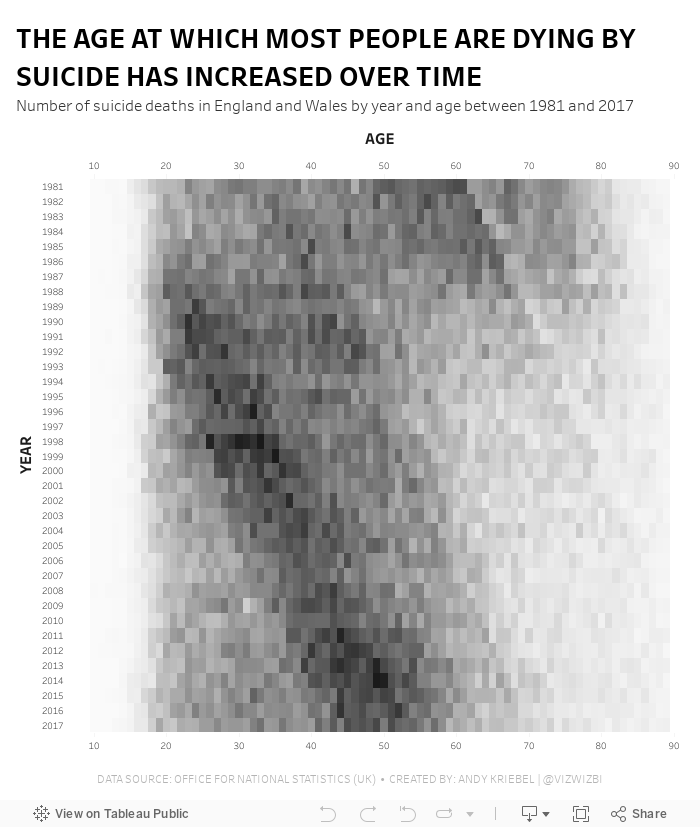
October 20, 2019
#MakeoverMonday: The Age at Which Most People Are Dying by Suicide Has Increased Over Time

- It's a simple data set.
- The original visualization is really good.
What Works Well?
- The patterns are super intuitive to see and understand.
- Amazing interactivity that allows you to look at an entire year without the overlap of the other years.
- Nice annotations
- Years and ages are in the appropriate order
- Using the intensity of a single color to emphasize the number of suicides
- The number of axis ticks could be reduced to every five or ten years.
February 8, 2016
Makeover Monday: How Many Blacks Did the Police Kill in 2015?

This week's Makeover Monday was much harder than I anticipated and I must note that it took me way, way over an hour to create something I was happy with (more about that in a bit). The website that we reviewed had a series of three charts about police killings in the United States. I'll focus on the first two:

What works:
- Good title and subtitle
- Bars are sorted properly
- Using a rate is good practice because it normalizes the data
- Using a different color of the U.S. average
What doesn't work:
- I hate charts that make me turn my head sideways to read the labels.
- I would have the U.S. average as a reference line.
- There's no sense for the rest of the population.
- It feels like there's more to the story.
Ok, so how about the second chart:
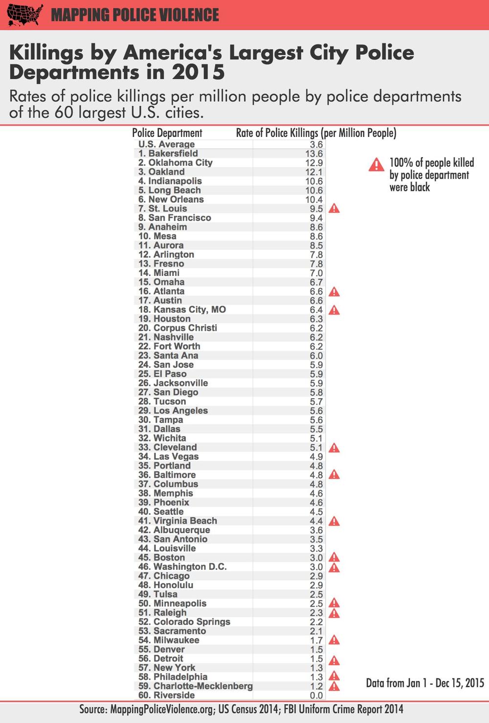
What works:
- Good title and subtitle
- Ranking the police departments
- Using a rate is good practice because it normalizes the data
- Calling out those that police departments that have only killed blacks
What doesn't work:
- I almost didn't notice the U.S. average (it's above the first police department).
- The column headers should wrap so they fit better.
- Again, it feels like there's more to the story.
- The table makes comparing police departments harder than necessary.
A quick bit of background before we get to my viz. Last week, we brought Caroline Beavon to the Data School to teach an infographics and information visualisation course. I would highly, highly recommend the course. It was a perfect blend of the courses that Andy Kirk and Cole Nussbaumer teach if you've ever been to their classes. We learned a ton about knowing your audience, choosing the aim for your visualisation and picking out the proper story in the data. In addition, we designed several infographics, which is something I was particularly excited to put into practice this week. With that being said, here's is my makeover of the two original charts, but really, it's completely different and delves much deeper into the story the data is trying to tell.
You can download the workbook from Tableau Public here.
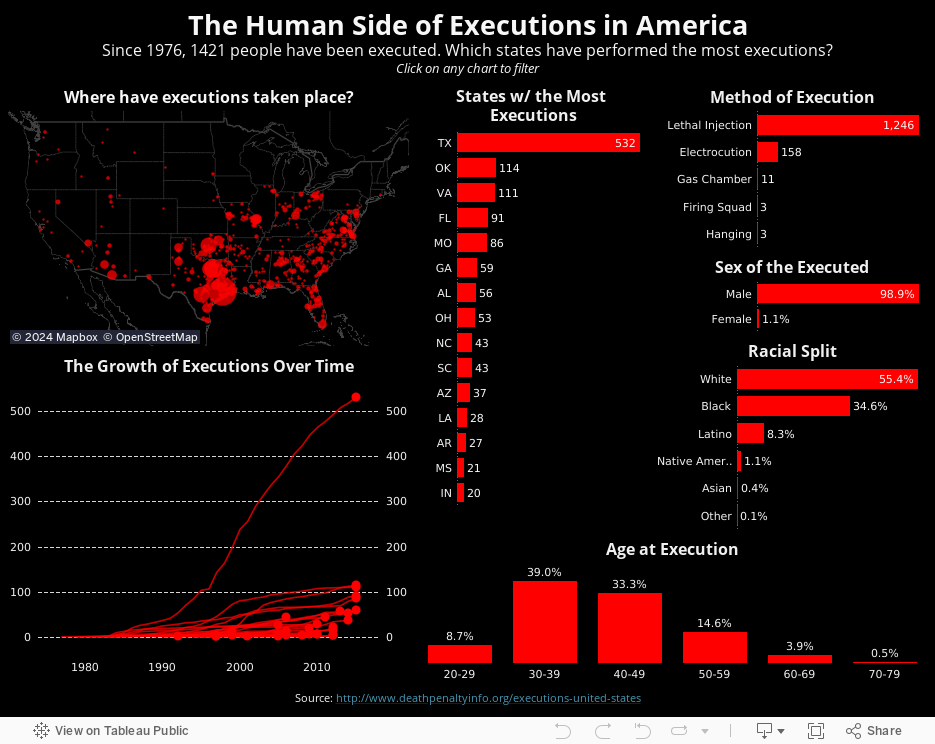
December 7, 2015
Makeover Monday: The Human Side of Executions in America

For this week's Makeover Monday, I take a look at this visualisation I saw on FlowingData.

What works well?
- Nice summary table
- Impactful
- The chart needs a title.
- There are too many colours on the line chart to distinguish and unless you pay attention carefully, you might not notice that the legend is actually the text on the table.
- The scale of the line chart distorts the view and the non-linear scaling is not called out.
- The line chart should have about a 3x2 scale; this one is more like 2x3, making the lines too steep.
- For people not from the US, a map would be helpful.
- Why not include the data for all states? It only took me a few seconds to find it.
- My eyes are drawn to all of the text on the upper left first, not the story in the charts.
October 20, 2014
Monday Makeover: Causes of Death in the USA

One of my frustrations with Viz of the Day, as I've noted on both of my appearances on the Tableau Wannabe Podcast, is that I suspect people look at these as examples of visualizations done well, even though that's not the true intent. Yes, I'm saying that anecdotally, but I base this off of a few conversations I've had with people about it.
In today's viz, there are an abundance of issues. Here are a few:
- The filled map makes it impossible to see the smaller states. In fact, it's nearly impossible to trigger the action when hovering over Rhode Island. Filled maps can easily skew the data towards the larger states, so a bubble map is preferred.
- The temperature diverging color palette for the map is not color-blind friendly.
- The colors on the map and on the packaged bubbles are too similar. Green on the map means a low rate, while green on the bubbles means cancer.
- The stacked bar chart in the middle adds no value. When you hover over a state, the packed bubbles changes, so what value is the stacked bar chart adding.
- Packed bubbles are a very poor way to communicate ranking. A sorted bar chart is better.
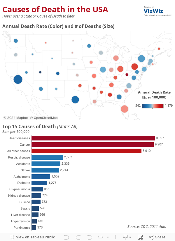
- I changed the map to a bubble map. Now it's easier to see all states because I've also sized the states by the number of deaths for additional context.
- I'm using a blue-red color palette consistently throughout to represent the death rate.
- I removed the individual colors for the diseases and colored them by the death rate instead.
- I killed the stacked bar chart. I also included an action from the bar chart to the map (in addition to the existing map to bar chart action).
- I changed the packed bubbles to a ranked bar chart.
September 1, 2014
Makeover Monday: Where We Donate vs. Diseases that Kill Us

Of course the point of this infographic is to show how much money the ALS Ice Bucket Challenge has raised compared to how few die from the disease relative to other diseases. The data is from 2011, so it doesn't account for the fact that the Ice Bucket Challenge has now raised over $100M. For the purpose of this makeover, let's focus on the chart itself. I see several issues immediately:
- The bubble sizes were originally based on the diameter of the circles, not the area. This is a big mistake! The author has since fixed this so the graphic above is now correct.
- There are too many colors. I find myself going back and forth to the legend. It shouldn't be so hard for the readers.
- The colors in the legend are in no particular order; not alphabetical, not by deaths, nor not by money raised. This is way too confusing.
- It's difficult to trace the relationship between the deaths and the money raised.

- We can see the ranking relationship between the cause and the disease much easier.
- I've highlighted the Ice Bucket Challenge since it is the focus on the article.
- I colored the remaining line by red or blue to indicate a decline or increase in rank respectively.
- I labeled the ends of the lines directly to eliminate the need for a legend.
December 14, 2012
A map that says it all - States with stricter gun control laws have fewer deaths from gun-related violence
From the Washington Post. Enough said. Let the political posturing begin.

May 24, 2011
The World’s Deadliest Roads – Watch out for cars in Africa
Before you travel around the world, you may want to consider where you are safest. According to the Guardian, road traffic accidents “kill more people around the world than malaria”. While China would obviously have the highest number of accidents based on the size of the population, I was surprised that many countries in Africa and the Middle East have such a high incidence of deaths (measured as deaths per 100K of population).
Use the interactive viz below to see if anything stands out to you. One good way to look at the data to really make the death rate in Africa stand out is to choose “Estimated Deaths per 100K” for both the color and the size. What do you see?
January 21, 2010
Deadliest Earthquakes
I encourage you to take download the workbook and use Tableau Desktop or Tableau Reader to interact with the data. The map views have been configured to return Google search results based on the earthquake that you select.


