October 20, 2019
#MakeoverMonday: The Age at Which Most People Are Dying by Suicide Has Increased Over Time
death
,
Makeover Monday
,
mental illness
,
office for national statistics
,
ONS
,
suicide
No comments

- It's a simple data set.
- The original visualization is really good.
Let's have a look.
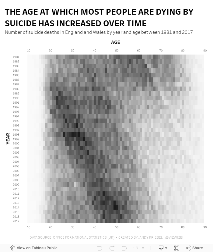
What Works Well?
- The patterns are super intuitive to see and understand.
- Amazing interactivity that allows you to look at an entire year without the overlap of the other years.
- Nice annotations
- Years and ages are in the appropriate order
- Using the intensity of a single color to emphasize the number of suicides
What could be improved?
- The number of axis ticks could be reduced to every five or ten years.
What I did
I thought I would try to build a horizon chart, but it became too complex and the data wasn't quite suited for it. I then built a series of area charts like the original, but without the overlap. It didn't look good; the original has nice rounded lines, whereas a Tableau area chart has sharp edges.
I tried line charts, small multiples, running totals, none of them worked. I ended up keeping it very simple and went with a heatmap that I think gets pretty close to the same analysis as the original.
Subscribe to:
Post Comments
(
Atom
)


No comments
Post a Comment