Showing posts with label office for national statistics. Show all posts
October 20, 2019
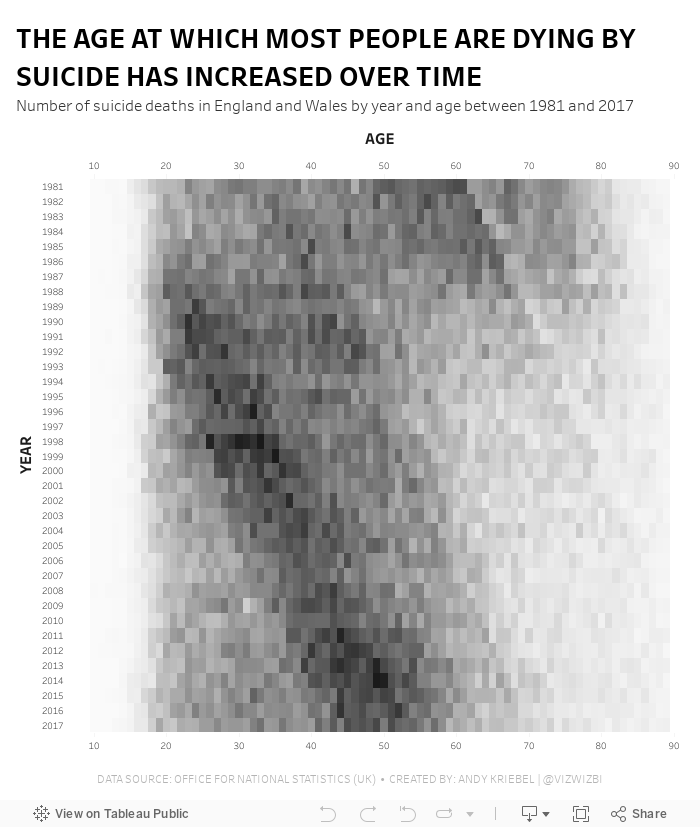
#MakeoverMonday: The Age at Which Most People Are Dying by Suicide Has Increased Over Time
death
,
Makeover Monday
,
mental illness
,
office for national statistics
,
ONS
,
suicide
No comments

- It's a simple data set.
- The original visualization is really good.
Let's have a look.
What Works Well?
- The patterns are super intuitive to see and understand.
- Amazing interactivity that allows you to look at an entire year without the overlap of the other years.
- Nice annotations
- Years and ages are in the appropriate order
- Using the intensity of a single color to emphasize the number of suicides
What could be improved?
- The number of axis ticks could be reduced to every five or ten years.
What I did
I thought I would try to build a horizon chart, but it became too complex and the data wasn't quite suited for it. I then built a series of area charts like the original, but without the overlap. It didn't look good; the original has nice rounded lines, whereas a Tableau area chart has sharp edges.
I tried line charts, small multiples, running totals, none of them worked. I ended up keeping it very simple and went with a heatmap that I think gets pretty close to the same analysis as the original.
May 1, 2019
The UK's Most Popular Baby Names
Alteryx
,
baby names
,
data prep
,
flourish
,
office for national statistics
,
ONS
,
rank
,
UK
,
united kingdom
No comments

Sophie's Challenge
While Tableau is an amazing tool, when you use it all the time you can fall into data-viz-auto-pilot mode. You build the same kinds of charts; you construct similar kinds of dashboards; you fall back on the same formatting styles. While familiarity with tool, and a workflow, is a good thing, it also narrows your view of what’s possible.For today’s Dashboard Week challenge, I want you to step outside your data viz comfort zones and try building a viz using Flourish. Flourish is a free tool that lets your build interactive, responsive, and embeddable vizzes and data stories, all within the browser using your own data. Flourish is focused at the communication side of data viz (more than the data exploration side), and I’d like DS13 to really think about communication in today’s challenge.
Why Flourish? I really like their wide (and ever expanding) range of templates and interactivity (transitions, stories and ‘Talkies’ to name a few); also they are based in London – so why not viz-local?
Using any part (years, geographic locations, genders) of the England and Wales baby names data sets, I want DS13 to find and communicate one specific story from this data set.
Here are the rules for today, and what I’d like to see as output:
- They must work independently.
- Everything must be finished by 5pm.
- They must use Tableau and Alteryx for the data prep and exploration.
- The final viz must be made in Flourish.
My Approach
First, I had to get some data. I decided to download the data from the ONS for 1996-2016 because it was in a relatively decent format.Next, I opened the "Plotting Competitors" example because I loved the animation. The great thing about Flourish is you can immediate use the template. All you need to do is upload your own data, assign the columns, and you're done!
This meant I had to do some data prep in Alteryx to get it in the correct shape. I needed the years across the view and the number of births for each name and gender. Then I filtered both the boys and girls to the 25 most common names, giving me 50 names in total.
I absolutely LOVED playing with Flourish and will definitely use it in an upcoming Makeover Monday.
Check it out! The animations are so so good! There were straight line and curved line options. I went for the curves. Enjoy!
Subscribe to:
Posts
(
Atom
)


