Showing posts with label shooting. Show all posts
February 8, 2016
Makeover Monday: How Many Blacks Did the Police Kill in 2015?
black
,
death
,
Makeover Monday
,
police
,
race
,
shooting
,
United States
,
white
3 comments

This week's Makeover Monday was much harder than I anticipated and I must note that it took me way, way over an hour to create something I was happy with (more about that in a bit). The website that we reviewed had a series of three charts about police killings in the United States. I'll focus on the first two:

What works:
- Good title and subtitle
- Bars are sorted properly
- Using a rate is good practice because it normalizes the data
- Using a different color of the U.S. average
What doesn't work:
- I hate charts that make me turn my head sideways to read the labels.
- I would have the U.S. average as a reference line.
- There's no sense for the rest of the population.
- It feels like there's more to the story.
Ok, so how about the second chart:
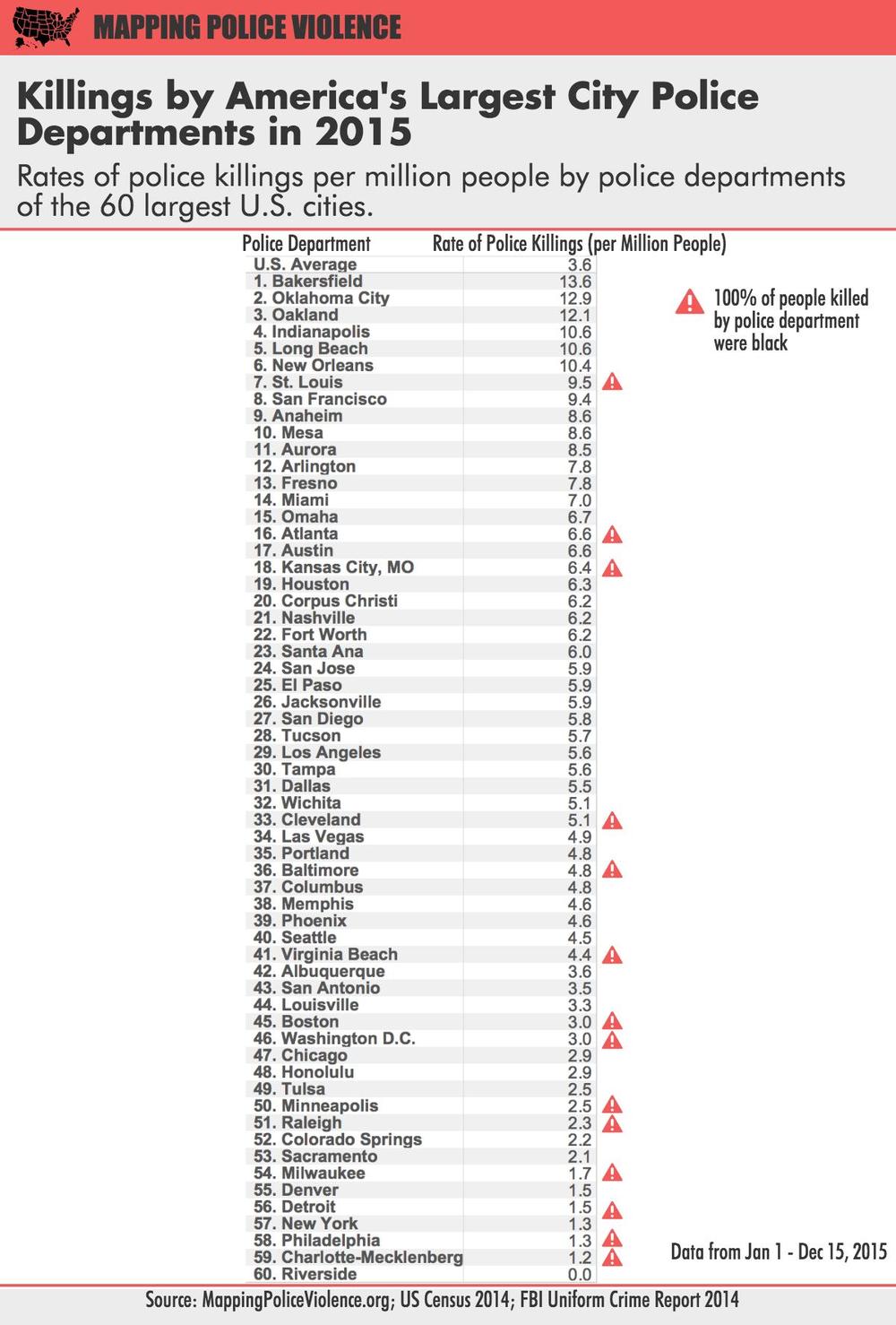
What works:
- Good title and subtitle
- Ranking the police departments
- Using a rate is good practice because it normalizes the data
- Calling out those that police departments that have only killed blacks
What doesn't work:
- I almost didn't notice the U.S. average (it's above the first police department).
- The column headers should wrap so they fit better.
- Again, it feels like there's more to the story.
- The table makes comparing police departments harder than necessary.
A quick bit of background before we get to my viz. Last week, we brought Caroline Beavon to the Data School to teach an infographics and information visualisation course. I would highly, highly recommend the course. It was a perfect blend of the courses that Andy Kirk and Cole Nussbaumer teach if you've ever been to their classes. We learned a ton about knowing your audience, choosing the aim for your visualisation and picking out the proper story in the data. In addition, we designed several infographics, which is something I was particularly excited to put into practice this week. With that being said, here's is my makeover of the two original charts, but really, it's completely different and delves much deeper into the story the data is trying to tell.
You can download the workbook from Tableau Public here.
November 15, 2015
America's Gun Problem: How Frequently Do Mass Shootings Occur?

The terrorist attacks by ISIS are despicable, cowardly, sad. I can’t even begin to fathom what would make one human want to kill another. Needless to say, a solution is needed, and it won’t be easy.
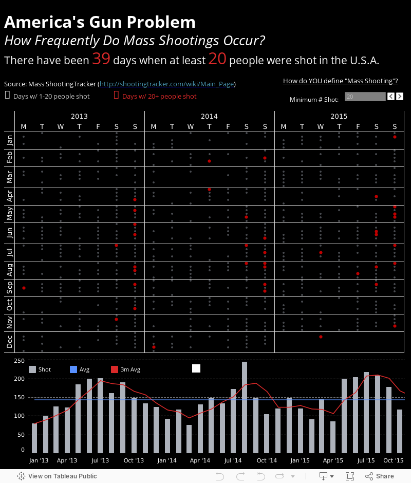
But as I was checking on my friends in Paris, a question popped into my head: How often do the biggest of mass shootings occur in the United States? With that question in mind, I started by exploring the data with Vizable and shared the results on Twitter.

I knew there was a story to be told; I also wanted the people interacting with the story to create their own definition of mass shooting. So I opened the data in Tableau and started answering the question myself. I had a few goals:
To me, looking at the data this way shows the staggering numbers of shootings in the US.
But as I was checking on my friends in Paris, a question popped into my head: How often do the biggest of mass shootings occur in the United States? With that question in mind, I started by exploring the data with Vizable and shared the results on Twitter.
I knew there was a story to be told; I also wanted the people interacting with the story to create their own definition of mass shooting. So I opened the data in Tableau and started answering the question myself. I had a few goals:
- Show all of the days when people were shot
- Allow the user to create their own definition of mass shooting (I chose 10)
- Highlight the days that “qualified” as mass shootings
- Show the cyclical nature of shootings
To me, looking at the data this way shows the staggering numbers of shootings in the US.
October 3, 2015
Mass Shootings: America's Gun Violence Problem
gun control
,
guns
,
map
,
murder
,
shooting
,
USA
2 comments

Another mass shooting in the USA. 17 more people shot. 10 dead. 7 wounded.
So what’s one to do? How about find some data and see if a visualisation can have an impact?
This morning, I woke up early thinking about the data. I didn’t want data about murders; I wanted data about shootings. Why? Because if shootings don’t occur, then gun murders can’t occur.
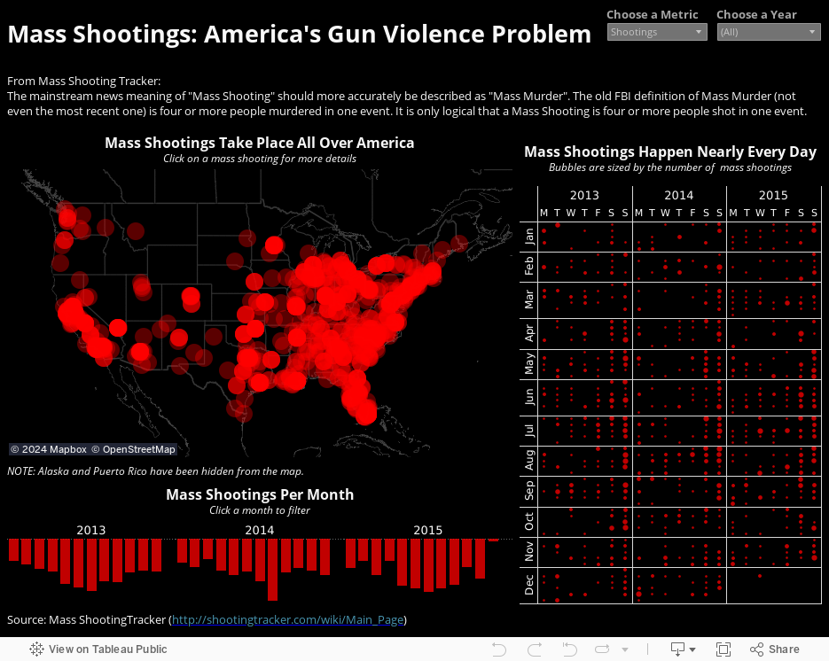
A Google search turned up the amazing website Mass Shooting Tracker. They’ve been collecting data about mass shootings since 2013. Their explanation of what and why they track what they do is critical:
So what’s one to do? How about find some data and see if a visualisation can have an impact?
This morning, I woke up early thinking about the data. I didn’t want data about murders; I wanted data about shootings. Why? Because if shootings don’t occur, then gun murders can’t occur.
A Google search turned up the amazing website Mass Shooting Tracker. They’ve been collecting data about mass shootings since 2013. Their explanation of what and why they track what they do is critical:
The most obscene incidents of gun violence usually do not make the mainstream news at all. Why? Because their definition is incorrect. The mainstream news meaning of "Mass Shooting" should more accurately be described as "Mass Murder".I downloaded all of the data, parsed out the locations, loaded them into Batch Geocoding and viola…all the data I needed to build this viz.
The old FBI definition of Mass Murder (not even the most recent one) is four or more people murdered in one event. It is only logical that a Mass Shooting is four or more people shot in one event.
Here at the Mass Shooting Tracker, we count the number of people shot rather than the number people killed because, "shooting" means "people shot".
December 14, 2012
A map that says it all - States with stricter gun control laws have fewer deaths from gun-related violence
children
,
Connecticut
,
death
,
elementary
,
gun control
,
guns
,
Newtown
,
shooting
,
violence
4 comments
From the Washington Post. Enough said. Let the political posturing begin.

Subscribe to:
Posts
(
Atom
)






