August 25, 2014
Tableau Tip: Month over Month KPI Movers
Brian Bieber
,
calculated fields
,
change
,
KPI
,
last
,
lookup
,
monitor
,
parameters
,
table
,
tableau
,
tips
13 comments
Reader Brian Bieber (no relation to Justin), a Data Analyst at Vanguard, sent me this question:
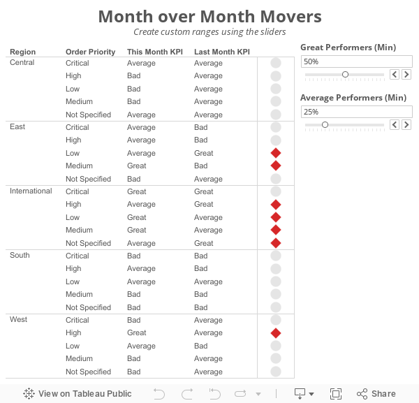 The steps for building a KPI movers viz like this are pretty straight forward. I'm using the Superstore Sales data set that comes with Tableau in this example.
Step 1: On a PC, right-click drag Order Date to the Columns shelf. On a Mac, Option+Drag Order Date. Choose the continuous month option.

Step 2: Right-click on the Order Date pill on the Columns shelf and change it to Discrete.

Step 3: Right-click on the Order Date field on the Column shelf and choose Show Missing Values. This is important because it turns on data densification. Months where data does not exist get displayed.

Step 4: Add the dimensions you would like to slice the data by to the Rows shelf. For this example, I've used Region and Order Priority.

Step 5: Create a calculated field called Last and change the Default Table Calculation to Order Date.


Step 6: Right-click on the Last field you just create in the Measures area of the Data window and choose Convert to Discrete.
Step 7: Drag the Last field to the Filters shelf and choose 0. This will change the view to only show the latest date.

Step 8: Create a calculated field to get the value for the most recent month. Notice that I'm using the LOOKUP function. Change the Default Table Calculation to Order Date.

Step 9: Create a calculated field to get the value for the previous month. The only difference here is we need to offset the LOOKUP by 1. Change the Default Table Calculation to Order Date.

Step 10: Create two parameters: one to determine the lower limit of the top KPI (Great Performers) and one to determine the lower limit of the middle KPI (Average Performers).


Step 11: Create the KPI calculations for the most recent month and the previous month. Notice that I'm using the parameters.


Step 12: It's up to you if you want to follow this step. For this specific example, I wanted to see the KPI for this month and last month in the table, so I've added them to the Rows shelf.

Step 13: Create a calculated field that returns a boolean to compare the values for this month to determine if they are a "Mover". I'm using Brian's definition for this example.

Step 14: Drag the Movers field to the Color shelf. I chose to set the colors to a light gray when True and red when False. This way only the Movers stand out.

Step 15: Optional - Change the Marks type to Shape and drag Movers to the Shape shelf as well, then pick shapes that give the affect your looking for. I chose diamonds for the Movers and circles for everything else.

Lastly I did a few cleanup items before placing the worksheet on the dashboard you see at the top of this post:

This method could easily be changed to accommodate many different scenarios like day over day, week over week or year over year.
Download the sample workbook here.
I'm currently running some monthly data where a list of records is assigned a KPI indicator like G/Y/R. I've been asked to produce a follow-up piece that would show "movers" from the prior month's data, just in a simple text view. So I guess what I need to try and do is figure out how to do a lookback/compare from prior month data to see who went from Y/R to G on the positive change side and who went from G to Y/R on the negative side.What Brian didn't realize was that answer to his question was pretty much in the question itself; he needs to use to LOOKUP() function. I sent Brian a solution, but decided to fancy it up a bit more and add some more functionality using parameters:
Step 1: On a PC, right-click drag Order Date to the Columns shelf. On a Mac, Option+Drag Order Date. Choose the continuous month option.
Step 2: Right-click on the Order Date pill on the Columns shelf and change it to Discrete.
Step 3: Right-click on the Order Date field on the Column shelf and choose Show Missing Values. This is important because it turns on data densification. Months where data does not exist get displayed.
Step 5: Create a calculated field called Last and change the Default Table Calculation to Order Date.
Step 6: Right-click on the Last field you just create in the Measures area of the Data window and choose Convert to Discrete.
Step 7: Drag the Last field to the Filters shelf and choose 0. This will change the view to only show the latest date.
Step 8: Create a calculated field to get the value for the most recent month. Notice that I'm using the LOOKUP function. Change the Default Table Calculation to Order Date.
Step 9: Create a calculated field to get the value for the previous month. The only difference here is we need to offset the LOOKUP by 1. Change the Default Table Calculation to Order Date.
Step 10: Create two parameters: one to determine the lower limit of the top KPI (Great Performers) and one to determine the lower limit of the middle KPI (Average Performers).
Step 11: Create the KPI calculations for the most recent month and the previous month. Notice that I'm using the parameters.
Step 13: Create a calculated field that returns a boolean to compare the values for this month to determine if they are a "Mover". I'm using Brian's definition for this example.
Step 14: Drag the Movers field to the Color shelf. I chose to set the colors to a light gray when True and red when False. This way only the Movers stand out.
Step 15: Optional - Change the Marks type to Shape and drag Movers to the Shape shelf as well, then pick shapes that give the affect your looking for. I chose diamonds for the Movers and circles for everything else.
Lastly I did a few cleanup items before placing the worksheet on the dashboard you see at the top of this post:
- Moved Order Date to the Detail shelf
- Reduced the level of the row divider
- Removed the bold text from Region
- Added a calculated field to the Filters shelf that checks that the value in the Great Performers parameter is larger than the value in the Average Performers parameter.
This method could easily be changed to accommodate many different scenarios like day over day, week over week or year over year.
Download the sample workbook here.
Subscribe to:
Post Comments
(
Atom
)


Andy, this is exactly what I was looking for. Thanks so much! One small change I made was to change the T/F for movers to an calculated population for good or bad movers. Then you can also set up a filter to see only those that move positive or negative. The syntax I used was (though there may be a more efficient way):
ReplyDeleteIf ([This month KPI]='Great') AND ([Last month KPI]='Average') then 'Good Move'
elseif([This month KPI]='Great') AND ([Last month KPI]='Bad') then 'Good Move'
elseif([This month KPI]='Average') AND ([Last month KPI]='Bad') then 'Good Move'
elseif([This month KPI]='Average') AND ([Last month KPI]='Great') then'Bad Move'
elseif([This month KPI]='Bad') AND ([Last month KPI]='Great') then'Bad Move'
elseif([This month KPI]='Bad') AND ([Last month KPI]='Average') then'Bad Move'
else 'no move'
end
Great! I'm happy it worked out for you!
DeleteAndy:
ReplyDeleteNice work. I like the addition you made in using parameters to define what's a great result and what's an average result. They inspired a question for Brian about his exact business need.
Brian:
I noticed that if you use the parameters to define what's a Great result you might have an unintended consequence and loose a big mover that you might otherwise want. For example if you lower the upper limit from 50% to 45% then that makes some of the results from this month move from Average to Great, while the prior month remains Great. That means the diff from month to month is based on Great to Great which is not shown as a big mover. This may hide a change that you might still consider a big mover if you looked at the actual number difference between months. If you play with the parameters in Andy's sample above you get other similar results. Does that meet your business needs, or introduce an unintended result?
If not, you can get even closer to identifying big movers by flagging the difference from the prior month using a pct change parameter (e.g. KPI's that changed +/- 15% or some number of pctage points) instead of comparing Greens last month that moved down to Yellow or Red this month, (and visa versa) It's possible to tweak what Andy has done to use a parameter to define how much of a difference from last month to this month you consider a big move up or down.
Hi Bruce,
DeleteI agree that using the summary statement of "Good Move" vs "Bad Move" can cause some oversight if you're looking at a continuous measure like profit margin in the example above. But my business need is based strictly on a standard stoplight Green/yellow/red, so the opportunity for missing big movers is much less likely. I think I'm going to modify my initial criteria a little bit to differentiate between Big movers (going two steps from Great to bad or vice versa) and slight movers (moving one spot in either direction).
I love the dialogue created by my question! Thanks so much!
Brian
I took Andy's launching point and added a couple of slope charts (which I also learned from Andy: http://vizwiz.blogspot.com/2013/02/pie-charts-duel-to-their-death-create.html ) that provide kind of a drill down summary of that month/month movement. Starting at the Region level, you can see the same kind of change of profit ratio analysis. Then by selecting a region in the cross tab, the slope chart changes to provide the order priority view that reinforces the cross tab and provides some insights to the values, actual change, etc.
ReplyDeleteI used the idea of a sheet selector and dashboard containers to filter between the Region slope chart and the Priority slope chart (http://kb.tableausoftware.com/articles/knowledgebase/creating-sheet-selector-for-dashboard ). Except instead of a parameter I leveraged the filter action from the cross tab selection and some additional filters on those slope charts so that when no region was selected the Priority view was empty and when one was selected the region view became empty. That allows the drill down type slope chart.
This was my first Tableau Public view, so hopefully it works.
https://public.tableausoftware.com/views/Metric_Movers/ProfitRatioMovers?:embed=n&:display_count=no
This comment has been removed by a blog administrator.
ReplyDeleteI like your dashboard but there's one bad bug as you are showing results for all Decembers and all Novembers and not just the two most recent months.
ReplyDeleteAndy first put MONTH(Order Date) into play as a continuous measure and then made it discrete. This is the equivalent of MY(Date) as a discrete measure. I know that Joe mako likes converting the continuous date into discrete and it's a great way to get the equivalent of QY(Date) but I find it may confuse people so I tend to use MY(Date). You can see for yourself when you look at the filter options for Last. Your filter shows 12 possible values and Andy shows 48.
As for formatting I would swap the orangle and blue as I usually see blue as good / increasing and orange as bad / decreasing. Think of this as colorblind-friendly versions of green and red.
Brian, I often see organizations present the same info but they just show the most recent month and have indicators showing if there was an increase or decrease from the previous month with the indicators color-coded to indicate whether the change is statistically significant. I had to do this three years ago for my first major client and Joe Mako helped me build a z-test into Tableau.
Steve Wexler
Data Revelations
Thank you very much Steve for pointing out my oversimplification of the Month dimension. I appreciate your taking the time to diagnose that and bring that to my attention. I've corrected my first Tableau Public dashboard.
DeleteThanks again!
Thank you so much! This was very helpful and answer to my problems!
ReplyDeleteHigh praises to you Andy! You're the man.
DeleteHi! I know this is old but maybe someone can help me!
ReplyDeletehow can I just show last 12 months data PLUS YoY? I have 24 months worth of data but when I use the filter to show only the last 12 months the YoY stop working (cause I'm filtering out the last year) Any help would be really appreciated!!
Hi Ariela. Now that LOD expressions exist in Tableau, this is much easier. See this post - http://www.vizwiz.com/2016/06/tableau-tip-tuesday-using-lod-calcs-for.html
DeleteGreat stuff (as always) and succinct, making it approachable even for beginners.
ReplyDeleteMy only suggestion for organizations interested in a quick hit on 'who improved, who slacked, who flat-lined' is a minor calc. update:
If ([Last Month KPI]='Great' and ([This Month KPI]='Average' or [This Month KPI]='Bad'))
Then 'Down'
ELSEIF (([Last Month KPI]='Average' or [Last Month KPI]='Bad') and [This Month KPI]='Great')
Then 'Up'
else 'Flat'
END