January 15, 2018
Makeover Monday: U.S. Household Income Distribution by State
census
,
household
,
income
,
inequality
,
Makeover Monday
,
tile map
,
United States
,
US
No comments

What works well?
- The ordering of the states by the highest income level from smallest to largest is easy to see.
- The colors are all pretty distinct from each other (as I'm not color blind).
- The colors seem like an intentional choice to go from red (low) to green (high) with steps of color in between.
- The labels help add context to the stacked bars and they aren't distracting.
- Including the data source
What could be improved?
- There's no indication as to which year this represents.
- As it's not interactive, you can't sort by a different income level, therefore it's not easy to compare different states without reading the labels, which is slow.
- Are there region differences? I can't tell from this view.
What I did:
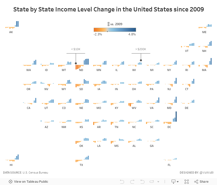
- To be able to see regional trends, I included a tile map.
- I used bars that represent the change since 2009 so that we could see which income groups grew and shrank the most.
- I included context in the tooltips that show each income level for 2016 and the change since 2009 for the selected income level.
- I added some annotations to aid understanding (thanks Eva for the idea).
Subscribe to:
Post Comments
(
Atom
)


No comments
Post a Comment