July 26, 2021
#MakeoverMonday 2021 Week 30 - America's Racial Breakdown by State

Makeover Monday week 30 looked at this viz from Visual Capitalist showing the percentage of each race in each State in America.
In the video below, you'll see my recreate the tiled treemap before creating a tiled bar chart. Thanks for watching!
Click here to view the interactive version on Tableau Public.

November 19, 2020
Pregnancy, Birth, and Abortion Rates in America

With Amy Coney Barrett being sped through the confirmation process of the US Senate before the 2020 Election (as hypocritical as it was) to become the 9th justice on the Supreme Court, there is now a conservative stranglehold on the judicial branch of government.
Justice Barrett deflected all questions about her stance on abortion during the confirmation process and it has raised lots of speculation that Roe v. Wade will be overturned. Yeah, you know, because the government should control a woman's body, yet there is nothing similar for men. Like, why doesn't a man get castrated if he accidentally impregnates a woman? Blasphemy they say; hypocritical I say.
I wonder if any of the anti-abortion Justice or Congresspeople have ever considered their stance if their daughter had an unplanned pregnancy. What is she got raped and pregnant? I bet their tune would change.
Anyway, my political and social views aside, this made me think about abortion rates in America. Since Roe v. Wade, abortion rates in the US have plummeted.

October 29, 2020
How to Create Time Series Tile Grid Maps

Unlike traditional maps, tile grid maps allow you to allocate equal space to each geographical area. We've probably all seen hex maps of the United States. Tile Grid Maps are similar, except they are squares with each block being the same shape and size.
In this video, I show you first how to create the tile grid map, then how to overlay time series data. I then show you three different visualization types for the time series. You could easily create bar charts as well.
Enjoy!

March 3, 2018
Creating Runkeeper Tile Maps with Alteryx & Tableau
- Login to Runkeeper
- Go to "Account Settings" from the gear at top right of the screen
- Choose the Export Data option on the left
- Select the date range
- Click on Export Data
- Unzip the files
To get all of your routes from Strava:
- Login to Strava
- Select "Settings" from the main drop-down menu at top right of the screen
- Select "Download all your activities" from lower right of screen
- Wait for an email to be sent
- Click the link in email to download zipped folder containing activities
- Unzip the files
I actually don't follow either of these methods. I pay a small yearly fee for a service called Tapiriik that allows you to sync your fitness data with Dropbox.

ALTERYX WORKFLOW

Steps
- Input all of the files using a wildcard match for 2018 runs only.
- Assign a unique number to every row. In these files there's a GPS reading every second. Having a unique number makes creating the routes easier because you know the sequence.
- The next few steps are the magic part. These essentially give every route the same size as a square. We need them all to be the same size regardless of the actual geographical area covered.
- Create points for each GPS points and connect them to create a polyline. Do this for both the route itself and the boundary
- Calculate some summary stats for each run.
- Bring them all back together.
- Export as a SHP file.
TABLEAU VISUALIZATION
1. Small Multiples

2. Calendar View
- Double click the Geometry field to get a map
- Filter to a single month
- Place Weekday on the Columns
- Week on the Rows
- Add information for tooltips
- Add total monthly mileage to the caption
- Resize the rows and columns to fit the window

LESSONS LEARNED
- Leverage the strength of your team to help you solve a problem and to help you learn.
- Alteryx makes creating and working with spatial objects incredibly simple.
- Prepping the data exactly as you need it in Tableau will make the visualization process much faster.
- Data prep processes in R and Python make for great data prep exercises in Alteryx.
- Fail fast and iterate quickly. Both Alteryx and Tableau allow you to try lots of things quickly without fear of breaking anything. Try something. If it doesn't work, try something else. Keep going until you've nailed it.
January 15, 2018
Makeover Monday: U.S. Household Income Distribution by State

What works well?
- The ordering of the states by the highest income level from smallest to largest is easy to see.
- The colors are all pretty distinct from each other (as I'm not color blind).
- The colors seem like an intentional choice to go from red (low) to green (high) with steps of color in between.
- The labels help add context to the stacked bars and they aren't distracting.
- Including the data source
What could be improved?
- There's no indication as to which year this represents.
- As it's not interactive, you can't sort by a different income level, therefore it's not easy to compare different states without reading the labels, which is slow.
- Are there region differences? I can't tell from this view.
What I did:
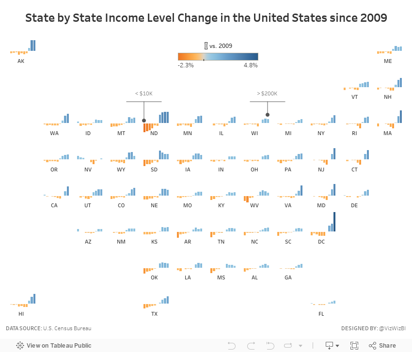
- To be able to see regional trends, I included a tile map.
- I used bars that represent the change since 2009 so that we could see which income groups grew and shrank the most.
- I included context in the tooltips that show each income level for 2016 and the change since 2009 for the selected income level.
- I added some annotations to aid understanding (thanks Eva for the idea).
November 3, 2017
Using Alteryx & Tableau to Visualize London Crimes by the Square Mile
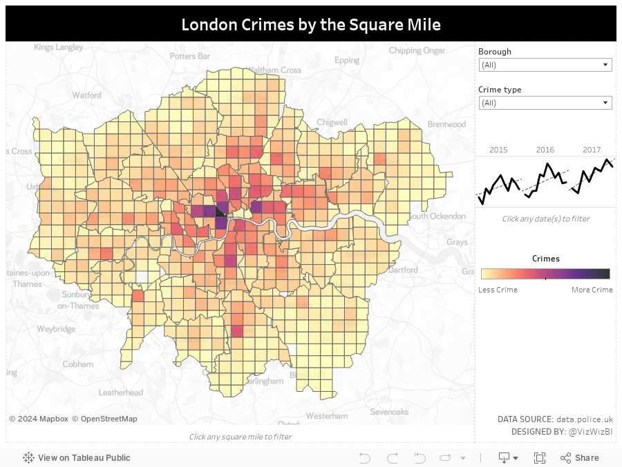
One of the exercises we went through was taking two data sources, one with shapes and one with points, and creating a grid map. This requires the following as my workflow below demonstrates:
- Import shape files for each London borough
- Create 1x1 mile grids within each Borough (which turned out really cool because Alteryx accounts for the edges of each Borough)
- Import the London crimes data
- Create spatial points from the latitude and longitude fields
- Use the spatial match tool to determine the Borough in which each crime occurred
- Summarize the crimes
- Export as shape files
- Import into Tableau

Practical exercises make concepts stick and this one worked for me. From this point, I created a simple interactive Tableau dashboard so people can find the areas near them with the most crimes.
June 22, 2017
Makeover Monday: Tiled Heatmap of U.S. Air Quality Levels
I was very interested in looking at state-level air quality and built lots of heatmaps and originally built them in a single worksheet using table calcs to sort out which states go in which columns and rows.
This didn't work for me, though, because it only helped me see the states alphabetically. It's much more intuitive if they are displayed geographically. An idea popped into my head...
I wonder if I can combine a heatmap that looks at daily max reading by state across all years with a tile map.
I quickly went to Matt Chambers' great post for how build tile maps added the secondary data source, blended it by state and replaced my crazy table calcs with a simple tile map view. What a fun exercise! I learned a ton and feel like I created a much more intuitive view. Does anyone recall every seeing a tiled heat map? Have I come up with a new chart type???
Click on the image for the interactive version. Note that the viz might be slow to load as it's displaying about 460,000 marks.






