November 19, 2020
Pregnancy, Birth, and Abortion Rates in America

With Amy Coney Barrett being sped through the confirmation process of the US Senate before the 2020 Election (as hypocritical as it was) to become the 9th justice on the Supreme Court, there is now a conservative stranglehold on the judicial branch of government.
Justice Barrett deflected all questions about her stance on abortion during the confirmation process and it has raised lots of speculation that Roe v. Wade will be overturned. Yeah, you know, because the government should control a woman's body, yet there is nothing similar for men. Like, why doesn't a man get castrated if he accidentally impregnates a woman? Blasphemy they say; hypocritical I say.
I wonder if any of the anti-abortion Justice or Congresspeople have ever considered their stance if their daughter had an unplanned pregnancy. What is she got raped and pregnant? I bet their tune would change.
Anyway, my political and social views aside, this made me think about abortion rates in America. Since Roe v. Wade, abortion rates in the US have plummeted.

March 5, 2019
Makeover Monday Power BI Edition: Births Attended by Skilled Health Staff vs. Female Life Expectancy as a Motion Chart

What's one to do? Try a tool that does support animation. In this case, Power BI. Scatter plots in Power BI support animation natively and it took less than five minutes to create this.
- Upload the data.
- Choose the measure for the x-axis and place it on the X Axis shelf.
- Choose the measure for the y-axis and place it on the Y Axis shelf.
- Add a dimension to the Details shelf to draw more dots.
- Place the dimension to animation across, i.e., years, on the Play Axis shelf.
- Add a title.
- Add a text box as a footer.
August 13, 2017
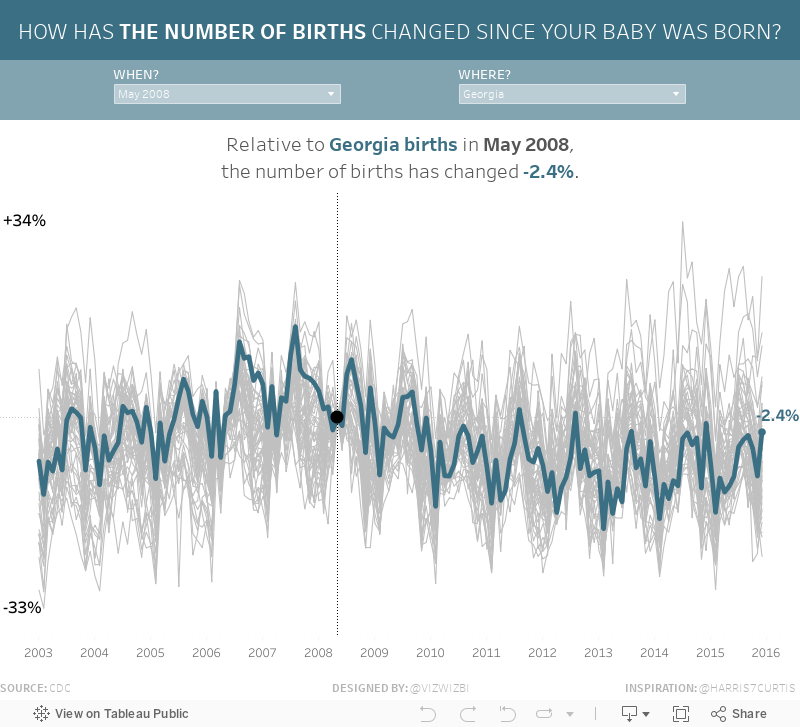
Makeover Monday: How Has the Number of Births Changed Since Your Baby Was Born?
If this data set and viz look familiar, it's because I highlighted it a few weeks ago on DataVizDoneRight and it was also the source for Workout Wednesday Week 31.
What works well?
- Incredible interactivity
- Amazing storytelling as your scroll down the page
- Great use of minimal colors for highlighting
- Great use of context
- Nice example of stepped lines
- Including a link to the source
- Good placement of the filters at the top to encourage the user to use them first
- Including event icons which update the viz based on the year you're viewing
- Great annotations
What could be improved?
- Could use a more impactful title
My Viz
October 14, 2011
Practicing what I preach – A self-critique
Back in August I critiqued and improved a viz created with Many Eyes. Some of my comments included:
- The map incorporates both color and size, which are set based on the measures picked on the right.
- Brushing a State(s) in any chart highlights the State(s) on the other charts.
- Hovering over a bubble or bar reveals the details of the stats chosen. The stats update based on the selections made.
- I’m able to use the color scale consistently through all of the charts.
Now that I have learned how to use simple state polygons in Tableau, I realized that what I previously created was unnecessarily complex. Here’s take 2:
I made a few easy to implement improvements:
- States are now polygons instead of bubbles
- The option to choose a size has been removed as it no longer would add any value
- The table on the right is now shows only the top and bottom 10 (I learned how to do this today via a discussion on the Tableau Forum that, not surprisingly, included a sample workbook for the solution from Joe Mako)
I also didn’t lose this set of functionality:
- Brushing a State(s) in any chart highlights the State(s) on the other charts.
- Hovering over a state or bar reveals the details of the stats chosen. The stats update based on the selections made.
- The color scale is consistent through all of the charts.
In the end, I’ve reduced the viz from four charts to two and made it much easier to interpret the results.
See, I can practice what I preach and I love learning something new everyday.
August 13, 2011
Fertility Exposed – Tableau vs. Many Eyes
It’s been a while since I’ve checked out Many Eyes, but this one below has been on my list to review for a while now. Click around to get a flavor for their presentation.
I’ve seen lots of vizzes done well on Many Eyes. The viz above has many good qualities:
- The mouse-over feature is smooth and quick. I like the format of the text and how the state becomes outlined.
- You can easily switch between metrics with the drop-down box.
- You can show one, two or all maps at the same time to make comparisons more easily.
- Initially, when you show more than one map, the color scales are unique to each map, but there is a simple checkbox that aligns the scales.
- The brushing/highlighting feature works well when you show more than one map, which makes comparisons between individual states even easier to make.
- I like the choropleth maps, a feature we’re all still waiting for in Tableau.
- Switching from choropleth maps to States represented as bubbles can be accomplished in one click. This would be another great feature to add to Tableau once/if they add choropleth maps.
- I particularly like how you can crop Alaska and Hawaii to make the overall map bigger without sacrificing those States. It’s a bit annoying that you can’t do this directly in Tableau, however, you can work around it in a dashboard.
However, there are some improvements that I would make (and attempted to below):
- There’s not enough variance in the colors, making small variances between States harder to distinguish.
- While the choropleth maps are nice, they should be used with caution because the larger States can easily stand out simply due to their size (e.g., Texas)
- For some reason, most of the States are labeled, but not all of them. Not sure why that is especially considering the unlabeled States in the Southeast.
- Many Eyes limits you to one view (i.e., a map or a line chart, but not both). In other words, you can’t create a dashboard.
- If you view the map as bubbles, you can’t add another dimension or measure as a color.
- The default bubbles sizes make variances between States indistinguishable. There’s a scale on the lower-left, but it doesn’t automatically adjust to the data in the view. The only measure that is well represented by the size is the number of births.
Here’s my take, using Tableau:

With Tableau I’ve been able to make many of the improvements recommended as well as add vizzes that allow for quick insights:
- The map incorporates both color and size, which are set based on the measures picked on the right.
- Those same parameters update the other three charts.
- Brushing a State(s) in any chart highlights the State(s) on the other charts.
- Hovering over a bubble or bar reveals the details of the stats chosen. The stats update based on the selections made.
- You can easily see that Utah has a small population, but the highest fertility rate. Maybe it’s their religion?
- I’m able to use the color scale consistently through all of the charts.
I made this viz with Tableau 6.1, which now allows hyperlinks on images. This certainly simplifies directing people to your social networks and data sources.
How would you improve my viz? Please share.






