January 29, 2018
Makeover Monday: What the Most Profitable Companies Make per Second
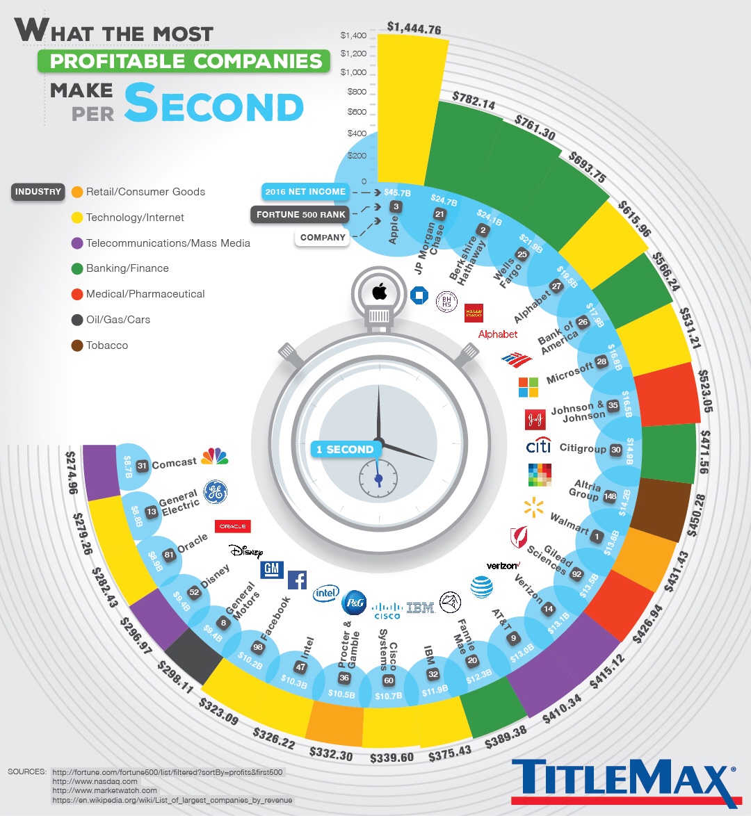
What works well?
- The companies are sorted by profit per second.
- The chart is certainly different, which caught my attention. Capturing your audience's interest is a good first step.
- Coloring the companies by industry makes it easy to see that tech companies and banks are dominating the top spots.
- Including additional information like net income and Fortune 500 rank provides additional context.
What could be improved?
- If the companies weren't sorted, it would be way too difficult to compare the companies.
- The unusual shape of the graphic distracts from the message of the story.
- There is lots of unnecessary decoration like the stop watch in the middle.
- The company logos don't add anything to the visualisation.
- What do the blue bubbles mean? I think they represent net income, but you can't even see the whole bubble and bubbles are terrible for comparisons.
My Goals
- Simplify the viz by removing the decoration and flattening it out
- See if there are any relationships between the different metrics.
- Consider grouping the companies by industry.
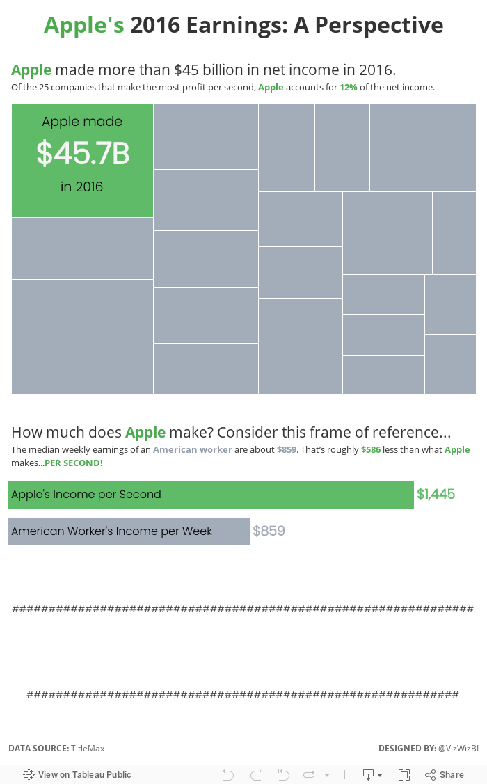
- Read the article and incorporate some of the text that includes some interesting facts.
In the end, I found that a particular section of article about Apple would be a nice way to tell a story and provide some perspective.
Subscribe to:
Post Comments
(
Atom
)


No comments
Post a Comment