March 9, 2021
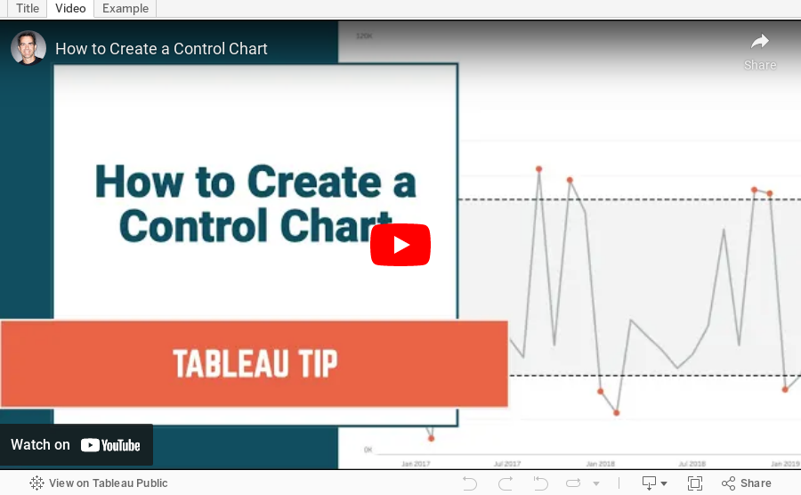
How to Create a Control Chart
analysis
,
calculated field
,
charts
,
color
,
dashboard
,
formatting
,
graphs
,
how to
,
how to make a control chart
,
parameter
,
standard deviation
,
table calculation
,
tableau
,
tutorial
,
worksheet
No comments

- A control chart is a time series graph.
- A line across the time series that represents the mean of all of the measurements in the graph.
- Upper and lower control limits (UCL and LCL) that are displayed as a reference band across the view at a specified number of standard deviations from the mean.
- Indicators to show which measurements are "out of control".
In this video, I show you how to create a control chart that allows the user to specify the number of standard deviations at which to plot the upper and lower control limits.
Subscribe to:
Post Comments
(
Atom
)


No comments
Post a Comment